WD15, The Big Stonking Post™
Another year, another new venue! Luna Park was a curious location, but if you want to see adults turn back into kids - give them free access to dodgem cars!
Old school jump menu
- Disclaimer & photo credits
- Trends
- Cap Watkins – Design Everything
- Alisa Lemberg - Building empathy through data
- Mark Dalgleish & Glen Maddern - CSS in the age of components
- Dan Burka - Build for speed
- Julia Clavien - Cognitive bias in software development
- Cameron Adams - From zero to four million
- Nathan McGinness - The perils and pitfalls of A/B testing
- Maciej Cegłowski - The Website Obesity Crisis
- Denise Jacobs – Hacking the creative brain
- Martin Charlier - Designing connected products
- Brynn Evans - Beauty of ordinary design
- Mike Riethmuller - Advanced responsive typography
- Craig Sharkie – Style with substance
- Tom Loosemore - Enough lipstick on pigs
Disclaimer & photo credits
These notes were hammered out very quickly because doing so seems to help me remember them. However due to the haste, errors occur and you should always assume I'm paraphrasing - if you need an exact quote, please check the session recording later.
Photo credits as noted in the Flickr, Instagram and Twitter embeds.
Trends
- Keywords: silos - as in, break down the silos.
- Recurrent slide theme: Venn diagrams. Geeks and designers do love a good Venn diagram!
- Prevalent tech toy: Courtesy of Web Directions, the Vanamco Device Lab - given out to teams who attended WD15. Otherwise, if anything, it would have to be coffee gear. The give aways at the end of the conference included two different Aeropress giveaways, a cold brewer and a Moccamaster. Having organised the Moccamaster, I can attest that this was not organised between sponsors ;)
- Most-asked question at the after party (for me, at least..): "So... what does ansarada actually DO? What's M&A?" The short answer is: we make software :) The longer answer is - ansarada provides a virtual data room which makes arduous Mergers & Acquisition deals less stressful. For more info see team.ansarada.com
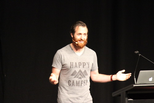
Cap Watkins – Design Everything

“If this cat can ride bacon through space… we can do anything.”
Cap wasn't always a designer - as a kid wanted to be a doctor and that lasted for many years. He got more serious about literature after high school, oddly due to failing a subject and deciding he could do better. Naturally after he got a degree in creative writing he worked at Starbucks…
After some other jobs he moved into design freelancing and eventually went full time – learned a lot about user flows, A/B testing, user testing. Worked on a secret project at amazon… that he still can't disclose… but it was the first time he'd really worked with other designers instead of being the lone designer in a company; and he had a great mentor. Worked at etsy then Buzzfeed.
Buzzfeed does a curious range of products – there's the news and articles, but then they have apps for rating how cute pets are; and the Apple Watch app which is basically a Tamagotchi.
How do you create a culture where design is valued? Trusted? It is hard and can be frustrating. Much like designing a product – there are going to be failures and setbacks; and the wins will often feel small.
How do you start? Define your ideal state of the world. What would it look like if everything was great?
A lot of people think it means “design makes all the decisions” but what does that really mean? If it sucked for someone else to make all the decisions for you, it'll suck for them if you do it.
Are there silos? Do PM, Design and Engineering collaborate or do they just hand things off to each other with no real communication? Or do you have cross-discipline teams with autonomy over their area? Or separate teams that come together for collaborative sessions?
Then start working as though you are already there. Paint the picture. New hires can start without any baggage and just work the new way… that builds momentum.
At Buzzfeed they use a very long Basecamp thread to capture early communications and ideas, then the ensuing discussion. The roles tend to blur this way – devs and PMs asking design questions. People catch misunderstandings early.
The designers created Solid, their atomic UI library – very much designed for designers who didn't know how to code, they “recreated CSS with class names” (.floatleft). Some of the designers taught themselves HTML and CSS with sites like Treehouse.
They had the usual problem with JIRAs asking for things to be moved 3px… “that JIRA is never getting fixed”. So they started labelling JIRAs as “design-tweak” and the designers would triage and fix design bugs. There's a rotation of designers and devs so they only do it occasionally; but it adds up. This means every single designer has now touched production code!
People do start getting nervous though – when roles blur or cross over, people ask questions about what that means for them. They worry about risks, eg. “the designers are changing production code..?” Change creates uncertainty – it's hard. Acknowledge this and empathise! Make them partners, not opponents. When people like each other it's really easy!
Build trust! ...maybe not with bears (animated gif of a guy putting his head in a bear's mouth)
At Buzzfeed they also didn't have some organisational things like role definitions. Titles were all over the place and there wasn't any real understanding of what career progression looked like. After sorting that out with design, Cap ended up spearheading professional development in all tech areas. Something that wouldn't have happened if he insisted on staying his silo.
You have to let things go! Hanging on to things is stressful; and letting little things go builds trust.
With a developer, he created the “number of fucks given” scale from 0 to 10. It was helpful to solve arguments they were having. The dev asked wait… how much do we care?
- one was 2/10 fucks given
- one was 6/10 fucks given
...so the 2/10 said “ok we'll do what you want to do!”.
Be patient – with yourself, with other teams, with progress you are making towards your ideal state.
Leadership is not a role. Everyone is awesome and capable. If you are working with 5 people, make it the best 5 people working together ever.
@cap | cap@buzzfeed.com
Alisa Lemberg - Building empathy through data
It's not just building empathy with data it's building some empathy for data…
A story…
Story of Abdul, a father seen on twitter selling pens in the streets of Beirut while holding his daughter – twitter latched on to this story and ~7000 people raised ~$180k to help him.
Alisa wondered – why this person, why this story? Do those 7000 people donate to other causes and charities?
The death of one man is a tragedy… the death of millions is a statistic.
- (variably attributed)
This is know as extension neglect. People will suggest longer jail sentences for someone who killed three people, than someone who killed thirty. We just don't process things very well. We don't connect to a large number of people the same way we connect to one person.
Empathy allows people to connect, understand and feel empowered to act on data. Most of us already know how to do it.
Case studies…
eBay
Ebay came to Ideo asking why customers were churning. They didn't know why they were leaving or where they were going.
They had great purchasing data – they knew about current customers. What did they look at, what did they spend money on? But once the customer churned – stopped purchasing – the data was truncated. They also didn't have as much information about new customers – where did they come from?
So they did interviews with actual eBay customers.
(slide: map of relationships… just friends, true loves, etc)
They had people map their relationship with eBay – place them on the map. eg. someone might say “just friends”… in fact the friend you knew as a kid and have on facebook, but doesn't really know you very well. Not a close relationship.
They added qualitative data to the existing data set.
Next challenge for Ideo was to inspire 30,000 eBay employees with the insights. How do you get people who aren't data scientists excited? How can you help them work with data?
They created an ebook explaining the segments and individuals within them. Separated the behaviour that described everyone who uses eBay, to everyone in a segment, to the individual.
They eventually found that many “churned” users were actually still there, just not finding things they wanted to buy.
Internally… Ideo found eBay was watching customer videos a lot. They were very keen to connect with real people.
Looking at video in twitter feeds. How will people react to autoplay video? There wasn't time to do an extremely deep behavioral investigation. They had stats on how many minutes people watched; but they used mini surveys to find out how interested they were in the content.
There was anxiety about autoplay videos – would users like it? Hate it? Leave?
They found people who had seen autoplay video before tended to be ok with it; but those who hadn't didn't like it as much.
- Experimental data from live users → What users are doing
- Survey data from those same users → how they feel about what they are doing
- Relevant qualitative research about video watching behavior → what is the larger context of their actions
Take away notes & Try This At Home...
So how can make data easier to work with for our organisations?
- Start by making data relatable
- present things with a story; have your engineering team take the same survey as users, then talk about the delta
- Know what you want to do with your data before you start
- What questions will be asking?
- What answers do you need?
- double check you can answer the right questions; scope can change and if you don't update the questions you ask you can be stuck without data
- Empower the organisation to make decisions using your data
- Ensure they will be comfortable interpreting the data and making decisions
- A lot of data just goes in the drawer...
- Break the silo to cross-validate insights
- Get people from different teams to come to your sessions about data, get their insights
- Alisa found if she looked official and organised things with a clipboard people would just sign up… :)
@DataByDesign
Mark Dalgleish & Glen Maddern - CSS in the age of components
Mark – the end of global CSS
Going back to the beginning… CSS Zen Garden inspired so many of us. It said if we wrote semantic markup we could use lots of different style sheets with it – and demonstrated that it was true!
But then how does that translate to web apps? Global scope vs. maintainability… Lots of attempts to deal with this – OOCSS, SMACSS, BEM, SUIT, even inline styles. BEM is arguably the most common.
As we move into the age of components, this story gets more complicated. Web components, polymer, ng directives, react components… Mark is using React for slides but the principles are the point.
Components are not new. HTML has lots of built in components like date picker and even just the humble select input.
Canonical example of The Problem is the jQuery UI Datepicker, where just one component required an absolute pile of code.
Looking at tools – the canonical Gulp tutorial focuses on types of files; SASS wants to know about your styles and nothing else… etc. Web components go the other way and focus on the component. What does component-centric tooling look like?
Webpack is the current leader. It builds a single dependency tree. Instead of folders per asset type, you are encouraged to think about components.
Instead of:
/css/foo.css/js/foo.js
You have
/foo/foo.css/foo/foo.js
This is an important mindset regardless of specific toolset.
So how does this integrate with tools and methodologies we've been using previously?
Well components and BEM map together to the same thing. You have components/modules/whatever you wish to call them.
Local scope… a feature that quietly turned up in webpack. You could import a “styles” object into your JS. Then there's special syntax in your css - :local(.selector) {} - which means the styles aren't in global scope. Webpack creates unique hash class names – IDs in effect – and maps them to usage.
So what if local scope was the default? Push things to global only when we want to? They used PostCSS to create this custom transform, so the CSS they actually wrote was mostly normal CSS (with unusual effects when compiled).
This led to the CSS modules project.
Glen: part one - the rise of modular style
Going back to the beginning for Glen… in 2008 JS was all about namespaces and Chrome brought V8 to the market. Glen feels CSS needs the same kind of localised scope that people wanted for JS in 2008. NodeJS has the kinda-default way of handling dependencies with require().
For CSS we have Browserify trying to create a module system for CSS.
You can change the human interface of a language without needing to change the language.
CSS has been pushed forwards by frameworks – notably Sass, LESS, PostCSS – but none of these change the fact that CSS is inherently global.
Now they're pushing Interoperable CSS. ICSS adds import and export blocks at the top of an otherwise normal CSS file. This lets a compiler rewrite the CSS to suit the machines; while keeping clean syntax for humans.
Part two – modular style
So what can you actually do with all this? What's the actual value?
You can compile CSS for use in production – Glen showed you can even convert to emoji and really pack the bytes.
You can use mixin-style relationships in your CSS, so the link between styles is not the name of the class; it's declared specifically within whatever class you wanted to write.
You can define an API in your CSS for your components to use.
So where could this go? Site-wide theming, publishing reusable components with CSS, non-JS platforms/environments.
Global scope relies on convention; modular CSS could give greater safety. For Glen if everything's a component it's easier to think about.
@glenmaddern
Dan Burka - Build for speed
Dan has “a very weird job...” doing venture capital for Google… but they have a design team! May be the only design team in VC. They feel design is critical in the way businesses succeed, so they do hands-on design work with the companies they are funding. This gives a great 10,000 foot view of the industry.
Asked a bunch of entrepeneurs in Britain “what does design meant to you?” Brand would come up quickly; then talk about look and feel; maybe they'd talk a bit about UI and UX… but that would be about it. Then they'd ask “what keeps you up at night?” and they'd immediately relax and start talking about other things.
Now they talk to people about how design can help them with the things that are keeping them up at night. This means they are talking about their craft with everyone involved; and showing people that “design” is not magic pixie dust.
Big challenge to business right now: agile is not as quick as people think it is. You make your best guess, build it, launch it, measure results and iterate. But you are starting with a bad idea. Then you take longer than you think to build it; now it's too expensive to abort; the measurements are inconclusive… but you can't go back once something is in the wild. Even when it's terrible, those ten super-passionate users will come after you with pitchforks if you take it away. Then most teams don't really iterate.
So at Google Ventures they do five day design sprints – skip the slowest parts of the sprint.
See gv.com/sprint for much more info...

Case study – creating robots for service industry, eg. hotel check in desks that fluctuate from “mellow” to “bonkers” at two big peak times per day. So they build a delivery robot to take items to rooms at times the front desk is bonkers. They wanted to test the risks of rolling this out in a real hotel.
So they assembled a sprint team: designer, engineer, robotocist, customer service ambassador from the hotel, plus their CEO and COO were also in the room for the week.
Day one: they create a sense of urgency with time pressure. It makes people move faster.
Get the right people to test – you don't want the homebody who never stays in a hotel; nor do you want the road warrior who never needs anything. You want someone who stays in hotels 3-4 times a year. So they put an ad on Craigslist and link that to a screener.
They had to map out a huge amount of user experience touchpoints of having a robot deliver things – from a robot whizzing past you in the lobby; to how it deals with getting in and out of lifts; to how does a robot announce themselves at the door of the room? (it rings the room phone)
Biggest opportunity *and* risk: How should the robot behave? They're confident it is safe but should it have personality? If so what kind? Most people have not interacted with a real robot, but we kinda expect Wall-E… but we don't have science-fiction level robots yet. They simply don't exist yet.
Then they do some notes, then sketching, then some three-pane interactions. Everyone works on their own in this stage; it's a quiet, focused room. Avoid narrowing ideas too quickly; don't let the loudest voice dominate. You want the best ideas out of everyone.
Then they put up 10 options and quietly vote on them. No design by committee.
Look up “dot voting jake nap”(sp?) for ideas about how to do weighted voting.
People vote next to good, important ideas – this creates an instant heat map. Then they talk about why they voted; then do some “super voting”. Certain roles who are close to the customer or business get a bigger vote (yes including the CEO).
This brought out important things to test – should the robot have a face? Should it knock on the door? Should it make noises at all? What dialog should occur – what's written on the screen? Then a crazy idea – make the thing dance! A simple, delightful end to the interaction.
Day 4: prototype. Wait, there's no time left! Also a prototype has to be something you're willing to throw away immediately, no unhelpful attachment. So in this case they made a digital prototype – just keynote to get images onto the tablet that formed the robot's main interface. Don't worry about colours, typeface, etc – just do enough to suspect disblief.
Then they divided their efforts – some people made fake screens; some made sound effects; some practiced manually driving the robot through the interactions.
Then on the last day they did 5 customer interviews (in the hotel, with a pile of cameras, it was a bit weird and they really had to make the interviewees feel comfortable).
People loved the robot. They loved interacting, they loved the little dance, they were all ok with the robot bringing something to them. There were lots of upsides to a robot – eg. privacy. They did want to know what to call the robot.
The risky ideas had paid off. In just a week they'd tested things people felt were too expensive or risky to try out.
Other things they've done… 8 hour app prototype (just done in keynote and flinto)… just do enough to make software feel like software. They work with a huge range of companies in a huge range of industries.
- Gathering the right team is critical – have the expertise AND buy-in, in the room.
- Prototype like it's a prototype – throw it away and do the real engineering for production. Design sprints are pre measurement to gauge the chances of success before you build the real thing.
- Get quick, credible research done – get data quickly, test with real people and see what works.

Again… gv.com/sprint
Julia Clavien - Cognitive bias in software development
[Full house for this talk! I missed the first couple of minutes trying to find a patch of floor to sit on...]
[wording may not be quite right:] Cognitive bias – systematic failures or problems of thinking common to all humans.
Five common problems for teams:
- planning fallacy
- groupthink
- confirmation bias
- hyperbolic discounting
- sunk cost fallacy
(1)
Planning fallacy: tendency of individuals to display an optimism bias and underestimate the time and resources required to complete a project.
Example: the Sydney Opera house – estimated $7m cost, final cost $100+m
This is basically what happens in software too.
Are people motivated to estimate well?
Term: Planning focalism – thinking a task is unique, not similar to tasks completed in the past. Tshirt sizing is a great way to move away from this problem.
Three types of info:
- known knowns – someone won't be available for part of the project
- known unknowns – we need more details here
- unknown unknowns – stuff we simply didn't see coming
Reference Class Forecast can help sort this out. Ignore details that distract from an accurate estimate.
Postmortems are common – we do retros, postmortems etc… but what about a Premortem? Get people together and imagine you've executed the plan you have – and what went wrong? This unlocks peoples thinking, lets them find the risks, legitimises doubt and lets people speak out.
(2)
Group think: the tendency to favour group harmony. This means people don't challenge ideas, instead they just follow along with the majority or the leader.
How to combat this?
- Solicit opinions in advance – let people be candid (they use a tool called Candour)
- Blind vote on issues – even when it seems like overkill. They did this on a tool selection process and got a totally different result from the blind vote.
(3)
Confirmation bias – if you asked this room where “the nearest apple store” is, they wouldn't send you to a fruit shop! We see things through our own lens. This is why we don't test our own code.
So flip the framing of questions. Instead of “is x true” ask “is the opposite of x false”.
Assign someone to the devil's advocate role. It can actually be quite amusing!
(4)
Hyperbolic discounting – tendency to prefer smaller payoffs now, over larger payoffs later. We discount future value that requires sacrifices in the present.
“I'm definitely going to come back and document this later… I'll refactor this later...” This is where technical debt comes from.
You don't have to do everything now – but you do need to ask the questions.
(5)
Sunk cost fallacy – tendency to honour previously expended costs over future benefits.
Have you ever finished a book despite thinking it's a bit crap? Ever finished a feature even though the future need and value has gone? “We've gone this far...”
We are wired to hate waste, we don't like throwing away effort. We don't like to get rid of things even when they are useless.
To reduce the impact, get clear on options and outcomes.
@juliaclavien
Cameron Adams - From zero to four million

A quick humblebrag… they actually hit six million!
The best thing you can have is passionate users. They are the ones who come back every day; the ones that spread your product by word of mouth.
People get excited using Canva, they feel proud of what they achieve.
People go through phases from hearing about your product, to trying it, through to becoming a passionate user.
What do users see the first time they try your product? People will spend more time evaluating your competitors. The ideal onboarding flow goes from having a vague idea of what your product does, to thinking it's great. Don't tell them about your product – tell them how the combination of them plus your product makes them awesome.
Onboarding has been around as long as software – it used to be a huge user manual you had to read to get anywhere at all. Then tutorials came along – interactive CDROMs. More recently we have the 4-5 static info pages you have to swipe through (noting we mostly swipeswipeswipe get me to the damn product)
Ideally: teach your user to use your product while they use your product.
Canva had some issues when they started. People expected design software to be slow and hard to use; secondly they didn't think they themselves could design.
Big thing was giving it the title “23 second guide to beautiful design in canva” - that's hard to resist! Anyone can spare a few seconds.
Building up users' confidence came next – they wanted people to do things. Initially they thought they'd do a bunch of on-screen guidance, but they didn't really have the dev time to support it (only two frontenders on staff at that point). So they created a way to get people to use Canva to learn Canva.
“Getting people to drag a hat onto a monkey is really gratifying… monkeys look great with hats.”
The beginner challenge raised their net promoter score from ~5 to 9-10.
Canva also created a game where you found the stars in the product which led people to new features – things they hadn't tried yet. Progressively revealing the UI as people learned new features.
Trello is another company with a great onboarding experience. It sets you up with boards populated with cards that get you to use parts of the UI or consider use cases for Trello.
Slack uses a chat bot to get users to start trying the product.
Cam is quick to point out they don't think they've got everything perfect with Canva's onboarding. There are really powerful things they could add on to make a better experience for different types of users – eg. tailoring content to people in different industries, or referring to the search terms that brought the user to Canva.
Look up: useronboard.com
@themaninblue
Nathan McGinness - The perils and pitfalls of A/B testing
A cautionary tale… you imagine A/B testing will lead you quickly from an idea to better results. But it's easy to spend a lot of time and money on testing, without really making any gains.
Often your gains also come with losses – eg. asking for an email address, do you ask early to get the most potential responses (and maybe annoy people) or later when you've built trust (but lost a few people)?
So what's going on? Perhaps you're rushing. Perhaps you're just trying every possible option. Maybe you're focusing on the wrong things – testing little things and not taking on the big problems.
Maybe you're just drowing… too many requests, managing too many sources, running too many experiments, have too much data to crunch it all.
Maybe you're ditching good ideas. A test may only be showing whether you ran a good test or not.
Maybe you're not focused.
Maybe it's taking too long to get enough data for a significant amount of responses. See http://blog.kissmetrics.com/when-not-to-test/ for a rough guide to the volumes you might need. A simple rule: use a bare minimum of 100 conversions. Don't look at the data until 100 real people have done something.
Timing is everything. Measuring shopping habits in December will just tell you how people do Christmas shopping. Try to test across cycles to normalise the data.
Will one person see both A and B? Will that seriously confuse or worry the user? A/B testing pricing models is really risky – someone might look on their ipad, then their desktop… if you give two totally different deals it breaks trust.
Remember don't just chase the numbers – someone once said if you purely do things to get more clicks and traffic “you end up with a porn site”.
Remember that you are increasing your costs – twice the design and dev, more time to process the data. Keep track, measure your investment.
Beware of the hype – the science is irrelevant if your theories are wrong.
When should you test?
- When you really don't know which of two good options is better.
- When you don't know your customer – if you have different sources, a new channel, you can use A/B testing to speed up the “getting to know you” process.
- It's not all about ideas having to “win” a test. You want well considered solutions. You don't have to A/B test to measure something.
- Some wins are quiet… they won't cause massive data spikes.
- You can't test everything – some things just have to be tried with everyone.
- Make a concentrated effort on areas that move the needle for your business.
Good methodology: ICE. Impact, Confidence, Ease. How much impact will the test have? How much will the test cost? How confident are you that the results are meaningful? Put a score on these attributes to decide which test to run.
Low impact, low effort, high confidence – just do it! That's just an improvement. Don't test the no brainers.
Four key points:
- Value time – choose where to spend your time
- Have a theory – know what you're looking for
- Volume is key – get enough data
- Design well – test good design
Choose your problems. Be brave – test dramatic changes, make the full effort for all options and tests, know when to just walk away from spreadsheets and just make a decision!
@njmcgee
Maciej Cegłowski - The Website Obesity Crisis
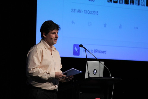
NOTE: you cannot do justice to Maciej in writing, watch the video. This is merely a sketch of an impression of what the talk was like.
Beautiful websites come in all shapes and sizes, this is not to shame anyone and that's not what he's here to talk about. He watches online video, uses big js image galleries...
What he's worried about is sites that just keep getting bigger.
One year's bloated web page is next year's normal. We should anchor to something. Maciej recommends your text-based code should not exceed the weight of masters of Russian literature.
A 400 word article on medium is, in text weight, longer than Dostoyevsky's Crime and Punishment.
War and Peace is about 3 megs.
Maciej shows us a web page on the Yorkshire Evening Post that – somehow – clocks in at 40 megs. (Audible gasp from the audience)
Everybody is aware that there is a problem.
Facebook has proposed Instant Articles, where just your content is posted within Facebook's UI… but they announced it on a 6 meg site which links to a 40 meg video. Their internet.org site has a 16 meg video just for decoration. So do they really care about connectivity? Would you want to load that site on a slow, expensive connection?
When you travel you find places – like rural Australia or New Zealand – where internet data is treated like rare expensive brandy. You can have more but really you want how much?
Google has announced Accelerated Mobile Pages Project… the page repeatedly downloads a 3 meg video. Maciej and Jeremy Keith had an interaction on twitter and were told “limited resources and outsourcing” were to blame. Maciej recreated a tiny flat version with images of Howard Taft, but Google haven't used it...
The Taft test: if your images look better with images of Howard Taft, perhaps you don't need them?
All of the massive sites mentioned can be easily changed to load in under a second. This is not out of our reach.
The only honest measure of page load is from the moment you enter the URL, to the moment you finish closing the last ad. There are many ways people essentially cheat when they report on page speed, apparently loading time and so on – don't fold in the wingmirrors to make a Humvee more efficient, don't drive the Humvee.
Ideal web pyramid:
- JS – just a little
- CSS – go on, have a treat
- Images – a little is ok
- Markup – you need this...
- At the bottom – text worth reading, have plenty
The real pyramid has a tiny bit of text, vast amounts of crap, topped with surveillance.
There is a problem where investors are pumping money into marketing companies… more than they're getting back. Eventually the hundreds upon hundreds of ad companies must eat other or go bust. They will do all kinds of things on the way out… more and more tracking.
Advertisers are tracking people even when people have ad blockers and surf incognito.
Advertisers say micropayments are dead – yet we are making micropayments all the time, the cost of data goes to telcos. If a share of that went to publishers they probably wouldn't need the ads.
We don't need to abandon ads, but we should go back to “dumb ads”. Remember ads that didn't track the user paid for everything for decades…!
Enough about ads.
What about fat assets… things that are just oversized.
The accidental 3 meg image displayed at a small size – you don't notice unless you happen to load it on a slow mobile connection. Or the hero image that is beautiful but hasn't been minified. Or an animated gif run in a little promo spot in the footer.
Chickenshit Minimalism – the illusion of simplicity backed by megabytes of cruft. (see Maciej's full post of the same name)
Not everything has to be minimal. Some information density is ok if you are trying to get work done with lots of data. You don't need acres of whitespace when you've made the key information too small to read.
Then we have the tension between mobile and desktop – because the interface isn't sure if you are using a tiny pointer or you are “slapping the screen with a big fat meat stylus”.
Heavy clouds…
It used to be hard to host a website at really large scale, as you had to source and maintain hardware. Then Amazon offered cloud hosting… suddenly you could rent massive space, although it might occasionally be unavailable (that's just a fact of life with hosted services).
But devs love this stuff. We love complexity, it's a challenge. We use everything, kinda because we can. So we get overkill. Layers and layers of complexity in cloud hosting, JS got faster so we started rendering everything in it.
You can take the profit out of your business with hosting costs.
No matter what we say about web bloat, it never gets fixed.
There are two futures Maciej can see:
One is the Minecraft future, where everything's a bit blocky but you make stuff and have lots of fun with basic building blocks. A playful and contributory web where you are expected to add something creative.
The other is the Call of Duty future, where everything is beautifully produced by a team of experts. Everything looks the same despite all the investment. You have to play a very specific way and you don't get to choose a different way, you can only choose not to play at all.
We should shake off the advertising overlords. We should lighten the load. We can choose to stand together. We can choose a better future for the web.
@baconmeteor
Denise Jacobs – Hacking the creative brain
Denise had an epiphany after writing “The CSS Detective Guide” – that creativity is a power we all have. A great moment of “criticism free creativity” where she went into the creative flow and really created something she loved. She decided to become a creativity evangelist and see if more people could reach this state, more often.
What is the state of the creative nation?
Our best tool for creativity is the brain… but our working lives are not set up to maximise this! We have difficult bosses, demanding clients, time pressures, distractions. We are mentally overwhelmed and oppressed – which stifles creativity.
When we are in the creative flow we feel happy, powerful! We can achieve anything when it is happening.
“Creativity is magical, but not magic.” - missed source
The process Denise will talk about:
- emancipate our creative brain
- adjust
- practice disciplines
- generate ideas & then execute them
Emancipation
We are under a mass hypnosis where we accept meetings, email, timesheets… distractions!
Habits to quit:
- Distractions are not just the norm, they are increasing. Multitasking is multi taxing. Our brain basically turns off and resets every time we switch tasks. We know that feeling of trying to get back into flow after an interruption – the brain takes a few seconds to switch back to the task. Zeigarnik effect: when you start a task and it gets interrupted, the brain keeps processing the old task AND the new one. Repeat and layer that and you get tired.
- Communication addiction is a real thing – we get a little dopamine from checking messages, so we constantly refresh…
- Our inner critic – everyone has this. Everyone worries they aren't good enough, not as good as other people, won't achieve enough. If these thoughts dominate you when you try to work,
- Identifying the inner critic: comparison with others; imposter syndrome (“they'll find out I'm a fraud); perfectionism (it has to be flawless); procrastination… FEARS.
- Fears translate to signals, electrical signals in the brain.
- F.E.A.R.: False Evidence Appearing Real. (or… Fuck Everything And Run)
- Distinguish danger from fear – danger is real but fear is a choice.
How to hack fear:
- say no to comparisons – you cannot compare your insides to others outsides
- the imposter syndrome paradox – you will only experience imposter syndrome when you are competent and skilled. Re-read this as many times as you need to.
- Break the perfectionism→procrastination loop. People procrastinate because it's not perfect…
- reassign your inner critic to other duties – pay attention to your critical voice when you are editing ideas. Ignore during ideation, listen during editing.
- Amp up empathy for your inner critic – your inner critic is trying to save you from harm.
- Maintain perspective - “so what?” Just because you're thinking something doesn't mean it's true.
- Reframe failure and mistakes – Henry Ford's saying “Failure is the only opportunity to begin again more intelligently.”
- Body hack: change your body language, change your mind. See Amy Cuddy's TED talk.
Adjust
Adjust – train your brain to get into a creative state.
Is creativity really all about left vs right brain? It's the combination: the left brain stacks up information but does not make connections, the right brain can do that but it needs the information to work with. Creativity is whole-brain.
Brain waves – if you are in beta state too long, you get into anxiety and stress. Alpha is alert but relaxed, creative state (kids spend most of their time in this state). Theta is very high creativity but we mostly only do it asleep (dreaming). Delta is really low, deep dreamless sleep. Gamma is the highest level – “aha moments”.
Alpha brain waves are the gateway to creativity. There's an exercise to enter alpha… close your eyes, “look up” like you're remembering something, put your tongue on the roof of your mouth, breath slowly. This takes you into alpha. It is also why you get amazing ideas right before you go to sleep, but can't remember later…
Hacks to get into alpha:
- breathe to refocus
- be prone – literally, just lie down, that will put you into alpha
- showers – yes, you really do get ideas in the shower
- space out, daydream
- get physical – exercise! “Cross channel movement” helps the brain hemispheres sync with each other. Brain scans have backed this up – the science is clear!
Practice disciplines
- Focus on meaningful tasks
- Show up every day – do something creative every day. Commit to it, give yourself a check-off chart to see if you've kept the streak going.
- Delegate – free up your own brain
- Clean up your habit fields – you have habits attached to places. (see Jack Cheng article on A List Apart)
- Single-task – say no to distractions. Try something like rescuetime.com to give you a report on where you spent time. Or try heyfocus.com (mac only) which will block sites you shouldn't be reading at certain times.
- Pomodoro technique – 30 minutes = 25 minutes uninterrupted time, 5 minutes off.
Generate & execute ideas
- Start the flow of ideas – start with what's already out there, steal like an artist! Copy, transform, combine. Everything is a remix.
- Create constraints – they help you play within parameters, avoid analysis paralysis.
- Capture ideas – embrace disruption, write things down when they happen. Gather and curate your ideas (eg. gimmebar.com).
- Prototype, iterate.
This all sets the stage for flow state. There is also a “flow afterglow” where you remain creative for some time afterwards; and it's easier to get back into flow.
Take this information and go be creative!
Denise's upcoming book: Banish Your Inner Critic
@denisejacobs
Martin Charlier - Designing connected products
Things we'll see more of, in some rough categories…
- products with extended value proposition – where connectedness is an enhancement. Scales that track your progress.
- Digital business models going into the physical world – perhaps we might have a free device that displays ads
- Services going physical – nespresso machines that can phone home, specific devices to order things from Amazon (no screen, less steps to order things)
- Device ecosystem – connected devices that also stand alone; product ranges where the battery is the delivery system for connectivity (Husquvarna do this).
So what does all this have to do with design? All of these categories require design… it's what people will be working on.
Are you creating a product or a tool? Products are complete solutions, tools are a piece that you use to solve a problem (like the Belkin connected power plug/socket).
Ways to cast the future – write the future newspaper articles, or press release. Can the product be plausibly conveyed in simple terms, how will you pitch it? Sketch the box – what would persuade when people look at the boxed product? What claims would you make and how would you back them up.
How does it work? Designers can help convey the connected model. Non-connected devices like a lightbulb is simple – one switch, on/off. A connected lightbulb suddenly needs multiple pieces like internet connection, apps, rules to run and evaluate… and what happens when one of them (like internet connectivity) drops out? Do things still work? ...how can you explain all this clearly? Or can you find a way to simplify it?
Part of the Amazon method is to write not just the press release, but then FAQ, which can lead to development tasks. If you can explore the ideas that people might need help with, perhaps you can design or build around them.
Interusability: composition, consistency and continuity.
Example: two different connected thermostats. One has a very simple subset of possible settings on the physical device, leaving the richer features to the app; another has all the options on both. There are tradeoffs – eg. the fully mirrored device may have a more cluttered UI, but it will work without your phone.
Consistency is a two-way street, where your app may not be consistent with itself across platforms as each OS has its own conventions to follow.
Continuity – kindles syncing your progress through the same book across devices. This can be quite hard to really get right, since you don't want delays in things like a light switch. Some apps like Instagram effectively lie – the “like” status happens instantly, even when it hasn't been sent back to the server. You could also be totally transparent about interim status, but it requires the user to understand processing time is occurring and accept that it's necessary.
Build the right product before you build the product right.
Paper+video protoyping: use video cut together of people interacting with paper prototypes.
Fake up a video of how the video will work: example of Sketch-A-Move cars being moved with magnets under the table to show how they would work.
Stills composition with narration (example: economizer, by cooper): quick sketches stitched into a video with someone narrating the flow. It's a quick way to think through the experience the user will go through when the device is purchased and set up. This can also set things like technical requirements without being limited in your thinking.
All kinds of everyday devices – power tools, food processors – are becoming connected devices. This means they can have new value, new features, bringing new design challenges.
@marccharlier
Brynn Evans - Beauty of ordinary design
Currently working on Project Fi – wireless for Android – a service design project.
Inspiration: The Beauty of Ordinary Things, by Harriet Scott Chessman… a traumatised person finds comfort in simple things like reading books and taking walks; then photography. Ultimately ordinary things combine and create his meaning in the world.
How does this apply to design? 70% of life is ordinary! We have morning routines, commutes, family activities… these things are ordinary, mundane, and it is where a great deal of our time is spent.
We have some bigger problems that are “ordinary”. Health care is ordinary. Education is ordinary. Marriage ordinary, but divorce is also ordinary.
These ordinary things would benefit from design process – designers using their approach to problem solving in places that aren't currently getting that attention.
With an aging population it becomes important to design things that work for the elderly – people will continue to need to use phones and software. They will need different forms of care at different times. A great example of designing a new experience is Hogeweyk Village in the Netherlands, where patients with dementia live in a village – a relatively normal life, with carers “disguised” as gardeners and other roles.
Similarly the ways military veterans are treated when they return home are confused and poorly designed. A new service in the US, the “Digital Service”, is doing things like taking on the confusion around Veterans Affairs. Instead of literally hundreds of incomplete, contradictory websites for veteran information; there'll be one site – AND they are contacting the people who run all the contradictory sites and working with them to take them offline.
Immigration in the US is plagued with complex, confusing paper forms – people who don't speak English natively often have to hire a lawyer just to get basic things done.
While it sounds like people are just digitising forms, the impact of that is high: you actually know information has been received, you can check progress and status. It changes the nature of the experience.
Looking at a literally sexy problem: safe sex. Many people hate condoms; and when you look into the history of condoms they haven't really changed much for a long time. The Bill & Melinda Gates Foundation has actually put forward the challenge to create the next generation of condom. An example of an improvement is the Pronto condom with applicator, which is a real innovation in the space kicked off by paying attention to the design of an ordinary thing.
What about mobile phone plans? The plans are usually complex and confusing. We just want our phones to work wherever we are…
Project Fi has one plan. There's a basic monthly fee of $20, then $10 per gig of data… and that's it. The cost of unused data is refunded.
Fi also manages open wifi (and secures the connection), connects to the strongest available mobile signal when no wifi is available. The experience is seamless – it just keeps you online, quietly in the background.
What's the common thread?
- long standing issues that haven't been changed or addressed in years
- socially, politically and/or culturally complexity
- Experiences span a long period of time
- service design
What can we do?
- Revisit old problems –
- ask “how can this be made better?” eg. the “magic link” login for Slack, which is better than pecking in a secure password on a mobile device
- ask what can be removed? Chromebooks don't make you log in when your phone is sitting next to it – you're already authenticated
- Expect users to change – track users over time and adapt
- Integrate online & offline – take a holistic view of experiences, consider the real context of a problem. What were they doing before and after they interacted with your site/service/app?
- Own the entire experience – fill in the gaps in a flow
- Find your passion – the best ideas come from deep passion. Ask yourself – is this what I want to be working on? Am I excited about this?
There is a lot of beauty to be found in very ordinary design. There is also beauty in ordinary life. These moments make up most of life – if you can take a moment to pause and enjoy those moments, you yourself will find a way to create meaning in the world.
@brynn
Mike Riethmuller - Advanced responsive typography
CSS values to know about...
- Specified value – what you write in the CSS
- Calculated value – what the result is expected to be
- Used value – what actually got used when all was done and rendered
Calc() can…
- add and subtract units with a similar type
- eg. 10px-3 is not valid
- multiply units by real numbers only
So with that crash course… responsive typography can be complex and jerky, with piles of media queries. You can smooth it out a lot at larger sizes by using things like viewport width units, which smoothly scale; but at small screen sizes they get too small.
So… You can set a base px width, then use vw above a minimum width.
html { font-size: 18px }
(media query min width 600px)
    html { font-size: 3vw; }
How about a maximum font size? Calculate your media query… 18/(3/100) – use the value as the media query.
A chart is much easier to read than doing lots of calculations.
font-size: calc( 12px + (24-12) * (100vw – 400px) / (800-400);
Modular scale headings: eg. each heading 1.2 times the size of the previous level. That scale is the minor third, “endorsed by nature”.
These techniques are also great for icons and other scalable images.
This is all a bit hard to remember… so let's forget everything we just learned and use Sass!
There is a Sass mixin, check Mike's blog for the code or links.
Fluid Type Calc Examples | madebymike
Craig Sharkie – Style with substance
Javascript borrowed from many other languages at the beginning and has continued to do so today. JS is now borrowing ideas from CSS – media queries! With great power comes great responsibility.
Part 1 – the separation of concerns
Structure, Behaviour, Presentation. HTML, JS, CSS.
If you should be doing something in HTML, do it in HTML! If you are going to use a CSS feature in JS, minimise the amount.
For demonstration purposes, Sharkie will assign each concern to a beer… (demonstration of three people opening one bottle, vs one person opening three bottles) the one becomes a bottleneck.
Part 2 – Matchmedia
Media queries are awesome. We have width, height, max-width, device-aspect-ratios… lots of stuff that JS isn't very good at detecting.
But when you need to do more than set breakpoints for styling, you need something more.
Matchmedia allows you to inject new content when it's required, but not send it down the pipe just to hide it with CSS. (obviously this would have accessibility impacts, so use with caution)
The old way to do this with JS was debounced window resize events; the new way is to watch a matchmedia query.
window.matchMedia(mediaquery)
Polyfill: paulirish/matchMedia.js
Matchmedia doesn't really need to be debounced as it doesn't fire events the way resize sprays them (even when debounced!).
Matchmedia also gives you state – where CSS doesn't know what you just did or will do next, Matchmedia can. (demonstration of an animated bird – CSS makes it fly backwards, Matchmedia makes the bird turn around to fly back)
@twalve
Tom Loosemore - Enough lipstick on pigs
First things to get out of the way…
- the pig – not the cute pigs… think of Napoleon the pig from Animal Farm
- luck – we, the people in this room, are the luckiest people alive
“We have it in our power to being the world over again.”- Thomas Paine
But the key question is… who is the “we”? The digital revolution is being done by the people in this room. If we're going to be inventing things, let's do things that matter!
In 2010, the UK Goverment opened the door to people from the internet. Francis Maude used a great deal of personal capital to get digital people into the civil service – this gets digital people into the heart of the government.
These people did not join to fix government websites – they joined to fix government. Because government needs fixing! There has been a growing gap between the expectation people have of web services, to the quality of services they are receiving from government.
So what was broken? Even when they weren't dreadful, government services never got any better. Much of this can be tracked back to the grindingly slow methodology of going from policy, through procurement and finally inflicting on users… and then the stasis of operation.

So what did GDS get right?
- They created a diverse, multi-talented team - “the unit of delivery is the team”
- The did a quick prototype of the gov.uk website; then they iterated with quarterly updates… eventually went live and won an award, leading to the headline “Boring website wins award!”
- There were creative, smart, frustrated people in government already – who had just never had the place to become a great product manager. GDS gave him a space to do so.
- They also brought some new talent in from outside
- They changed the language – no requirements, resources, specifications. They talked about “users” and the needs they have.
- Designed with data – they put up a wallboard showing how many people were on gov.uk and what they were searching for (“slightly filtered...”)
- Devops – they had a baseline that had to be able to release any time and must always release once per day.
- They brought some humanity into process – there was a 400-question survey to get a small carer's allowance. Over the years more and more questions had accreted until people had just forgotten the real human reason for the allowance. They massively simplified it.
- They simplified many processes; or in many cases assisted other teams to do so – registering to vote brought down to a five-minute process. Prisoner visit form was built mobile-first...and they simply never did a “desktop” version.
- They actually needed to put a speedbump into the process to set up lasting power of attorney – because it was such a serious decision, they'd made it too easy.
- Harder stuff – identity assurance, UK Gov Verify
- They set up design guides, a service standard, and importantly…. They did stickers!
They were trying to deal with the “square of despair” - policy, procurement, security myths, just making everything terribly unhappy.
So what did they get wrong? You know in hindsight… they had a huge opportunity and they weren't bold enough. They were digitising a paper-based government. They'd put lipstick on pigs. They'd taken bad processes and made them prettier, a bit easier to use. But each service was an iron-clad silo.
The siloed services each separately collected and stored data. They essentially ignored the existend of all the other silos. Users were left bouncing around getting different things from different silos; and giving up their details each time.
New public infrastructure requires new public institutions.
So Tom made a small team and asked them “What if we started again?” ...with everything except democracy itself. They did a great job and came up with many fantastic ideas, like APIs onto open, canonical government data.
Nice idea: minimum viable data. Eg/ You don't need to know how old someone is, you just need to know if they are over 18.
(Live demo of starting and updating a business through a unified service based on open data, using blockchain to guarantee integrity.)
Whether this model is absolutely right is not certain, but it is certainly better than what we have now.
Some government is going to get this right first. It could be Australia. We do have a PM who wants his party using Slack.
Have no poverty of ambition. Do stuff that matters and invent a future that matters!
@tomskitomski
Also check out www.dto.gov.au | @ausdto
A new Direction
Interesting to ponder the changes that John announced for Web Directions. The event lineup is being adjusted, with a single-track event named simply 'Direction' replacing WD. I don't think I'll miss having to choose between two unmissable sessions ;) A great thing about single-track conferences is the shared experience.
Last thoughts
As always, Web Directions passed so quickly it seemed unreal that it could be over so fast!
I focused on the design track; where there were strong themes around responsibility, empathy and collaboration. Experimentation and iteration in all things - in our work and in how we work. Plus a sense that we should know ourselves - how our brains work, how our brains trick us, and what we can do about it.
There were also some big hints that we need to adjust what we work on - the core things, not just the shiny things. Tom Loosemoore inspired us to reinvent government; Brynn Evans reminded us to embrace the beauty of everyday things; and Maciej Cegłowski dared suggest our tooling has distracted us from the real purpose of communicating information on the web.
All this before I get to the homework of watching videos of the sessions I couldn't get to!
Then as always it was time to repair to a local watering hole, to enjoy all the good company and think how we will put it all into pracice.