Direction16, The Big Stonking Post™
We returned to the Seymour Centre for Direction16 (nee Web Directions)...
Old school jump menu
- Disclaimer & Image Credits
- What came first was what comes next
- The vibe
- Josh Clark – Magic UX and the Internet of Things
- Jonathan Shariat – Tragic Design
- Wayne Thompson – Beyond Helvetica, some stuff you probably didn’t know about fonts
- Lucinda Burtt – Design by numbers
- Seb Chan – Making things for people to do things with things we’re preserving for them
- Caroline Sinders – Designing civility
- Aubrey Blanche – Scaling walls
- Matt Griffin – What comes next is?
- Jenn Bane – Let’s get weird
- Anna Pickard – Many hands, one voice
- Mark Pesce – WebVR: building and browsing cyberspace
- Jennifer Wilson – Change your game
- Aaron Spence – VR as used in our reality
- Ben Hawkins – Letting the kids run the show
- Andy Clarke – Art directing web design
- Jacob Bijani & Pasquale D’Silva – OK, Dracula, let’s make a video game
- Maciej Ceglowski – Who will command the robot armies?
Disclaimer & Image Credits
These notes were hammered out very quickly because doing so seems to help me remember them. Note you should always assume I’m paraphrasing – if you need an exact quote, you will need to check a definitive source such as a recording or slide deck.
Photo credits as per the social media embeds. Particular shout out to JJ Halans for the Flickr photos.
What came first was what comes next
Direction16 kicked off on Wednesday with a day of workshops; and an evening screening of the documentary What Comes Next Is The Future at the Dendy.
It’s a great documentary, highly recommended. If you’ve worked on the web for a long time it’s a wonderful look back; for newcomers it’s a primer on our industry’s early history.
The vibe
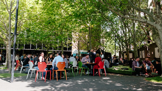
Back at the Seymour on a bright day, Direction 16 was both new and familiar. New format, familiar vibe.
Sample coffee roasters 😍#direction16 https://t.co/CCssCsn3fW pic.twitter.com/pjvh2dup4A
— wayneperry (@wayneperry) November 11, 2016
The Sample crew outdid themselves with a coffee flight: espresso, hot filter and cold brew, all on the same beans.
The single-track format meant no FOMO and no awkward conversations where someone hadn’t seen That Talk Everyone’s Talking About.
In the virtual world, @msharp and I rule as benevolent gods. pic.twitter.com/WFEXpWJtQV
— Kris Howard (@web_goddess) November 10, 2016
There was no doubt about this year's prevalent tech toy - it was Virtual Reality. VR headsets on stage and off. People spinning in chairs, staring at the ceiling.
The Drumpf in the room
There was a persistent undercurrent of shock at the US election result. Perhaps that’s why empathy came up again and again.
Empathy seems to be the keyword at #Direction16 - for team members, for users, for the general community. We could all use more empathy ❤️
— Teresa Watts (@Chisa) November 10, 2016
Many of the speakers (from the US) shared moments of raw emotion – anger, disbelief, fear; then acceptance and determination to tackle the situation when they return.
Josh Clark – Magic UX and the Internet of Things
Josh “won’t lie…” – the results of the US election make it very hard to get up and talk positively. It’s a context of global tragedy after millions have chosen hate over hope.
But there is some hope in treating this as a challenge, even a design challenge. The projects we choose matter, the things we work on can make a difference to peoples’ lives.
We have an opportunity to build amazing new things with emerging technology around physical devices, linking the digital and physical. But let’s show a real example!
shows clips of Harry Potter characters using magic wands
“But then I realised you can buy these on the internet…”
pulls out a universal remote made in the shape of a wand, and turns lights on and off with it
We have objects that are collapsing intent into action. A wand collapses the technology of an infrared remote into a smaller, reshaped device.
(Grab Magic video – where the “grab” gesture at a TV screen + Kinect lets you put screenshots onto a phone)
Combining things we already have in the home can create new interactions. They can have lightness and humility, some fun, some humanity.
Three acts
1. magic & technology
2. physical meets digital
3. magic, imagined
Act I: Magic & Technology
Any sufficiently advanced technology is indistinguishable from magic. – Arthur C Clarke
We use the terms of magic so loosely now, everything is going to “delight”... but delight deprecates.
One goal: the computer disappears into the environment. – Alan Kay
Technology should get out of your way, the same way a pencil gets out of your way.
Fantasy fulfills a need for a simpler, more controllable world. – Alan Kay
Very successful interfaces are often about creating a new and simplified model that we feel really confident using.
We all have our own magic wands: mobile phones are the first magic wand for everyone. Phones bridge the digital and physical worlds. They are the first IoT device that really went huge. Everyday objects with sensors, processor and internet connection (sensors + smarts + connectivity).
They provide interaction right at the moment of inspiration. You can use phones to look things up and interact with whatever is right in front of you. Mobiles bring computing power to immobile objects – things that were traditionally 'dumb’.
Example of Huggies Nappy Notifier – just a novelty really, but if something as disposable as a nappy can be made 'smarter’ then there really is a lot of possibility out there.
Most existing products and ideas are still mediated via screens. Everything pulls us back to the mobile phone screen; and research suggests the average phone user spends as much as 20% of their waking hours staring at a little screen.
So the availability at point of inspiration is the phone’s Achilles Heel as well as its great strength. So how can we push the interactions right to the point of inspiration rather than onto a phone while you’re there?
(Example of TryOn 'mirror’ in a store, which helps you try and compare outfits in a more natural way.) “This technology was previous only available to evil step mothers… we should raid the castle for ideas!”
Book: Enchanted Objects by David Rose
| Idea from magic and fantasy | Real world |
|---|---|
| magic brooms | Roomba |
| Dorothy’s shoes | 'Ruby’ the escape device |
| magic button that does things for you on demand | BTTN, Amazon Dash |
The Amazon Dash is not really the future we want – we don’t want to fill our lives with brands. But it does explore an idea in an amazing way. They released AWS ReInvent, a generic and hackable version of Dash so makers could do what they want.
The idea of making computers invisible is to make them a natural part of our lives.
ACT II: Physical meets digital
The world is the interface – as it has always been. IoT shouldn’t be about novelties.
The world is a data source
- Progressive Insurance 'Snapshot’ device measures what the car senses to give the company insights into the customer’s habits.
- 'Automatic’ uses similar tech in a more customer-focused way – it coaches the driver to be an efficient driver; and it translates warnings into instructions to make it easier to deal with the car.
- Propellor Health adds a device to asthma inhalers to track usage and help educate the user on how they manage their asthma.
Automagical – Interfaces that anticipate things we need to do or know; or track actions that give us insight later.
The military uses sandboxes to run scenarios; and digital versions have never had that physicality. So there are devices now that read the shape of a sandbox and project information over that.
Wearables -> maybe we should think about them as “Thereables”, where the place we are in does the sensing, rather than us wearing an armful of bracelets. So how would it look to design interactions for an entire room? Example video of a room that’s aware of the user and uses voice and gesture to handle lights and project information.
We’re currently in an era of surveillance capitalism, where ads follow us around… so why would people want to put that into our bedrooms? How do we take control of this as designers? If total surveillance is inevitable, how can we make that useful?
Why do we always jump straight to commerce? The world is a big canvas: don’t be a jerk!
Wayfindr is an app integrated with sensors that helps vision impaired people use the London Tube.
“This is the world I want to be part of, this is what I want to create!”
The world has depth and mass, but we tend to think of it as flat, two-dimensional.
THAW – brings computer and mobile together. Presented in a game context, but the jump between devices brings up all kinds of new interactions. “We’re constantly emailing crap to ourselves…” why don’t these expensive devices talk to each other more efficiently?
(video: Happy Together, where you tap your phone on your computer and it takes over playing music.)
Act III: magic, imagined
Of course we have to start with Google Glass… shows picture of Mad Eye Mooney
Instead of starting with tech specs and “let’s put it all on your face!”, what if Google Glass had started with the question “how can this device be magical?”
What would a magical coffee cup be like? Where is it in my day, how does it fit into my social interactions? How can a coffee cup play more of an emotional and useful role than it already does?
Josh doesn’t want home automation… that’s not a real goal. He wants a home that is calm, a sanctuary, a safe place.
Make the thing more of itself, “make the thing MORE the thing”. Hermione’s magic bag holds far more than a normal bag – it is more the bag than a normal bag.
Example: Vessyl – 'smart cup’ that tracks hydration and so on. It’s amazing tech, but as Colbert points out all the information it can tell you is printed on the can you just poured the drink out of.
So… don’t just add data, add insight. Add magic. Talking is not the goal – the goal should be better conversation.
We should also remember that magic always goes wrong. We just saw a botnet attack that used DVRs and security cameras. They did not have security and privacy sufficiently baked into them to protect the users.
Wink’s ads had fun with the idea of people being scared of their robot butler and preferring an app which “won’t develop human emotions”.
We need to build systems that are smart enough to know they are not smart enough. We should not bend to the technology – shouting weird pronunciations at voice diallers on phones… the machines should bend to us.
The magic is not about the thing – Harry’s wand isn’t magical, Harry is. IoT is not about the Thing, it’s about humans.
Technology should amplify our humanity.
It’s not a challenge of technology, it’s a challenge of imagination.
@bigmediumjosh
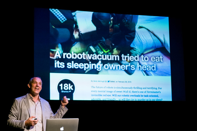
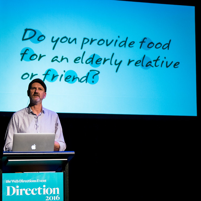
Jonathan Shariat – Tragic Design
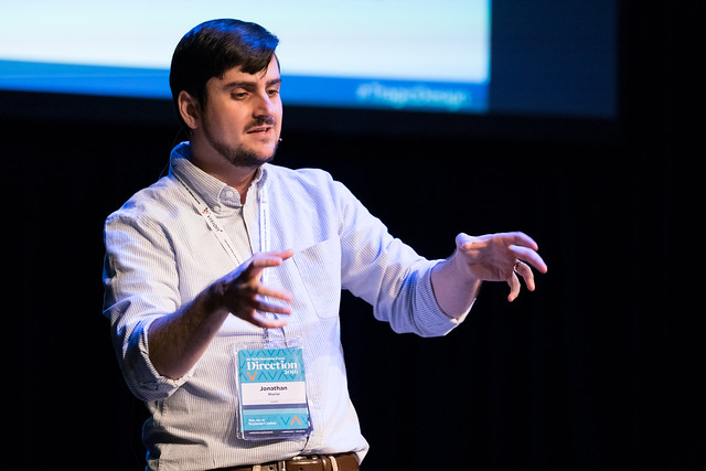
“This talk is a cliff notes of my book..” Tragic Design on O’Reilly
Jenny’s Story – shared with Jonathan by a nurse and it was a story that really bothered him. It bothered him and wouldn’t go away and “that’s when you know you’re about to beceom an activist for something”.
Jenny was in hospital for cancer treatment, which required toxic chemical treatment and careful 24 hour hyrdration post treatment. In the middle of everything, somehow the hydration was missed and she ended up dying. Jonathan wrote about it on Medium and the post got a lot of attention.
This sent Jonathan down the path of thinking how technology can make very serious differences to our lives.
Common negative consequences:
- physical harm
- emotional harm
- exclusion
- injustice
Physical harm
The healthcare industry has many instances of physical harm, where the technology in treatment contexts did not prevent harm; or got in the way of providing care.
Story of the Ford Pinto – they moved the petrol tank below the boot to provide more boot space; and subsequently the car tended to burst into flames even in very low-speed rear-end crashes… and to make it truly terrible in a shunt the doors tended to jam. Ford knew, estimated the cost to fix was more than the cost of paying out lawsuits. How could they possibly hold such a point of view? An economist had an answer that there is a cost to human life, there was a formula that could be used to make the decision.
We instinctively recoil against that kind of thinking. Then on top of that, Ford was wrong – they got sued a lot and it cost a lot. So they worked harder on a cheaper fix which they could roll out. Once the attitude changed the solutions came.
How can we look at our work differently? How can we view the world differently? How will this affect peoples lives?
Simple example: ergonomics. There are areas on a touch screen that are easier to use.

Diagram from A List Apart showing the easy and hard areas to touch with your thumb while holding a phone.
Emotional harm
We try to empathise but we can’t truly feel the way someone else feels.
Plus we often don’t empathise until we have pushed people into harm – kids do the “I’m not touching you!” trick of almost-but-not touching someone and it really gets into your personal space. Jonathan would do this to his sister when they were kids and it was when she’d cry that he’d snap out of it and say he was sorry.
Probably the canonical example: Facebook’s Year In Review showing Eric Meyer a photo of Rebecca, surrounded by celebratory graphics, in the year she’d passed away. This feature had good intentions but hadn’t been thought through and it hurt a lot of people – deaths of family, pets, houses burning down… things you don’t want to remember, particularly.
Game design has proved you can change peoples behaviour. League Of Legends were able to curb online abuse with a small design effort; yet other platforms like Twitter fail to really address online abuse.
Context drives action – the classic example was volunteers playing roles of prisoners and guards, where guards quickly started to physical harm prisoners.
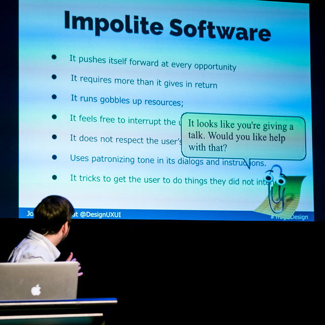
Impolite software: pushes itself forward, takes more than gives, gobbles resources, interrupts the user, patronises the user, ignores user preferences, tricks the user… Clippy had great intentions, just terrible execution. Notifications break these rules all the time, everyone wants your attention and prioritises that over whatever you were doing. You should always give the user more than you take in return!
Reference: darkpatterns.org – you should be familiar with these because you’re going to eventually have someone ask you to do one.
LinkedIn gives itself a bad rap on this – Jonathan had it email everyone he’d ever emailed with Gmail and it felt really bad.
Exclusion
357,000+ people in Australia are blind or have low vision. Worldwide it’s 285 million, including 39 million who are entirely blind. It’s really common yet we consistently fail to design for it. There’s a myth of the 'minority user’. Even if that doesn’t resonate, we have 4 billion people who aren’t even online yet.
There’s a danger to empathy where we don’t truly empathise, we transfer our own feelings onto someone else.
We all have bias. This is hard to accept about ourselves and really eye-opening when you get called on it. By definition you don’t know you have a bias. We all have bias.
It’s incredibly easy to accidentally introduce a bias. Example: wordpress theme that only has photos of women in oddly objectified poses. Even just simple things of posing with a coffee cup in an office rather than being shown working as a skilled professional. It sends a message whether that was intentional or not.
Injustice

Bad design of the butterfly ballot – the infamous dangling chads – ended up deciding the fate of a nation. Bad design led to votes being thrown out, taking away someone’s democratic right because it was hard to punch the right places on the ballot. Florida came down to 500 votes.
...
Design is important. Bad design just shows us how important.
What can you do? Look for jobs in “less exciting” areas like healthcare, think about ethics, stand up for principles, consider the bad scenarios and outcomes as well as the good, donate your time, vote!
@designuxui
Wayne Thompson – Beyond Helvetica, some stuff you probably didn’t know about fonts
Wayne designs fonts for a living. He’s a self-professed font nerd!
A brief history of all communication: Cunieform → Gutenberg → Digital revolution!
Who makes fonts? Anyone can make a font! It is mostly big companies and small foundries, few in-between.
How is it done? In a literal sense, software like FontLab.
What do you need to consider? Not just pretty letter forms, but fonts need to be functional. Legible, robust, well-spaced.
- People named Clint really appreciate fonts that kern properly.
- Character sets are quite large – not just the obvious characters but diacritics, alternate alphabets and so on.
- There may be two sets of numerals: standard (numbers need to line up in columns!) and non-lining numerals (sometimes known as 'lowercase’ numerals).
How much does it cost to make a font? It can be very very expensive. Wayne saw one quote for an internationalised font that came in at nearly $1.5m AUD. So it explains to an extent why fonts are so expensive to buy off the shelf.
Why do a custom font at all? Larger clients will do it to ensure they have no IP violations, or it costs so much to license thousands of seats it becomes viable to get a custom font done.

Why free fonts are bad for you:
- Many don’t have ligatures like ffl, ffi, etc. Most of our current software will handle ligatures and attempt to insert them; and you can end up with missing characters – literally gaps in the rendered text.
- Spacing is often bad – you won’t be able to do nice kerning without a lot of manual work.
- They’re usually not actually free for commercial use! They’ll be ok for personal use but not client work.
So with all that in mind, how do you choose fonts? It’s easy to think of this aesthetically but it needs to be based on functionality. Legibility has a lot to do with the subconscious skills we have developed after years of reading.
How this translates to the screen? Things like – how well do the shapes get displayed in pixels? Was the font designed for the screen?
Avoid Arial! It is an inferior copy of Helvetica which itself wasn’t designed for screens… and you also end up looking exactly ike everyone else.
Legibility aids built into good typefaces – stroked zeros, different spurs on p and q, bridge in k to open it up, opening up the apertures in e and s, plus many more. A lot of thought goes into reading type at small sizes.
So that was a quick tour through some minutiae of fonts!
@wayneatf
Great comment during Q&A – “You can’t be a designer without being a good writer.”
Lucinda Burtt – Design by numbers
Have you ever played “two truths, one lie”? You say three things, two are true and one lie… Lucinda gives some examples, but a truth is she speaks Spanish. She learned a lot about words we use in English by learning Spanish – the way words combine makes sense when you pull them apart to learn another language.
Data is useful, but we can easily get into a situation where our data is telling us two truths and one lie.
Three things to help us think about using data:
- Data can help us understand how a user 'uses’ the product.
- Data is based on what you’ve already got
- Metrics define what you value
Supposing is good, but finding out is better. – Mark Twain.
People say they like to read world news in a newspaper, but actually they read entertainment stories.
Remember the four types of data:
- qualitative
- quant
- attitudinal – what users believe and say
- behavioural – what users actually do
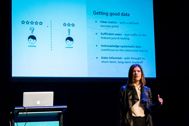
Getting good data:
- clear metric – defined success point
- sufficient users/traffic/data
- acknowledge systematic bias – focus on the micro, not macro
- data-informed – give thought to the short and long term tradeoffs
When to A/B or multivariate test:
- Optimisation – making a specific thing better
- Validation – understanding wider impact of design decisions
- Stress test – sanity check, test assumptions
Use the PIE framework (rate the three out of ten and you get a PIE score):
- potential (how much can you improve something)
- importance (is it valuable to work on this)
- ease (how hard to test).
When the Fairfax team redesigned the SMH people said they wanted the exact same experience on all devices. In reality, engagement was low on mobile. They did an A/B test removing summaries, to make things cleaner and easier to choose what to read. There were upticks on mobile and tablet; with no negative impact on desktop. In the long term there is some feedback that by hiding summaries, some users felt the tone of the publication changed.
Metrics are merely a reflection of the product strategy that you have in place. – Andrew Chen
Pitfalls:
- Micro-optimisation – particularly to the detriment
- Undefined hypothesis – unclear goal of research
- Inapplicable metrics
- Local maximums
Hypothesis statement
We believe that
    (doing this)
    for (these people)
    will achieve (this outcome).
We will know this is true when
    (we get customer feedback).
Be data-informed, not data-driven. Use data to support and test intuition.
@lucindaburtt
Seb Chan – Making things for people to do things with things we’re preserving for them
Seb is the Chief Experience Officer, ACMI
…
museums are democratic spaces
museums are curiosity machines
Museums should not be places you get sent to on excursions to learn a bunch of facts, it should be a place you discover something you didn’t know you wanted to know.
As the world changes, museums have had to catch up. The Smithsonian acquired an app and part of that was releasing the source code on github. How do the physical spaces evolve to reflect this? At most, 0.5% of its collection could be shown in the building at any given time.
Also Michelle Obama noted at the Whitney opening in 2015, that most museums are not inclusive. People do not feel welcome, it is not a place for them.

So at the Cooper Hewitt they made a magic wand! They gave everyone a pen, which was funcational and symbolic. It would communicate that design is for doing, not just for looking at. The pen could then connect the museum to its original purpose to inform, educate, let people copy, remix and create new things.
They did some trial designs and also found lots of unanticipated issues, eg. how to keep the pens clean? New Yorkers are really particular about things being clean! Plus battery life was a really big problem.
A key thing about the pen was the ability to use it without looking at it, rather than staring at a phone instead of the collection you’re supposed to be there to enjoy.
In the first year they collected 4 million new pieces of data, the API for the system is also public, users can choose to download or delete information about their visit, they can download copies of things they created at the museum. It is all anonymous to respect privacy.
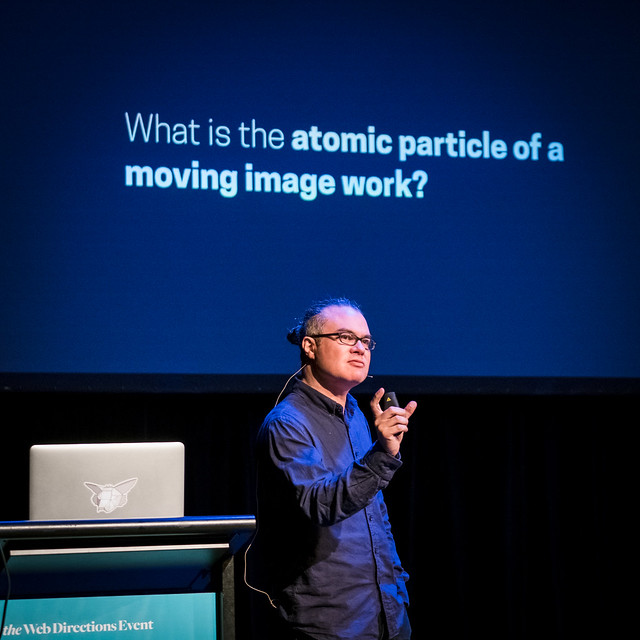
Seb moved to ACMI in 2015; it’s actually one of the most visited museums in Australia. It has films, but also other digital things like games. So what is the purpose of a museum when all its objects might be more comfortably experienced at home from your couch?
ACMI has particular challenges…
- it takes quite a while to view a video compared with the average ~20 seconds people look at a painting.
- People don’t like you to talk in a movie, so how does it work to have cinemas in the museum where people talk to each other?
- How do they work with rights holders – if you want a visitor to be able to download what they saw earlier in the day?
- What is the atomic particle of a video work? A frame? Can you do something with that? They created an app that searched subtitles (from torrents!) and showed the relevant frame, creating a keyword-searchable image database of movies.
- What interface best reveals the connections between media – eg. a film that refernces a video game.
What do we want in and from a museum? Seb is keen to continue a dialogue.
@sebchan
Caroline Sinders – Designing civility
The important question of the day, then #direction16 pic.twitter.com/Kh9maXEQmh
— Xavier Ho 🌞 (@Xavier_Ho) November 10, 2016
The definition of Gamergate depends on who you ask: to those in the group, it’s political activism; to those who are not – particularly its victims – it’s a hate group. Caroline spent two years doing a deep ethnography on Gamergate and how Gamergaters communicate.
Fandoms, activism and online harassment create emotional spaces inside of infrastructure. In some senses, the nature of fandom is the same regardless of what it’s applied to. If a Bieber fan talks in a similar pattern to a Gamergater, how can harrassment be identified in a large system?
Twitter has UI issues trying to handle hate actions. A retweet can be used to incite a 'dog pile’ attack where large numbers of people send a high volume of hate messages. The volume is too much to handle, all you can do is walk away. Twitter’s TOS don’t really cover this; and the interaction model for hate is the same as the interaction model for legitimate messages. Retweeting allows attackers to circumvent blocking: block the original poster, but you still get messages from their followers.
This isn’t a freedom of speech issue. This is a design problem.
There are significant technical issues blocking things via keyword across the planet (the Scunthorpe problem).
The flow of dealing with a photo on Facebook demonstrates why 'feeling uncomfortable’ is a shorthand. People sometimes claim that 'discomfort’ should not lead to 'censorship’ and other arguments. Discomfort can mean deep issues around being and feeling safe in the real world.
The action is to request “remove photo”. Why? Because I feel uncomfortable.
- I don’t like the photo
- I’m afraid I’ll lose my job
- I’m afraid I’ll upset my family
- I’m afraid I’ll upset my peers
- I feel unsafe.
Think of every post as an individual ecosystem. There are four broad types of post:
- Town hall – open, public, uncontrolled. This speech is a town hall.
- Front porch – it’s not entirely public, but it’s a little private.
- Living room – it’s private, but not the most private.
- Bedroom – the most private.
What if Twitter allowed users to choose distribution and privacy levels per post? This is not out of the question, many other systems do or have done this already (a contemporary example is Periscope, although many social networks have done this in the past).
Mockup: Twitter screen allowing filtering according to criteria such as age of the account, as that would stop the instantly-created troll accounts so popular with some groups.
So much to think about in this talk by @carolinesinders #Direction16 🌶🌶🌶 pic.twitter.com/OKkLBK22Zz
— Patima 〰 in Sydney ✨ (@the_patima) November 10, 2016
...
“I read the comments.”
How do newsrooms handle comments; and harrassment in the comments? Caroline worked with the Washington Post on their comments section.
Some things were simple – like keyword filters that could be tuned according to the author and what they faced. Comments could be set to require logins and other barriers to anonymous posts.
...
The internet is still wonderful. How do we keep the things we love while giving people a choice to remove things they shouldn’t have to deal with? Allow the cat gifs but block the trolls?
We need to think of design as not just a skill but a fluency to solve hard, complex problems. Design is political.
@carolinesinders
Aubrey Blanche – Scaling walls
Aubrey’s job is to attract, recruit and retain people in minority groups. This is necessary because the tech industry in general is really bad at this.
A good place to start is “why”: why don’t we see more women in technology? There are many hypotheses which are false, like 'women don’t like tech’; but there are points through the talent funnel that discourage women from entering or staying in tech.
Tech likes to think it’s a meritocracy, but it’s really not. When companies added ideas of meritocracy to their policies, research showed people exhibited more negative behaviours.

To understand how the current state, you need to go back to the mid-1980s, when computers were marketed specifically to boys. That gave boys a multi-year head start to learn IT fundamentals; and socialised girls to simply think of computers as 'not for them’.
We have strong and blunt stereotypes of people in tech – predominantly white, male, exhibiting particular behaviours. The reality is obviously something else entirely, but the stereotype still drives and shapes the tech industry. It ignores amazing women like Grace Hopper and Hedy Lamarr, who are somehow forgotten in tech history.
Unconscious bias consistently shows in research, for example screening applicants without gender-identified names removes a heavy bias to male applicants. We have very strong “like me” bias – we like people like ourselves.
You need to build an inclusive culture. Culture is a major reason people leave tech, particularly women, because who really wants to work in a frat house?
A lot of the changes required to build a positive culture are not expensive.
There are easy business-case incentives: diverse teams work better. Diverse companies are more successful – they simply make more money, they have higher retention, higher rates of employee happiness.
Atlassian had to start from scratch more than ten years in. They started with graduate recruits in Sydney, because it was a clear and controlled process. The first year they had zero female applicants. So they had to go back to the absolute basics – they went to women in tech meetups, held events for women and simply talked them. They found the confidence gap was stopping people applying at all – when men have 30% of the requirements on a job description they will apply; women will apply when they have 80% or more.
They overhauled their career site’s imagery and content, to ensure people from minorities were depicted as part of the team. They changed the focus of perks to put more emphasis on flexible working hours (and less on snacks).
They completely changed their job descriptions. They have tools to ensure biased language is weeded out, hyperbole like “rockstar” is removed, “computer science degree” is replaced with “ability to write software”. The JDs focus on what the role needs to do, not the way one person might have acquired those skills.
Then they had to dig further into the process. The first thing people do is a code test, so to eliminate bias they just automated that step – a computer gives a score, no humans means no bias and lots of time saved.
Serious wow town from Aubrey's talk. Value fit, not culture fit.. Gold! @adblanche #Direction16 🌶🌶🌶 pic.twitter.com/ON4k1Lq31A
— Patima 〰 in Sydney ✨ (@the_patima) November 10, 2016
Interviews were changed to use structural behavioural interviewing techniques. There is a structured set of questions and each candidate gets the same questions. The questions cover a range of skill types; and 'culture fit’ was removed entirely as it was far too hard to avoid bias (if you played the same sport as your interviewer, they are four times more likely to say you’re a good culture fit).
Instead they have 'values fit’ (company values).
If people are really stuck on 'culture fit’, ask them what they mean when they say 'culture fit’. It’s also worth noting removing culture fit will make the legal team happy.
Atlassian had 11.5% women in tech roles when Aubrey joined. Which is terrible in general but common in tech. The latest Sydney graduate cohort was 47% women, so the pipeline has improved where the changes have been applied.
It’s not just women who are affected by these sorts of changes – you also start to attract a different type of male applicant as well. People like working in diverse teams!
Addressing the elephant in the room – Trump – Aubrey finishes with a call to embrace the power conferred on the (white-male heavy) group. White males have great power to effect change, it is something to be aware of; it is something that can have positive impacts when collaborating with minority groups to push for social change.
@adblanche
Matt Griffin – What comes next is?
Matt needs to confess something… he… is an American. America hasn’t had a great time lately.
slide of a dumpster fire
But enough of the soul-crushing stuff. Australia has been great!
Matt grew up geeky in the 80s… so he played D&D, had a NES and loved NASA. He went back and rewatched Cosmos… and discovered a version that had been updated to 90s tech. The web was mentioned as a 'planetary consciousness’.
For the last three years Matt has worked on the documentary What comes next is the future. Today he’ll share lots of clips that didn’t fit the narrative of the documentary but do explore interesting ideas.
We are web designers, not graphic designers. However there is a legacy of print design on the web. There was lots to learn from print, which had gone before the web and so was a natural source of inspiration. The web has moving parts that preclude some rules that worked in print – download speed, device variation and so on. On the web there is no 'final’.
Responsive design completely dismantled the design process that had worked for print for years. This is challenging! People had to go back to square one and find new ways to work with clients to produce what their users needed.
Print was about control. The web requires you to give up control. John’s Dao of Web Design was quite precient, it was an early expression of what we currently call Responsive Design. In print the designer called the shots, but the web is more of a two-way negotiation – the user dictates the device, browser and connection used to access a site; and the design has to respond to that and decide how to accommodate this.
Design is not just what it looks like and feels like, design is how it works. – Steve Jobs
What we have come to now is iterative design, using generative reserach to inform initial designs. We quickly move to prototypes, then evaluative research. Then we take that information and refine the design. Then we iterate with evaluative research as far as time and budget allows. Sometimes we need to throw out a whole design, other times we have to keep a design even though we know there are problems.
Design must now be a team sport. We need designers and developers to work together, there is no more “throw it over the wall”. Teams need a different set of skills and need to incorporate more points of view. There must be some empathy in the process.
To design is to communicate clearly by whatever means you can control or master. – Milton Glaser
Are the days of the generalist over? Perhaps. The amount of knowledge required in the full process and development stack that it’s almost required that people specialise just to get things done. That in turn means collaborative processes need to be really strong, to have those specialists work together effectively.
So now you have cross-discipline teams working together and over time everyone learns a little bit about the other disciplines… then they are becoming generalists.
The inevitable question: should designers code? Web designers need to know code in the same way print designers need to know about printing presses. Many people interviewed said designers needed to at least be able to code a little, but not to production level. At the bare minimum designers need to understand the principles; and pushing on to basic dev skills greatly improves design process and outcomes.
What about UX?
The design of good houses requires an understanding of both the construction materials and the behavior of real humans. – Peter Morville
What does UX even mean? It’s a holistic design approach, taking the full experience into account and not just the visual aspects. How will the user move through a process? What creates the best flow? Does the IA make sense – can people find things in the way they expect?
So what have we learned about design? It’s a bigger, messier world than we probably thought. We need to be flexible in perspective and solutions. We need to embrace teams and collaboration with other specialists. We need to both specialise and overlap (think of team skillsets as a venn diagram).
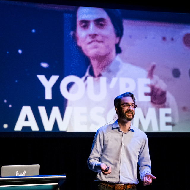
The web never sits still and neither do you. That’s why you love it. That’s why you chose to work on a universal consciousness. You can handle it, because you’re awesome!
@elefontpress
Jenn Bane – Let’s get weird
Warning right up front: this will be weird!
Cards Against Humanity was created by some friends who wanted to liven up a party. They made a set for $20 at a local copy/print shop and gave away a PDF of the cards. Eventually demand grew and they put up a kickstarter to make 'real’ cards.
“Meet cute” – old fashioned term for the adorable way people meet and fall in love. Jenn’s Meet Cute for CAH was that she couldn’t get a journalism job after graduating, so she took a boring job… and threw her creative energy into side projects like her blog. She blogged daily for a year. Almost nobody read it. But then to her surprise one of the few was a creator of CAH and emailed suggesting she quit her job and join CAH as 'community manager’.
Jenn was confused why she was chosen or worthy.
Comparison is the thief of joy.
Jenn was ultimately hired to create the 'character’ of CAH. They used the Brand Deck to work out some key words to describe the tone of CAH as a brand.
They write short, sarcastic emails to customers to make them laugh.
They do silly stunts like taking down their whole store and just sold boxes of actual bullshit on black friday, to mock black friday (then donated the proceeds to charity).
They do cool things like start a scholarship for women in science (SAS – Science Ambassador Scholarship) – $960k raised so far! They are looking for ambassadors for their field and paying their college fees. Applicants send in a 3min video to apply, which has the nice side effect of putting lots of youtube videos up of women talking about science.
http://scienceambassadorscholarship.org
CAH doesn’t really have a 'marketing strategy’; they just do big stunts to get attention.
Their office is a coworking space – there are about 25 CAH staff and the rest of the space is shared by essentially random people. They are dog-friendly, they do talks, podcasts, pushup club and silly things like the 'how long does it take to eat a whole head of lettuce’ challenge.
So. It’s time to speak about the election.
60 million people just supported someone who has a platform of hate and division. Jenn is scared for the safety of her LGBTQ friends, scared for the health of her family, she’s sad and scared and going to allow herself to feel that before getting back to work.
We cannot normalise what is happening in the US right now.
Ask youself what you are doing to help. Check the media you are consuming. Is your twitter feed all white people? If you are privileged, shut up and listen. Figure out what tools you have and go use them.
Start small. Thing local, think community.
Our job has never been more clear. We need to get back to work. Jenn’s job is clear. We need comedy more than ever. We’re gonna cause some fuckin’ trouble.
@JennDangerous
Anna Pickard – Many hands, one voice
Anna does words. Officially, she’s the Creative Director of Voice and Tone… and her job is to make Slack feel Slack-y.
Slack has grown a lot while Anna has been doing this – when she started there was no marketing team. There are lots of reasons she feels have made Slack successful – and feel friendly.
When you join Slack, Slackbot welcomes you. It tells it’s a bot and then asks your name and suggests you upload an avatar. While it’s a very simple script, it helps people get into the right mode: “this is a space in which you have conversations”. So from the beginning there is a humanity, a “human-ness” to Slack.
All their copy is driven by being human. They use various things like welcome messages, release notes, twitter posts and in-app error messages to reinforce the fact there are real humans making the product.
Caveat: these are not universal truths. Anna has been making it up as she goes along. All she can tell you is what happened at Slack and what did or didn’t work for them.
She worked on a game called Glitch where she had to do odd things like write dialogue for pigs. The game unfortunately died, so she ended up working on Slack.
Until Anna joined, the CEO had been doing all the writing – product, blogs, everything 'wordsy’. To hand this over to Anna, he peppered her with things and saying “we don’t sound like this!” (example of a huge slab of text full of buzzwords). That’s a good way to start, but it doesn’t give you what you do sound like. It’s also quite negative and doesn’t scale, because people can’t follow the rules – it’s like saying “I’ve hidden three fist-sized diamonds on the planet. They’re not in your laundry cabinet…”
So you take the 'nots’ and flip them around
Site: voiceandtone.com
Anna did a 'this but not that’ list:
- Confident (never cocky)
- Witty (but not silly)
- Informal (but appropriate)
- Intelligent (always treat others as intelligent, too)
- Friendly (but not ingratiating)
- Helpful (never overbearing)
- Clear, concise and human.
It was thorough – they have a full guide just for writing Twitter posts. They do break their own rules occasionally too – “we do not LOL....except sometimes because it’s funny”.
But people had trouble following it and sometimes people sounded robotic rather than human. Anna had put down these guidelines, why did people sound like a pale imitation of what they were supposed to sound like?
You have to have a reason to follow rules. You can try to condense things down to a tiny set of rules (this is how we do release notes…) but it probably won’t get a consistent result. People need to know what their motivation is, what the purpose and goal is for the thing they are writing.
A great example was this error:

People tend to screenshot and share this error message. Somehow they’ve been stopped doing their work, and come out of the moment delighted. There’s empathy – the user’s annoyance is noted and the developers’ frustration is also shared. There are real people behind this who aren’t happy with what’s happening either.
How to encourage empathy – ask these questions:
- Who am I talking to?
- What emotional state are they in? – describe the state in emoji if it helps. Exactly which angry are they?
- What is the context (frequency, placement)? – if people will see a message 18 times a day, strip all jokey tone out of it; if they will see it just once, go for it
- What do I want them to take away from this?
Be courteous – say things as politely and concisely as you can, then get out of the way.
Example: “Welcome to the new and improved Posts!” with “Tell me more” and “I’ll figure it out” buttons.
Slack also coaches users to be courteous – if you’re about to use @channel, “you are about to notify 38 people in 10 time zones. Are you sure?”. From the product design point of view, is this point of friction necessary? Do we need to take the user out of their flow to tell them something?
Craftsmanship. Set aside ego! Be prepared to work with others, explain reasoning behind decisions
- Is this as good as I can make it?
- Whose work am I representing?
- Can someone help make this better?
- Does this deserve the word “deluxe”?
Why “deluxe”? The emoji picker is not an emoji picker, it’s “Emoji Deluxe™”. There was a funny conversation about choosing the word “deluxe” where someone explained the feeling in emoji.
Playfulness – it’s not just about throwing emoji everywhere. It’s about playing the game as best we can, then playing it better. Have a spirit of play, look at things with Child Mind. (Example of the user suggesting you change your name to 'Viper’... so they all did and it was indeed confusing)
Release notes – they list things out in detail, to acknowledge in a way that they impacted users. It also subtly teaches people what they can do in the product. They write the notes with enough charm that people want to read them, perhaps even share them. Not too much charm, not over the top – just Minimum Viable Charm! They do it in solidarity with the people they work with.
They say nice things. They say things that make you feel a little better. Like a tweet “It’s all good. You’ve got this. :balloon:”
The culture turned inward makes the product. The culture turned outward makes the brand.
Having created fairy dust that could be sprinkled over any new copy, Anna discovered people were going nuts and doing too much. They needed to tone it back down. One ladybird in your house is cute, but a million of them is terrifying.
🐞
— Xavier Ho 🌞 (@Xavier_Ho) November 10, 2016
🐞 🐞 🐞 🐞 🐞 🐞
🐞🐞 🐞🐞 🐞 🐞
🐞🐞🐞 🐞 🐞 🐞 🐞
🐞🐞 🐞 🐞 🐞 🐞 🐞 😱
🐞🐞🐞🐞 🐞 🐞
🐞 🐞 🐞 🐞 🐞
🐞🐞 🐞 🐞#Direction16
“If you work for this company, you are part of the voice of the company.” But you don’t have to throw everything at every single interaction.
(slide: diagram of modulating voice and tone to the correct level. the glowing middle box is the product. the most oomphed-up section is social media, parties and events.) They’ve had people wanting to inject lots of personality into an analyst deck that needed to be really serious.
They do “magic hour” twice a week where people can come in for a few minutes for advice on the copy they are writing. People say “thanks for your magic” but mostly they’re just fresh eyes.
Some aspects of voice and tone are subtle. When you autocomplete emoji, :th should go to thumbs down first; but they actually set thumbs up as the default because they presume people want to be positive more than they want to be negative.
This talk is pushing the limits of my #sketchnoting with all the emojis and magic sparkles ✨ @annapickard on @SlackHQ voice #Direction16 pic.twitter.com/Ba32LxVAjD
— Teresa Watts (@Chisa) November 10, 2016
Last thoughts…
- Words are powerful. You should weigh each one. You can change peoples’ experience but you can also cause harm.
- Words are hard. They’re not impossible, we all use words.
- Meet people where they are.
- Do the work. Be courteous, don’t present anything where the user needs to guess what you meant.
- Make sense. Clarity over correct grammar.
- Make room for joy.
- Have character, but never let that overwhelm the content.
- Surpass expectations. A little surprise and delight.
- Know when to stop.
@annapickard
Q&A
Mentioned: Slack took out a full page ad in the NYT (“Sometimes we are provocative and sometimes we are serious. We also wanted to tell our big customers that we were serious and here to stay.”)
There’s a sense that anything that is not engineering is marketing. Every time you talk to a customer, by any means, it’s basically marketing.
Help the user with their story, don’t pull them into yours. Do things for them, not yourselves.
Mark Pesce – WebVR: building and browsing cyberspace
https://daydreamwebvr.com/d16/
VRML generated a lot interest, but in 1994 people were so busy trying to digest the web they didn’t have a lot of mindshare left for Virtual Reality. Subsequently VR disappeared. It was gone, dead and buried.
Then an amazing-yet-predictable thing happened. It came back.
Google Cardboard flipped peoples thinking in 2015 – suddenly people realised there were millions of VR-capable devices already in peoples’ hands. Samsung GearVR didn’t move the needle much, it was just a tricked-up Cardboard.
Then Microsoft surprised people by shipping the Hololens which is awesome, Oculus Rift and HTC Vive followed in 2016. Sony PlaystationVR just shipped, which again increased the number of VR devices by an order of magnitude in a day. Then yesterday Google released Daydream VR, which brings all the high-end Android phones being VR capable devices.
WebVR is going into browsers, bringing the browser into the ecosystem. It’s W3C supported; it’s in Chromium and Firefox Nightly… it will hit Android via a special build of Chrome. The point is that it will become easy for us to build 3D affordances in the browser.
WebVR tech stack:
- App
- Frameworks: eg A-frame
- Three.js
- WebVR + polyfill
Three slide crash course in VR:
- VR is built in scenes, each scene has three element – objects you see, lights that illuminate them, there’s a camera looking at the objects. These things are always present even if you haven’t specified, there will be defaults.
- Every one of these things has a position in space expressed as (x,y,z); plus orientation (pitch, yaw, roll)
- Objects are made of two things – geometry and materials. Geometry is the skeleton, the shape; material is the skin. Combined, these two things create visible objects that you can light and see.
A-Frame is a Mozilla project bundling everything you need…
Code demo and walkthrough showing how easy it is to create simple things in WebVR… it’s incredibly familiar to anyone who has worked with SVG and you can manipulate the resulting elements like any other DOM element.
A-Painter is a FOSS in-browser version of Tiltbrush!
There are gotchas!
- CORS
- HTTPS is recommended, even though the spec doesn’t say it
- Update browsers & frameworks – things are moving really quickly
More at webvr.info – that is the first landing page for all things WebVR.
...
We are now 25ish years in to the web and we are starting to understand what we’ve done. It’s a great machine for sharing knowledge, whether it’s true or not.
VR is for the sharing of experience.
In 1998 there was an experiment building a Virtual New York Stock Exchange, which was impractical in many ways but was found to greatly increase and improve the ability for someone to process information.
Sensual computing, a vision of modern day systems @mpesce #direction16 pic.twitter.com/2STHUqZEAN
— Xavier Ho 🌞 (@Xavier_Ho) November 11, 2016
Sensual computing: helping our ability to make decisions; then, what data can help you make those decisions; then, what visualisations will help; then, what interactions do we have to work with to help us make decisions.
The first pass at VR is likely to just be web pages shoved into VR. Think of web pages in 1994 – the first content in a new medium is the medium it makes obsolete.
We need new affordances for mixed reality. How do we connect, share and learn from one another in mixed reality environments? You will lead the way. The sensual computing revolution is yours.
...
Mark thought VR had died… but it turns out it was just asleep.
The first vision Mark had of VR had become true. The design of the game had colonised the real world, whether it wanted it or not. We had people playing Pokemon Go everywhere, even when it was totally inappropriate. There is no current way to map the virtual world to the real in ways that understand you shouldn’t chase Pikachu at Auschwitz.
Mark has submitted Mixed Reality System to the W3C. It maps locations to metadata. It can tell you whether a location has drone flyover rights, are there hazards, are there VR game permissions, is there a directory available for the building you’re in.
We need tools to let the world speak for itself. We need to think in these terms. We need to activate the real world the same way we activated the virtual world.
@mpesce
Q&A
Q: it’s been hyped before, what’s different this time?
A: it’s simply happening. We have millions of devices coming online.
"Data visualisation is another beast. It's under utilised because it's too easy to slap text over a chart." We can do better. #direction16 pic.twitter.com/al9IdejZ9Z
— Xavier Ho 🌞 (@Xavier_Ho) November 11, 2016
Jennifer Wilson – Change your game
Persuasive techo: combining digital (game motivations) and behavioural changes.
BJ Fogg’s 3 step method:
- get specific
- make it easy
- trigger the behaviour
Knowing what’s good for us rarely changes our behaviour. We still eat and drink too much, smokers can’t instantly quit. But games 'trick’ our brains. Games make failure fun… it’s the playing and conquering that makes games fun. If games had a button marked 'win’ they’d be boring. Games fulfil social and emotional needs. Games help us focus through a balance of frustration and fun.
Games help with things like depression, anxiety, improving fitness and generally changing behaviour.
Project: SPARX, from Uni of Auckland. It walks people through challenges that were proved as effective (for some people) as face-to-face therapy for people with depression.
Project: This Way Up for St Vincent’s had a 75% rate of improvement (to some level) with zero negative effect. This is an extraordinary result.
Project: My Quitbuddy. There are lots of things built into games that tap into really simple human reactions. We see a picture or diagram of a body, we immediately visualise ourselves in it. We respond to personal best data as we compete with ourselves. Numbers that flick and change are really compelling. We can distract ourselves – at peak danger times, Quitbuddy gives people facts and little mini games to distract themselves from their craving.
Project: Check Up GP – turned a survey into a quiz game. Particularly for kids, it was a way to get more and more-honest information from the patient to their doctor.
Gamification is really popular and like most established things there are good, bad and everyday examples. Zombies, Run! is a good example; it makes your run more fun and engages people with exercise. A bad example was the Ford hybrid car which animated a growing green plant when you drove efficiently, but it distracted people so badly they were missing stop signs watching it. Really everyday examples are bars having Happy Hour – it’s appointment dynamics. Reward points systems like frequent flyer programs – it has levels and achievements.

Keep the Fogg model in mind and tread carefully. Ensure you are encouraging the behaviours you set out to encourage.
@jenwilsonsydney
Aaron Spence – VR as used in our reality
#Direction16 #VRtalks @aaronspence 👍 pic.twitter.com/ehY84cMjkP
— Mandi (@Dizenya) November 11, 2016
A little terminology (not canonical but for the purposes of the talk) –
- Live Action VR – content filmed with cameras; usually not interactive and linear.
- VR – computer graphics, simulations, etc; higher interaction levels, explorable worlds, etc.
- AR/Augmented Reality – overlaying data onto your real world view (eg. pokemon go)
- Mixed Reality – overlaying 'holograms’ on your real world view… arguably just AR
Equirectangular Image = Master VR Format. They look pretty weird (great example of the Brooklyn Bridge) but it’s how the 360 image is captured. When converted for viewing the distortions and curves are straightened out to what we expect.
(lots of live demos with all the associated perils ;))
VR Distribution strategy – not all devices give the same experience. The more expensive options create a better experience, but if you can’t provide that you can do a Cardboard and people still get an experience. Also worth noting that Apple devices only work with Cardboard at this point. So as a strategy – if you can bring people to you can give them the very best, then cool; then provide options to be inclusive. You can back up full VR with 360 videos, which tend to get more views since they work in places like Facebook posts.
Beware of product announcements in this space – people announce far more than they actually produce. Pay attention to options that are already available and working.
Live demo of Cruiseabout, a commercial project… People are using virtual tours of the various rooms on cruise ships, so they can make a purchase decision without having to visit the actual ship (which is at sea).
Compassion project – using VR to put people into other peoples shoes to create empathy and compassion.
Live demo – QANTAS use VR to train people who are going to work on the tarmac at airports. A luggage loading scenario is run to train supervisors to see things being done incorrectly, then they do an assessment at the end. This allows immersive training with situations where errors are made, to train supervisors to spot the errors. Which is better than people having to make real errors in a live, dangerous environment.
@aaronspence
Ben Hawkins – Letting the kids run the show
“So what is someone who designs phsyical spaces here at a digital conference? I’m asking myself right now!”
Why provide physical spaces when you can buy things online? People still buy stuff. Why aren’t we evolving the experience in physical spaces?
Pirch is a store in NYC that lets you buy kitchen and bathroom things after using them. You can have a shower and cook things, before buying shower heads and stoves!
This is a case study… how can you change the way people operate in big corporations…?
Optus need to build an in-store space for kids. ok…
In large businesses there are ideation sessions, projects start getting some momentum as an idea, people start getting excited because something sounds interesting, you hit stakeholder input, then journey mapping starts to ensure we use up post-it notes, then the design agency gets involved and they have their own workshop…........... so a vast amount of people are already doing a bunch of work and nobody really knows what the goal is yet. People don’t have a shared understanding of scope.
Problem of doing any projects with kids: we don’t know how kids think! We haven’t been eight years old for a really long time! Nothing was digital back then, except MAYBE a watch.
So we are completely unqualified to build a kids area in a store. Nobody on the project was really qualified to do it. Everyone was just running on their creative cognitive bias. They had their own idea of the truth of the project and latched onto that.
Humanity is the new luxury. Ben Hawkins #Direction16 pic.twitter.com/peipznY8XA
— Teegan Lincoln (@teeganlincoln) November 11, 2016
So Ben brought in a new team – kids!
They asked kids what they thought about shopping. What was their least-favourite thing? Going shopping at all… Waiting for mum to finish shopping… Parents wanted the kids to be safe while they were buying things. People just didn’t really like going shopping.
Kids have totally different behaviours and dynamics. They wanted a group table, because kids will start on a separate table but almost immediately join any other kid in the vicinity – in ways adults just don’t do. Kids suggested the tablets and devices they were playing with should have been mounted under the tables, so they could hide down there while they used them.
So what’s next? People who are under 25… almost nobody in the room was in the age group. So they got people in for workshops. Three different groups said that if they could have anything at all in a store… they wanted puppies. A fourth group said a petting zoo.
Ben loves research, he loves designing physical spaces. And now… lunch!!!
Andy Clarke – Art directing web design
The web needs to be things like fast and reliable and accessible, but that is not enough. It can and should be a vibrant medium for creative expression. Andy is not saying things used to be perfect back in some brighter past either… he remembers the guestbooks, hit counters and little men constructing things in gifs.
Somehow we’ve forgotten that the web is a medium for communication outside of applications. We’re letting things like atomic design distract from the need for great art direction.
So what do you think of when you hear the term 'art director’? Perhaps as a dev you think of creating responsive images. Perhaps you think of bloggers who used to create bespoke images and design for every post. But if it’s not quite those things, what is it?
Art direction is the art of distilling an essential, precise meaning or purpose from a piece of content.
Art direction isn’t strong on the web, but we can look to magazines for inspiration – there is so much amazing material. People have struggled to bring the same level of art direction from print to their web process. Propublica did a good job.
Examples: reporting an admittedly very confronting story, telling a tale from two points of view backed up by different designs and writing. Using intense illustrations for an article about violence. Using white space around a roadside drug testing kit to emphasis the disproportionate impact these small objects can have.
So how does this apply to all of us? We are all telling stories. We may simply be telling the story of our company – the who, the history, why does it exist. Go beyond that and think about what the company and its products means to people in their lives?
Art direction is essential for communicating across devices and channels.
Typography is key to a website’s visual identity, because it conveys personality and sets the tone.
How can you use type to emphasise the meaning of content?
Example: block quotes. You can mark them with different symbols, pull them out of the grid, lead the reader out to the pull quote and back again. We can allow the quote to subtly interrupt the reading experience by indenting them into the body. You can vary type size to emphasise key words. Great pull quotes rely on collaboration between design and copywriting to produce really strong results.
Headings can be set large, small, layered and even in the middle of the page – turning the first paragraphs into a prologue.
A heading and standfirst can be set with a large area of whitespace before the body copy begins, to give the reader a moment to digest the standfirst. Standfirsts can precede headings.
Readers will reward you for your time spent designing type with their attention.
The web supports drop caps and initial caps. Using drop caps in multiple locations can help break up blocks of text, to make it easier to read.
.@Malarkey showing examples of CSS supported art direction #Direction16 pic.twitter.com/TLnkjLNyCm
— Jean-Jacques Halans (@halans) November 11, 2016
To make inspired design decisions we need to feel inspired.
We should look to great designers in any field, not just within the web. We need broad inspiration to avoid making endless pastiche of the same things.
Currently a vast number of people start their design on top of Bootstrap’s 12 column grid. If we have an infinite number of possible combinations and variations, why does every site look precisely the same?
If we’ve got an infinite No. of layout combinations, then why is this what we always get? its a lack of imagination! #Direction16 #design pic.twitter.com/4r2yfqMNtc
— Gaith Bader (@Gaithb) November 11, 2016
Frameworks are an easy target for criticism, but it’s not their fault – it’s a lack of knowledge of how to use grid systems properly. They are a decades-old principle, yet many people are just choosing grid layouts via guesswork… and it doesn’t need to be guesswork.
We can use ratios – and not just the well-known golden ratio. Look at the tool called “Gridset” to see what’s possible. We can use fibbonaci numbers to work out how to lay things out.
In reality Bootstrap’s 12 columns are rarely used for more than overall spacing. So why not turn things into a 6 column grid? What if you need an oversized column, perhaps you split the first column and add that space to the last. Andy did this for the WWF’s recent website redesign.
There’s no good reason why so many websites are indistinguishable from each other.
You can handle ads too – Smashing Magazine needed a compound grid: a 6 column grid to lay out the editorial content combined with a 4 column grid to accommodate the ads they needed to run.
The second dimension of grids is obviously the horizontal. This sets up the compound grid, which in turn makes it easy to determine how elements like images and captions should be sized and placed.
We’ve become too dependent on process and testing, too risk averse to make decisions without stopping to get data to support it.
A cohesive experience needs more than a guide to a library of patterns, it needs a singular creative vision.
Pattern libraries and style guides are not incompatible with art direction. Without art direction the atoms and molecules will have little more than superficial beauty.
Art direction is the gravity that can pull atoms together.
...
Slides at speakerdeck.com/malarkey
@malarkey
Jacob Bijani & Pasquale D’Silva – OK, Dracula, let’s make a video game
Why make a game? First of all they are fun to make and fun to play… do you want to have fun?
OK, Dracula is a game that works on Apple TV (there are very few games in the Apple TV store); which has a lot of challenges around the conroller – it’s small an imprecise. They wanted a game that drunk people could play… or children… or the venn diagram of both?!
The game is largely kicking a skull through terrain. They started with a mix of 2d and 3d graphics, but committed to all-2d. The art and ideas started to gel.
So how do games work from a technical perspective? Broadly they take user input, process the results and render the result. It has to happen 60 times per second to have a smooth game to play – performance is a really big deal. The background of the game is a set of parallax layers, then you add foreground and ui layers. This all has an impact on FPS.
Teaching behaviour is important in games – what happens if you run into a bear in the game? How will the game react? How do you teach a bear to walk along the ground?
Break it down to:
- bear – an animated character that can be animated by the game (virtual animation rig)
- ground – a set of points in space
- walking – the movement of walking is an animation loop; which then has to follow the ground path
You quickly hit problems where the root motion didn’t match distance – the bear’s feet were sliding, the bear didn’t move far enough.
Awesome to get some insights into the design of the game 'OK, Dracula' by @jcb and @pasql (and the costume!!) #Direction16 pic.twitter.com/ybGqms9Cgs
— Teresa Watts (@Chisa) November 11, 2016
Next: teaching a duck how to toss a dagger. Classic design problem!
They had a duck character that tossed daggers that stayed in the game; if you landed on them they’d kill you. So the character was scary enough, they didn’t add in any targeting.
MVG... they wanted to get the game working as quickly as possible. Start with version 1, even though you’ve thought ahead to version 4… 5… 10… But that pushes the finish line and removes iteration.
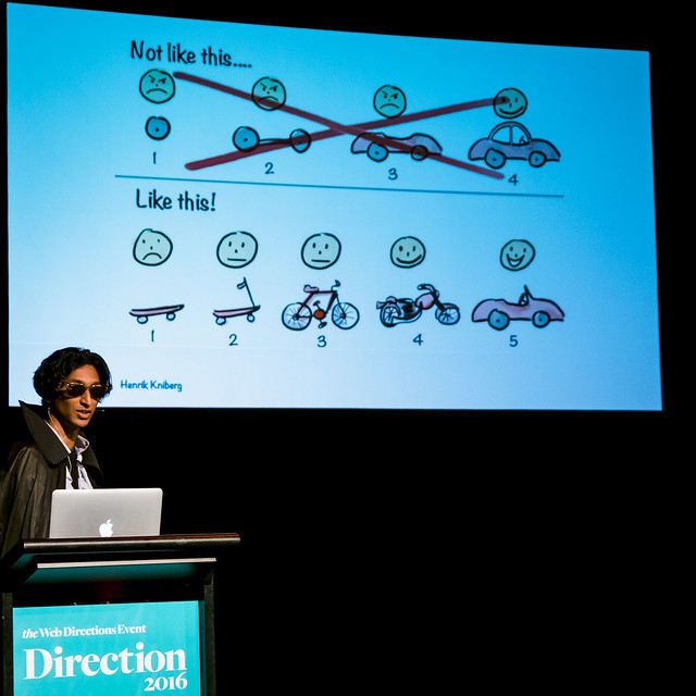
slide: the classic MVP graphic. skateboard->scooter->etc
Remember games are still just software. Use the same tools you always use for things like source control, comms and tracking. Unity is a bridge that lets artists and engineers work together. It has a lot of plugins and features that let you adjust things without manipulating the code directly.
Debugging animation – animation bugs aren’t always obvious. There were bugs Jacob just couldn’t see (Paquale would report them), but he could graph the data to see the shapes in the data.
We wanted total entropy, total random environment generated so that we can augment them abs create endless play. #direction16 pic.twitter.com/nenyJBOekR
— Xavier Ho 🌞 (@Xavier_Ho) November 11, 2016
Limitations require creative solutions. The start position needed to be flat, so they added a mansion as the starting point of every level. While Pasquale could create awesome, organic looking levels it wasn’t inifinitely extensible; whereas using a level generator made gameplay infinite. To help performance they modelled one tree and just rotate it randomly to create different-looking trees. Dracula can’t walk around so he puffs in and out of existence, which looks kinda neat.
(Very funny video of goofs and artefacts)
What’s next? They plan to ship for lots of screens next year. They had so much fun they formed a new company, thinko.co
@jcb
@pasql
Maciej Ceglowski – Who will command the robot armies?
We have robot armies. We have all kinds of drones, mini drones, unmanned tanks, horrifying mechanical mules for infantry…
There’s going to be a point where we simply don’t send actual humans into combat. Currently we still have people there as a notional point of control and decision, but that is unlikely to last much longer.
America has been in a permanent state of declared emergency since 9/11 and military research has gone along with that. The cycle of conflict around the world simply does not stop.
The old military gear gets handed off to the police force, which is available to them in all scenarios – including civil unrest. This is why riots are met with police in tanks and body armour.
Police departments also love drones, because who doesn’t like playing with toys?
As always, @baconmeteor has the audience in stitches 😂 Best way to close out #Direction16. pic.twitter.com/jjiZmuIuJr
— Fiona Chan 🐳 (@mobywhale) November 11, 2016
#NotAllRobots are trying to kill us. The JuiceBro is just a $700 juicer. There’s a $200 smart winebottle that doesn’t pour if its batteries are flat. People are portscanning their home networks to find their smart kettle. There’s a smart umbrella that tells you when it’s raining. Our houses are full of devices that want our attention.
Who’s going to manage all of this? Hackers.
Pausing for a second to ponder… why do hackers have such bad ergonomics?
Who's going to unify all the technology available in our ecosystems? Hackers. With bad ergonomics. #Direction16 pic.twitter.com/GrDiOPslWP
— Deloitte Digital AU (@DeloitteDIGI_AU) November 11, 2016
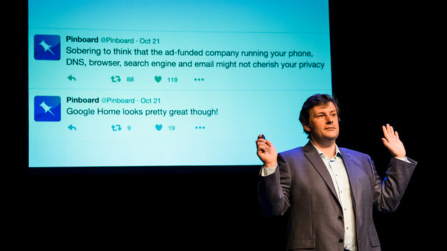
(heat map of america) “...this map could mean so many things right now…” but actually it was the map of the source of DoS attacks launched by IoT devices. IoT has done a terrible job of security.
Google is trying to control everything with Google Home. The day Google announced Google Home, Yahoo disclosed the fact they’d been monitoring all email passing through their system. Combine that with the changes in leadership in the US, are people really going to be keen to have more and more devices that can listen in their homes?
There was a kind of tyre screech noise as people suddenly had second thoughts about IoT. But that’s ok because Amazon just keeps going and we like buying things, so…
Amazon is a candidate to control the robot army. They have huge reach, huge amounts of servers, a huge human workforce doing low skilled work. But Jeff Bezos immediately congratulated Donald Trump… what can be expected if Amazon is asked to reveal data?
A lot of contemporary startups are really just quietly repackaging low-paid work. Mechanical Turk As A Service.
"A lot of startups are just repackaging hard labor by low-paid workers." Preach it @baconmeteor #Direction16
— Mark Pesce (@mpesce) November 11, 2016
A great commentary on this is Ethical Turk – a device that 'chooses’ who in the room gets cooled by the fan by sending a photo to a low-paid human who decides.
We get replies on twitter from accounts where it’s not clear if you’re dealing with a real person or a script.
Who trains who? Maciej’s flatmate thought he’d caught the cat to fetch, but they realised in the end the cat had trained him to be a cat toy. So when we “train” algorithms, eg. on facebook, who is really being trained? Facebook has trained us to click things a whole lot.
There’s an antipattern in development where apps get given all possible access on your phone, because it’s easy during development. This is essentially why Pokemon Go had such extreme permissions. It’s a really common mistake made by developers on a deadline. Devs making mistakes regularly collects and stores information that didn’t really need to be collected.
The final answer really: whoever wants it the most will control the robot army.
We, developers, have had an easy run and not been careful enough. We tend to think we can solve all problems with more technology; and that doesn’t work. We are kind of hoping we’ll eventually create a super-intelligence that will fix all our robots for us.
On the way to SYD, Maciej stopped off in Dubai and hadn’t fully thought about the implications. Dubai is a huge example of the gig economy – terribly poorly paid workers have made a brand new city out of nothing. It’s modern slavery.
We haven’t planned ahead at all. We have to think about all these robots we’ve created. They’re not that bad, but they need some structure and guidance.
We need to think about the kind of world we want, and actually start building that world. We must make sure we are protecting the people who rely on the robots.
@pinboard
...
fin
I’ll never really get used to the subjective speed of a Web Directions event going past. It’s always astonishing that the event is over, but that’s tempered by the fact it’s time to unwind with a drink and hang out with friends old and new.