WDS22, The Big Stonking Post™
Web Directions Summit 22 was a milestone, with the return of an in-person audience at the ICC in Sydney alongside the now-familiar streaming audience.

Summit was thoughtfully constructed to be welcoming and comfortable, catering to a range of reactions and challenges around returning to big events in a covid world. Additions included a quiet zone and a dedicated games area, and defined cues to give people space when they needed it.
Plus the more familiar elements were there - great coffee from Sample, the always-popular range of competitions and give-aways, and hundreds of welcoming web folk.
With a monster six track lineup, choosing sessions was harder than ever!
Trends and themes
- A sense of Twitter's impending demise - “I'm on Mastodon now…”, “I'm on Twitter if it's still up…” and many references to “the bird site”. The Web Directions crowd were very early adopters of Twitter, so when this crowd leaves... something up.
- “How have you been? What have you been up to?” long pause as everyone tries to mentally summarise the pandemic… Be kind to yourselves. It's been a long pandemic ;)
- If the sponsor prizes are anything to go by, we all watch Lego Masters.
- A recurring theme in slides was... unexpectedly... sprinkles. Sadly no Confetti Cake in the break (although the food was awesome).
Disclaimer & Image Credits
- These notes were hammered out very quickly and paraphrase what speakers were saying. If you need an exact quote, use a definitive source such as a recording or slide deck.
- Many of the photos are by JJ Halans, from his gallery Web Directions Summit 22 | Flickr
- Other media as per social media embeds, or borrowed from speaker slides.
Old school jump menu
- Yiying Lu - Bridging the World through Cross-Cultural Creativity & Innovation
- Henri Helvetica - Web Performance 2023
- Alexandra White - Technically Speaking: Improve your code with documentation
- Charlie Gerard - Trust me, I'm an open-source developer
- Rachel Andrew - When new CSS features collide: possibility and complexity at the intersections
- Ahmad Shadeed - Defensive CSS
- Bramus Van Damme - CSS architecture with layers, scope and nesting
- Himanshu Bharadawaj - Make Joy Your Design's Source Code
- Patima Tantiprasut - Designing with friction
- Isabel Brison - Creating and maintaining frontend APIs
- Corey Ginnivan - Should designers _____?
- Mandy Michael - Controlling, designing and improving text on the web
- Gian Wild - Mobile Accessibility
- Dan Hill - The infrastructures of everyday life
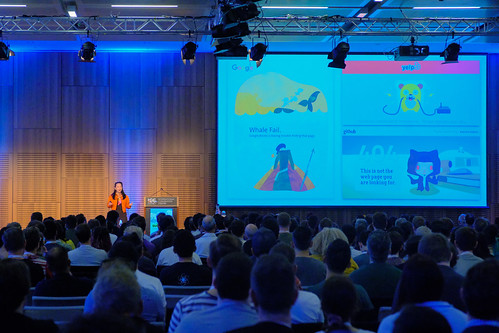
Yiying Lu - Bridging the World through Cross-Cultural Creativity & Innovation
(opening slide: the Blue Screen of Death!)
Yiying was the artist who created the famous and beloved “Twitter Fail Whale”, officially titled Lifting A Dreamer. An artwork that has developed a cult following - fan art, cakes, cocktails, street art, craft projects, costumes… even tattoos! You can see a range of these on her site: Lifting A Dreamer (aka. Twitter Fail Whale) @ Yiying Lu.

Yiying created the whale as a birthday e-card because she missed her friends, she was studying abroad and it was expressing a wish. But suddenly it became the Fail Whale… and just at the start of her career, her name became associated with “failure”. That didn't seem so good!
She was forced to look into what “fail” and “failure” really mean. There are some really different interpretations and connotations with failure.
In original chinese it translates to “destroy something precious and create something new”. If you hang on to something precious, perhaps you will lose the ability to create something new.
A good demonstration of this was when Conan O'Brien's team contacted her to create the “Conan Pale Whale”! It gave her a whole new group of people in the US, it gave her a voice and a platform to connect with people who connect with her work… all due to the so-called Fail Whale!
…
Perhaps the influence is broad. Many technology companies are now engaging with artists to create more interesting moments in their error pages, not just blandly functional messages.
How do we find the fun in function? How do we bridge the gap between the two?
The blue screen of death was functional but not fun. The “Twitter is over capacity” page was fun and connects with people across language and culture. Which is probably why it resonated so much around the world.
Yiying worked with Disney to help them recruit great talent when they were opening a resort in Shanghai. How can you bridge the idea of “authentically Disney and authentically Chinese”? Not only are the characters not chinese, many are different species!
So she brought the Disney style together with Chinese culture and style. Mickey got flourishes within the strong existing design - paper cut artwork, tiger shoes and cloud motifs. Simba was a challenge to ‘lighten up', he got a tattoo of young Simba. The brief for Mulan got even trickier as they wanted her to have more ‘masculine energy' and some ties to ‘western culture' - she used the pose of Rosie The Riveter, and used a magnolia flower motif. Elsa's hair was drawn like a paper cut. Snow White needed to come with the whole team, but no heirarchy… so she had the dwarves around her but not with any rank.
More: Disney Shanghai Recruitment Campaign @ Yiying Lu
…
Yiying has designed six emoji!
EMOJI is not from ‘emotion', it's actually…
- E drawing
- MO language
- JI character
🥟
Dumpling…
She was trying to send someone a text about dumplings and realised there wasn't a dumpling emoji… so she created one! Dumplings are a universal concept and she and some friends started a campaign that got Unicode's attention. It required some design tweaks to remove the face and sit at 45deg.
🥢🥡🥠
At that point they asked her to design more emoji - chopsticks, takeout box and fortune cookie. There were many things to learn, like the etiquette of chopsticks never being crossed.
🦚🧋
Later she created peacock and boba tea (bubble tea) emoji… which took five years and help from data scientists! The process to get emoji created is actually quite detailed, it's not straightforward.
…
Designing a localised logo for 500 Startups was quite a challenge. There are so many languages and dialects that changing the “500” mark simply didn't work. So she used colour and made a border of multiple translations.
…
Integrating work and life…
Yiying's artwork “the bridge” has been used in lots of interactive ways. Adobe released a watercolour app (Fresco) for ipad, so people were given The Bridge as a canvas to try it out; which led to a huge range of interesting artworks.
But when Covid hit, all these events stopped. Yiying had to find ways to move things online.
She created an online drink-and-draw, where she got lawyers to illustrate their joys and frustrations by sketching dumplings… it was amazing!
Combining art and technology frees people up to express things in a different way, and it maintains their energy through tasks that might otherwise be draining.
…
For Web Directions Summit Yiying created the Sydney edition of Bridges Around the World.
Yiying would love to hear about the bridges you love and the bridges you are creating.
Henri Helvetica - Web Performance 2023

(Note - Henri listed a lot of stats quickly, so check the slides if you are going to rely on any numbers in a critical context.)
Among other things Henri is a runner, and he has realised there are parallels between the experience of running and the experience of using the web.
In running you are impacted by your gear, the weather, the course…
Henri shared the data his running gear gave him while doing the Carlsbad 5000 earlier this year. He used to focus on the elapsed time, but now he understands more about pace, elevation vs distance, and what these things mean in combination for how the run feels. Is it tough, is it easy? You need to look at more than just the time.
Measuring web performance, how the page feels, is similar. You need to look at a range of things.
…
What is a metric? It's a system or standard of measurement.
Modern web development requires modern metrics. But it's worth looking at history too.
Firebug gave us insights into what was happening when our sites were loading. It was a big evolution of web dev tooling when it launched.
A lot of sites from the 90s performed really well because they didn't try to do so many things. - Annie Sullivan
Images were added to the internet in 1995. Javascript in 1996. Both pivotal moments for the web… and for web performance.
In 2016 we hit another pivotal point in web history: it was the year the internet was accessed more on mobile than it was on desktop. It's unlikely we'll go back to desktop dominating the stats. However you measure it most traffic, most engagement and interaction is on mobile now.
We are operating in a mobile world, and we are here to improve the experience. What's undisputed is that the mobile experience is very different.
Page performance is now parts proof, perception and measurement.
In 2022 we have pages loading huge JS payloads, and that includes a lot of unused JavaScript. Up to 50% of the payload on the big sites is downloaded, parsed… and never executed. Third party JS accounts for huge amounts of this.
Things have gotten a little weird with images, perhaps people haven't been paying much attention. 44% of images on the web use a lossless format, and most of those don't need to be lossless. They should be lighter. People aren't using modern formats like webp.
Only 25% of images are lazy-loaded.
There are no real mistakes in performance, there are just oversights. - Henri
When you identify a problem you can go dig into it.
Modern metrics:
- first contentful paint
- time to interactive
- speed index
- total blocking time
- largest contentful paint
- cumulative layout shift
- first input delay
…data led us to these metrics. However people probably don't fully understand all of them.
- largest contentful paint: it's a core web vital, but it's the metric that people struggle with the most and usually has a poor rating. About 45% of the web have mediocre to bad results on LCP; and ~70% of that is images. Only ~8% of images in the LCP are being lazy loaded.
- cumulative layout shift: aka “the jank index”, how much does your page jump around.
- first input delay: this metric is likely to be replaced with Interaction To Next Paint.
- time to first byte: indicative of what could take place with all of your metrics. If you don't get this right there is a domino effect for the others.
…
So where does this all leave us?
We need to be more granular in our work. Instead of adding an image, we need to ask which format, what settings should ba applied, how will it be loaded. Should they be prefetched or preloaded? What fetch priority should we set? You can use ‘early hints' to request and send highest-priority images very early.
Early days - Partytown, Qwik, enhance.dev … these are about serving only what you need and when you need it.
Make data-driven decisions. http archive + Crux + BigQuery = you can find out anything you want about the web!
rumarchive.com - beta service looking at RUM data (Real User Monitoring)
If you fail your TTFB your Lighthouse score is almost certainly going to fail, it will be around the 28 mark.
The data shows that Wordpress has some challenges, it can be fast but often isn't. Given how much of the web runs on Wordpress that's a big deal.
The waterfall in your dev tools will expose most of the issues you have.
…
It's important to improve your performance literacy.
WebPageTest have a free course by Scott Jehl to help with this:
webpagetest.org/learn/lightning-fast-web-performance/
@henrihelvetica (“…while twitter is still up!”)
Alexandra White - Technically Speaking: Improve your code with documentation
The lovely @heyawhite, technical writer at @Google @Chrome on stage at @webdirections Summit, giving a talk on: improve your code with documentation:“Documentation should not be sprinkles, they should be confetti.”
— Yiying Lu 🐳 🥟🧋 (@YiyingLu) December 1, 2022
You may also know her as the secret @hellokitty twin sister 😻 pic.twitter.com/X0c0yVonPj
You are a writer!
Everyone in this room is a writer. Everyone writes as part of their job.
Good documentation is important - to your users, to your team and to you.
What do good docs look like? Let's look at what they are not…
- Good docs are not Hamlet, they are Cliff Notes. Leave the prose and metaphors to novelists, essayists and marketers. Writing docs is not a literal translation of what the code is doing, it's a conceptual explanation. Help the user understand what's happening,
- Good docs are clear and concise.
- Docs should not be sprinkled on top of your work. It should not be the last thing on your list tacked on when time allows. It needs to be integrated through the creation process.
- Good docs are accessible. Havings docs at all is part of inclusivity, but you need to pay attention to using inclusive language. Use semantic HTML correctly and write meaningful alt and link text.
…and, please all take note:
PLEASE STOP WRITING “CLICK HERE”! DOWN WITH “CLICK HERE”!
Understand your audience - you have to know who you are writing for before you can write for them.
Write docs for your future you. Future You will thank Past You. Accurate docs will save you a lot of pain later on. Don't write a plan and include that instead of docs that reflect the actual build. Your colleagues will often be relying on this too.
Your external audience is obviously important and often varied. Start by asking who will need to read what you're writing, and what they need to do with the thing you are writing about.
Remember that technical readers will be split between beginners, experts and decision makers. They each need something different from the docs.
Ask yourself:
- what is the prerequisite knowledge
- what is their purpose of reading
- how long will they have to read it (people are often very time-poor)
It can be hard to ask all these questions. Sometimes you will fall foul of the Curse Of Knowledge. You use acronyms that you forget other people don't know. You forget what you know that your reader will not know.
Once you know these things you can work out what to write and when to write it.
- Code comments are part of this - good code comments help retain knowledge of specific details and context that would not be otherwise obvious.
- README - write more docs for your colleagues! Prereqs, configfs, instructions, contributor guides, license
- Step-by-steps - how detailed depends on the audience
- Release notes - please spell out what those bugfixes and improvements were, or at least which features had bugs fixed. Give people context on how to use new feature, or how to opt out if they don't want it.
Use templates:
- collect shared questions
- reflect your audience's expertise
- be product-specific
In addition to your docs, and not as a replacement for docs, blog posts are great. Tell a story: problem, challenges, solution. But please keep the publish date, it's critical context!
Teaching something will make you learn it in a whole different way. Embrace it.
100% of the best developers write docs!
Yes your time is precious, you are busy, docs probably aren't part of your performance review but they should be! Docs should be worth your time.
Final takeaways:
- keep it concise
- be thorough, don't skip steps
- request feedback, from peers and customers
- write docs as you code
Write like you are a piece of confetti cake. Sprinkle docs throughout your work and not over the top at the end.
@heyawhite | @alexandrawhite@mstdn.social
Charlie Gerard - Trust me, I'm an open-source developer

In the course of her work, Charlie because increasingly aware and concerned about the potential for malicious code to come in from open source projects. You have all kinds of company data on your workstation… plus thousands of open source packages, all of which could contain a malicious executable. We see breaches frequently, the stats are a bit terryfying.
There are many types of attack, but to illustrate Charlie will discuss:
- protestware
- ransomware
- reverse shells
Protestware typically doesn't do direct damage, but it is disruptive. There are examples of sending people to political websites, or displaying political messages. So it could certainly cause brand damage if your website suddenly starts sending people off to strange content, even if it's not exfiltrating data.
Ransomware is destructive. Typically it encrypts the files on a user's device, destroys any non-encrypted copies, and extorts payment from the user to decrypt the files again. The ransom is often demanded in cryptocurrency.
Reverse shells gain access to the victim's machine by establishing a tunnel that allows remote code execution and
file manipulation. It's surprisingly easy (nc command) to create a background process that accepts
commands and executes them.
…
Package managers are designed to run scripts, so it's very easy to hide malicious code in a package in ways that look legitimate.
Common methods of hiding malware:
- install scripts in package manifests
- code obfuscation to disguise what you're doing
- corrupt resolved URLs in lockfiles (adjacent names and typos make this hard for humans to detect)
- bin script confusion (example attack is to intercept calls to a runtime like nodejs, and run a malicious version)
- IDE extensions (eg. VSCode extensions include scripting hooks)
…
So how do you protect yourself?
You can't really…! You certainly cannot do it manually.
But you can reduce the risks and impacts:
- use security tools like Snyk or Socket
- include manual security checks in your workflow
- don't install packages you don't need (reduce attack surface)
- regularly update dependencies (the more you have to do at once, the more likely you will miss something)
- if you can justify the cost - use an airgapped computer. Otherwise apply principle of least privilege to prevent installation of malicious packages or limit the damage if one gets through.
- work in the cloud rather than locally - can't execute locally if it's not installed locally…
- be alert to typosquatting - malicious packages published under typo-adjacent names so people accidentally
install them (eg.
npm i reatcinstead ofnpm i react) - prepare a disaster recovery plan
Obligatory note: hacking without consent is illegal! Don't do it for fun, that's still illegal.
The Optus and Medicare hacks have brought attention to security recently. It's a pity it takes a breach to do it, but at least there is some focus on improving security.
It's not if you get attacked, it's when you get attacked. So take precautions.
Rachel Andrew - When new CSS features collide: possibility and complexity at the intersections
A little strangely, during the pandemic while many things stood still CSS kicked it up a notch. Lots of new things came out.
So what happened? How did we rocket into new layout systems, what does that mean for us in our jobs, and what do we need to understand about it all?
For a very long time, we had to make do with floats for layout. You had to do the maths to determine what would fit, or find a framework which would do it for you. We got good at it, we got good at designing around the limits, and we built perfectly reasonable websites.
If I had asked people what they wanted, they would have said faster horses. - Henry Ford (apocryphal)
While we know Henry Ford probably never said that literal line, the sentiment is useful and applies here. Web devs thought in floats and weren't really asking for better things.
In floats, each element is working on its own outside document flow - unaware of the others, in a way. Flexbox fundamentally changed layout because it created layout groups that worked together and responded to each other. Flexbox works around the content.
At the same time, CSS Grid was being developed. A brilliant feature is the ascii art sytax for defining layout areas. But it is a different approach to layout, where you create areas for content to fit into.
But people would regularly ask why use Grid instead of Flexbox? and looking at the data today, people say they use (or have used) grid… but grid is only shipped to about 2% of sites. The State Of CSS asks if people have used it, but not if that was in production.
Flexbox had provided faster horses, so why learn Grid?
We are now getting a feature we have asked for - Container Queries. It's very close to mainstream, with just Safari remaining to make it a mainstream feature.
Container Queries reflect our focus on building component libraries, which need to respond to a local context and not the overall viewport.
Why did container queries take so long? How can it be so simple now when we were told it was impossible for so long? Because the content inside an element could impact parent size, there was a very high chance of creating an infinite rendering loop.
But CSS has been advancing. As each feature lands we unlock new options. For container queries, we needed the containment spec first. It prevents the infinite loop problem, so now we can have container queries.
Combinations of new specifications are powerful. Container queries combined with aspect-ratio let you change the ratio of elements based on available space in a reliable way.
…and “speaking of things we couldn't have before…” We almost have the Parent selector! :has() This one is waiting for Firefox
li:has(h2:p) {}So you can do things like insert a placeholder image using li:not(:has(img)):before {} and a
placeholder with reliable aspect ratio.
Subgrid is a recent, powerful addition to Grid. It is rated by many as the great missing feature. It does lead to grid line naming becoming much more useful and powerful. The value of subgrid replaces the track listing. You can subgrid in one dimension or both. While it took longer to develop subgrid, the delay made the feature much more useful. Waiting is fine if it gives us a better result - it's much harder to change things once they've been added to the web platform.
Combining container queries and subgrid enables powerful layout options with reasonably simple code.
There are so many possibilities. Rachel sees the combinations of new things as a powerful way to move forwards.
Please try things, and try their combinations!
@rachelandrew@front-end.social | Rachel's slides, code and resources
Ahmad Shadeed - Defensive CSS

Unknown content breaks websites, so how can you defend against that?
Examples:
- images that come through without consistent dimensions and aspect ratios
- missing images
- long and short text content
Modern CSS gives us lots of tools to control these situations, but we still end up with bugs… how does this happen? It's not that CSS can't produce a robust design, you need to anticipate content stress points.
Defensive CSS is a strategy to write bulletproof styles. It's not just for developers, it's for designers and QA engineers as well. Each role has a list of things to inspect and check.
“What if..?” the CSS Trouble Maker - thinking about how to break things.
Image and text tips:
- set text overflow and wrap rules for elements like headings
- set min and max widths for images
- when setting images as backgrounds, set
background-repeat - avoid image distortion by setting
object-fit - when setting text over images, ensure there is a suitable background colour on the IMG
Flexbox tips:
- remember to set
flex-wrap - account for long content by setting
align-selfon key child elements - an image aligned to the top will look neater than a stretched image - remember that flex overflow wrap also requires a
min-width:0for break-word to have an effect - beware of space-between - it can stretch too much. You can use
gapinstead
Grid tips:
- grid min content size to handle oversize/scrolling content
auto-fitandauto-fill… these may work the opposite way you imagine! if you're laying out multiple items, remember to test with just one- fixed values in a grid can create content overflows - put them behind a media query
Unknown content:
- handle long content…
flex:1; min-width:0;will help in many cases - can also use
text-overflow: ellipsisbut be very careful to maintain accessibility - a simple way to avoid content overlaying is to set right-side padding on the variable content. when it's small it does nothing, when it's long it avoids touching the next element
- in many cases you can use
min-widthandmax-widthinstead ofwidth; and same forheight
Scrollbars:
- to hide scrollbars on short content that doesn't need it, set
overflow:auto - avoid content shifts due to scrollbars with
scrollbar-gutter: stable - avoid background scrolling with
overscroll-behaviour
So please make your CSS defensive!
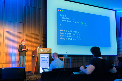
Bramus Van Damme - CSS architecture with layers, scope and nesting
It's a brilliant time to be a frontend developer, because so much is coming. But it's also a confusing time, because so much is coming.
Browsers are releasing new preview versions constantly. You spend a lot of time checking caniuse.com
There are now platform trackers to keep in touch with what's likely to land soon, you can check bug trackers…
But thankfully there are people aggregating information:
Plus all browser vendors are now working together on interoperability efforts, where they plan and work on the same key standards in the same year. You can keep track at the web-platform-tests dashboard and particularly the interop 2022 page.
There's so much but Bramus will pick out four things today:
@layernesting@scope:has()
Cascade Layers were delivered almost at the same time across all browsers - just 30 days from first implementation to the last, which for the web is extremely fast.
CL helps manage the cascade, so competing declarations can be resolved more predictably. To date we've mostly used
specificity and order of appearance, because mostly our styles are coming from the same context. This is the classic
situation where you end up with !important
CL inserts a new layer in the cascade which is evaluated above specificity. It lets you control the priority of each layer. You create layers in a block; and you specify the order those blocks should be prioritised.
So you can separate reset, base, components and utilities; and ensure resets alswyas loses in a clash but utilities always win (so they work as utils!).
@layer reset, base, components, utilities;

@layer reset {}
@layer utilities {}
@layer base {}
@layer components {}
When there is a layer statement, the order of layers in your source code no longer matters.
CSS Nesting brings in a popular syntax feature from CSS preprocessors like SCSS.
There is still some debate about syntax. One example is to nest using &, another is
@nest… there are about five proposals. No matter which syntax wins, you need to be aware that
specificity will be based on the underlying expanded rules which use :is(). You will be chaining
selector specificity in new ways.
Scoped Styles give further control - @scope sits between specificity and order of
appearance.
@scope (.light) {}
@scope (.dark) {}
or
.light >> * {}
.dark >> * {}
Then if light and dark elements are nested, only the styles from the nearest scope will apply.
Scope allows you to start both start and end to scope. So you can have a media element with multiple images, and define the selectors in between which to apply styles.
<div class="container">
<img />
<div class="child">
    <img />
</div>
</div>
@scope (.container) to (.child) {
img {}
}This will select the first IMG but not the second IMG. This is called ‘donut scoping' because it defines rings of scope.
:has() pseudo-class, commonly known as the Parent Selector although you can do a lot
more than that - sibling, nephew, niece…
a:has(img)…selects the a that contains an img.
(More practical examples but too quick to capture - review the slides!)
Himanshu Bharadawaj - Make Joy Your Design's Source Code
Himanshu Bharadwaj - best ideas comes in shower (where you are in peace)
— Anton Korzunov (@theKashey) December 1, 2022
- this is why you want to focus. To let your unconscious speak
- this is why you don’t want to focus. To let you conscious control #webdirections pic.twitter.com/jaEpu7CoNd
When we are born there are no constructs. There is curiosity, wonder, delight and joy.
Fast forward to now and we don't have all three at once:
- 8 hours sleep
- Perfect work
- Weekends
…a lot of us suffer from sleep deprivation now. There are more people suffering from lonliness than before. One in five people in America are on antidepressants.
There are too many three letter acronyms to remember.
Elon Musk tweets about hate speech. Why don't we talk about love speech?
We live in a world where business uses metaphors of war. We have head hunters, a sales force, we make a killing, we destroy competition and we have deadlines. Why not use simpler, joyful terms? Why does the language need to be so violent?
How do we create delightful, uplifting products in the middle of all of this?
If you go to any website these days, you immediately get asked to accept cookies. There is nothing delicious about them. Then there is another popup, and it has the smallest close button possible. It raises your blood pressure.
Himanshu calls this “digital torture”.
We can delete cookies, but we can't delete the traces in our minds. Slow-loading pages cause the most stress of all website problems.
Our surroundings effect us. People are more alert, confident and friendlier in colour offices than they are in drab cubicles.
Our thoughts lead to actions, so if those thoughts are polluted the actions are too.
As our phone screens have become larger our distraction has increased. It takes 6 seconds to become distracted, but 23 minutes to come back to your pre-distraction state.
Our devices break our connection with others. As a child, Himanshu remembers the whole family would watch movies together. Now everyone watches Netflix on their own.
The modern devil is dopamine. It is free. The same principle that drives slot machines in casinos drives our behaviour with phones - random intermittent rewards.
…
What you hide in your heart will show on your face and the designs you create. It's the tip of the iceberg - only 5% of our mind is the conscious mind.
The longer you hold something in your hand, the heavier it feels. When we hold on to stress, it feels worse.
Stress is causing most diseases today. As creatives, as problem solvers, we should be thinking about this.
…
So what is joy?
While working in advertising, Himanshu saw a lot of people burn out and leave the industry. There was a constant churn of stakholders destroying the work. It's the same in product design.
Definitions of happiness vary between unstable sensory or emotional concepts like pleasure and delight, and more long-lasting concepts like happiness over time; and ultimately bliss which is a perfect state of contentment.
Despite the whole human race notionally being in pursuit of happiness, we have not reached it. We are often seeking the future, and not living in the present.
Joy in an intesnse, momentary internal experience of positive emotion. Joy is a drive towards life. Joy is losing yourself in the present moment, calm delight, like candy with no bad calories.
Don't chase happiness, embrace joy.
positivity -> comfort -> joy -> happiness -> bliss
There is a technique where if you can hold on to joy for a little longer, it accelerates happiness. Don't post the sunrise on instagram, enjoy the sunrise longer.
People are not good or bad. They are either learned or ignorant.
…
So how can we create joy in the products we create? How can we connect feelings with features.
(slides: plutchik's wheel, junto emotion wheels)
Himanshu created Joyful Design, from user experience to user transformation to user joy.
Christmas tree:
- Spiritual Joy (the star)
- Intellectual Joy
- Mental Joy
- Sensual Joy
- Usable
- Reliable
- Functional
- Intent & Context (the trunk)
Move on from why-how-what to why-how-what-wow. What would wow this user?
We need to think about users differently:
- You're not building a product, you're creating a customer
- Whenever we sell a product, people are paying with life, the time spent that was required to earn the money
- go beyond empathetic, become compassionate
There is more action in compassion than there is in empathy.
…
Humans are creatures of habit.
Transformation is much more than using skills, resources and technology. It's all about habits of mind. - Malcolm Gladwell
Exercise:
- Cross your arms.
- Note which hand is on top.
- Now uncross your arms, shake them out a bit.
- Now cross your arms with the other hand on top.
…it feels confusing and difficult! Brains are lazy, they don't want to have cognitive load, so they follow patterns.
Innovation is following a pattern and predicting a pattern. Creativity is breaking a pattern and creating a new pattern.
As intelligence moves into machines, into AI, our superpower will not be intelligence. Our superpower will be creativity.
Brains love multi-sensory experiences. Why do we remember events like a wedding so strongly? We wear nice clothes, there are flowers, there is music, there is food… all the senses are engaged.
A single negative sensation can undo a joyful moment - if you are sitting on a very hard bench, you won't enjoy the sunrise.
60% of the world comes to us through the eyes (for sighted people). Visual design is surprisingly overlooked, we focus on usability and functionality a lot.
When we are stressed, we only see what's right in front of us - the tree. When we are calm, we see the forest. This has an evolutionary background around fight, flight or freeze - stress makes us focus on immediate danger.
Skin is an interesting sensory organ. It is our ultimate barrier, but also a powerful sense. We remember touch very deeply.
Research found people connected more with product shots shown with a hand touching the product - 65% more likes for photos of a product in someone's palm, vs just the product. It changes our perception through the ownership effect.
This is why Apple want you to touch their products in the store. If you are looking at a computer, the staff will ask permission before they touch it - they are making you build a sense of ownership.
There are many examples of multi-sensory branding. Disney actively uses smell at their sites. Coke builds a brand using the sound of a bottle opening, and the iconic bottle shape.
Find novelty and surprise where love is to create joy. Surprise focuses attention - focused mode, instead of default mode with wandering attention.
…
The mind goes quiet during moments of joy. We say we want peace of mind, but what we really want is peace from mind. If you can extend that moment a little more, we can experience more joy.
A simple illustration:
- a long breath in makes you alert
- a long breath out makes you relaxed
There is a neuroscience protocol to help someone who is unhappy: do a quick double inhale - it makes you more focused on the moment.
…
Flow is prolonged focused attention in the present. We lose track of time. It is the balance between challenge and skill level.
You are five times more productive in flow state.
Instant gratification needs to be delayed during and beyond operation of the device. There is a very big difference between gaming and playing the violin.
If the UX is too easy or hard, people lose interest - it needs to be just a little challenging to keep in flow state.
The depth of your attention determines the depth of your experience. Hack: reduce the time for a task by 20% and your focus will increase.
Himanshu is in his flow state right now, standing and speaking:
fun + fear + focus = flow
It's a rich environment, he has our attention, he is talking to people who care, about a topic he loves. But there is fear of making a mistake, of people not enjoying the talk. There is focus because he is aware of himself. He is aware and focused on what he is doing.
…
Happy people make better products.
Joy is here and now.
Patima Tantiprasut - Designing with friction
@the_patima challenging the idea of "better". We should always think about what better actually means: "Better for whom? Better for how long?" - @webdirections #summit22 pic.twitter.com/wMITRf4cJg
— Ricki Barnes (@rickibarnes) December 2, 2022
We are normally told friction is bad, but Patima is here to tell us that friction is really interesting.
It can be associated with agitation, irritation, resistance… and it challenges basic principles of design. We're trying to remove obstacles, do things faster, remove inconvenience.
Friction has an opportunity for us to learn, grow and evolve.
Four ways friction can be good:
- preventing errors - helping people understand consequences before you take an action. eg. emptying trash on your computer has a confirmation step, some systems require you to type a word before irreversible actions.
- adding value - sales, conversion rates, customer retention and even prices. eg. Duolingo asks you to set a streak goal, instead of choosing it for you (ie. how many days in a row will you use the product); which increased engagement
- protecting people - removing the human autopilot condition caused by automation. It helps people regain consciousness and control over their choices. eg. Netflix is designed to hold attention and generally encourage binge watching; but it prompts you to confirm if you want to keep watching. Even Tiktok has added a prompt to take a break.
- respectful nudging - gates that remind people to consider the consequences of their actions, teaching social responsibility in positive ways. eg. Slack's whoops preventer, which checks that you really want to @channel notify a large number of people. Tiktok now asks you to reconsider posting offensive messages.
More examples (won't have time to cover today)
- perception of time
- allows consent
- provides fulfilment
- build trust and confidence
Design is a craft with an amazing amount of power. The power to choose. The power to influence… - Mike Monteiro
If we're creating a better world
- Who is it better for? Your customers? Your business? Society?
- How long is better? This week? Month? Five years? Longer?
Bonus round: Changing the world. Friction can help to create meaningful change, perhaps challenging the norms and implicit bias that hold us back.
Last year Pet Rescue (petrescue.com.au) had six million site visitors. That volume creates a very large opportunity to effect change. They use friction intentionally and deliberately.
Their objective is to create a world where every pet is respected and loved.
We have a lot of preconceptions about pets - from photos alone we'll make guesses about their behaviour, suitability for families, even price.
Pet Rescue do not let you search by breed, even though people constantly ask for it. But removing it forces people to consider more options, to challenge stereotypes, generalisations, labelling and implicit bias about breeds. We do this with pets just as much as we do it with humans.
People think: I want a (insert any breed here) because I'm looking for a pet that is (insert any generalisation here).
The mental model is the Mere Exposure Effect, or Familiarity Principle. We prefer things we are familiar with.
Actual science says that breeds are not a good indicator of a pet's personality, temperament or behavious… nor even if you will be allergic to them.
By leaving out breed, Pet Rescue creates moments of serendipity. People end up happy with pets they didn't expect. (See “Happy Tails” on the site). Including breed search would have prevented this happening.
Friction can be asset to use in our design process, and challenge what “better” means.
Isabel Brison - Creating and maintaining frontend APIs
Our next @webdirections Summit talk in the React track is by @ijayessbe, about creating front end APIs that can be consumed by others for theming and other purposes pic.twitter.com/2Mslz1CVPE
— Meligy (@Meligy) December 2, 2022
Long ago, people used to hand-code their websites from scratch. By the early 2000s this had moved forward to people using MySpace, where you didn't write the whole thing but you could customise it like crazy because the profile field reflected HTML into the UI.
MySpace hadn't intended this… let's be honest massive security hole… but it became a major feature of MySpace. Arguably it was the beginning of website theming, and a whole generation of web developers got their start hacking MySpace.
There were two ways to do it:
- you could add CSS and reskin what was there; or
- you could hide MySpace's markup and put your own HTML in
This was arguably the first theming API.
An API contract is ultimately documentation - saying what you support or allow.
Everyone wants personalisation… well, they want cat pictures, but otherwise they want personalisation! Two cases in mind today:
- Website themes
- Application themes
The APIs for these cases can look very different. How might you approach them?
…
Website themes
You might provide some kind of templating system to allow them to control where content is injected into their markup. This will require basic logic (if/else) and documented content references. This is good for things like inserting the title string into a heading. It is easy to use but restrictive.
Another approach is to give lower level access to query the backend, return data results and let the user handle it however they want. Wordpress uses this approach in PHP to account for the possible presence of custom data types. It's more complex to use but it is more flexible.
You might also provide functions that render their own markup; and you might allow people to inject their own classnames to give greater control. But as soon as you output markup, you make a broader API surface because all that markup has to be styled and any changes to that markup can break those styles. You can restrict your API contract to class names to reduce that surface.
Now with the Gutenberg editor project, Wordpress is enabling drag-and-drop customisation in a GUI. This means Wordpress is supplying all the markup, which sets up a lot of potential backwards compatibility grief!
They have a terse HTML-comment based syntax <!-- wp:site-title {"level":0} --> which helps
create themes. But how to deal with the impact of supporting all the markup?
To abstract the styling API they have a JSON schema to set design tokens. This means users aren't directly targeting the markup to apply style. This is not flawless and doesn't help people who still apply CSS directly. Also it has spotty support for old browsers, although that's a rapidly diminishing problem there are still customers supporting ancient browsers.
…
Application themes
Example - the colour theme in VS Code, which uses a JSONC file (JSON+comments) which enables tokens for content types and zones. You can actually open code inspector in VSCode and see that it's all CSS! …which does prompt the question of why you can only use hex colours when other formats would also work? Restricting the format to hex codes means they have more freedom to change in future. It's a smart choice to retain some control.
User themes for a website are more akin to app themes than website themes, as any user can tap into your CSS custom properties, apply styles to your markup, and so on. Even if you don't intend that, someone might be doing that. Your markup might always an API to someone. Even if the user doesn't do it, they might use a browser extension that does (eg. darkreader).
If you are hashing all the classnames, people won't be able to customise the way they see your website. There are very sound accessibility reasons for people to be doing this.
…
If you take one thing away from this talk: what people will do with your stuff will surprise you. And that's good!
Corey Ginnivan - Should designers _____?
Thanks to everyone who came to the talk! ☺️ @webdirections #summit22 pic.twitter.com/KlOTl7LBbB
— Corey Ginnivan (@CoreyGinnivan) December 2, 2022
Should designers…
write?
code?
manage people?
use canva? ;)
A few years ago Corey was asking himself a lot of these questions. He was stuck in a rut and felt like he hadn't learned anything new.
He realised he had to ask what should designers actually know?
🦄 For a long time he'd been called a unicorn as he knew some skills outside design. Which felt great… until it didn't.
🐴 He felt out of touch, left behind, looked up and felt like he felt he knew nothing.
In the past he'd hit this wall, he'd take the easy way out and go find a new job - an external catalyst for change. But he liked his job, so he didn't want to do that this time!
So he looked on the internet about what he should learn. And that was a mistake. The amount of skills was overwhelming and he had choice paralysis. It was tempting to run back to his easy bubble - it was still paying the bills after all.
He wanted a playbook on what to do. Which we do kinda have - job descriptions! He looked at similar design jobs to see what was missing… but that just “told him he sucked in a whole new way”. But there were some common themes that he could pull out.
He decided to apply his own design approach to the problem. He collected skills and traits across three categories - craft, productivity and leadership. He then graded 30 job descriptions against this… and in the end the data didn't help! The answers were either totally obvious, or unhelpful in answering the question of what to learn next.
This was the pit of despair.
But all 30 companies agreed on and valued some skills:
- Collaboration
- Communication and articulation
- Visual design
- UX design
- Interaction design
This unlocked the first step - the required skills.
So how to scratch the itch? He wrote down…
- things that make you happy
- things that you are doing
- things you want to learn
- things you are good at
- things you don't want to do
This led to commonalities as well. Top ten skills worth investing in, his unique skills profile (spider chart). This might be the comfort zone but it's also a good way to understand your personal superpowers.
So that just left the new and shiny - getting out of the comfort zone, to evolve the shape.
He decided to set three paths:
- adding to foundation (essential for your role)
- adding to shape (be indispensible)
- adding to career (stay on track)
Which led to the next steps:
- Foundational: improve public speaking (communication)
- Shape: grow to be a full stack dev
- Career: aim to be a staff designer
So what should designers be doing? Whatever you want!
But whatever you do learn should support your foundations, enhance your shape, and enhance your career.
Mandy Michael - Controlling, designing and improving text on the web
Yay @Mandy_Kerr! #summit22 #webdirections pic.twitter.com/R7JntJPqXx
— Fiona Chan 🐳 (@mobywhale) December 2, 2022
Up front you need to know that Jello is Mandy's dog. That will make sense later…
There is a lot of text on the web, and we do a lot of wrangling of text on the web. Covering everything you do with text would be a much longer talk!
First - choose the right type. Use the right HTML element. It matters! Do this for the same reason you use
Typescript for your JavaScript. A range of technology will use text differently according to the HTML, so you must
use the right thing. There is a large, but finite, list of text elements. If in doubt, check on MDN before you just
whack a div into your project.
Fonts play a big role in how text is interpreted, and how people feel when they read your text.
Variable fonts are a really big new feature for type on the web. It's a single font file that behaves like multiple
fonts. They have axes like the weight axis which goes through light, regular, bold, black. The
combination of these axes gives you whole different text types.
Although variable font files are a bit bigger when compared 1:1 to a non-variabl file, a variable font typically adds far less than multiple font weights - so most sites make an overall saving. Plus they are served in one request. Confirm details with your specific typeface.
Variable fonts gives you fine grained control, so you'll never have the problem where bold is too heavy and semibold is too light…
Because this all works live in the browser, you can expose the axes to user control.
There is a new specification allowing colours in font, eg. to colour the text, bevel and shadow differently. You
use an at-statement to declare your styles and then inject with font-palette. There aren't many colour
fonts yet but the more people use them the more will appear.
And yes, there are colour emoji fonts.
Important note - always check that the typeface you are using supports the font properties you want to use. Not all fonts support everything.
font-variant-numeric - one of the most under-used properties! This allows tabular-nums
which force the numbers to take up even space, which is critical if you want them to line up between table rows. It
lets you set diagonal or stacked fractions.
font-variant-ligatures - this where two or more letters are combined into a single glyph, to resolve
collisions. Also they tend to look nice. These are used heavily in code fonts, but whether that's actually easier to
read in that context is somewhat debatable.
Hey @Mandy_Kerr, have you open sourced your Fluffy Jello Ipsum? What an absolute and utter delight. pic.twitter.com/pxRB6n3jwa
— Alexandra (@heyawhite) December 2, 2022
font-variant-alternates - this is a bit different as the options are functions. A great example is
swash() which adds a “big swooshy bit”. To avoid going over the top it can be combined with
first-letter selector or dropcaps. Alternates also allow things like switching characters - there are a lot of
ampersands.
sparanoid.com./lab/opentype-features
To understand the next feature you need to remember that inline and block direction is horizontal and vertical… which changes by language.
Logical properties: text-align: start will mean left in English, but right in Arabic.
Spacing - we can control space between letters, words and lines; but note that setting letter-spacing
will disable ligatures, because there won't be collisions to trigger ligatures. But these properties can be really
useful, you should understand how to use them.
Text spacing has always been a little tricky due to leading - the space between elements is different around text,
it's not just the margin and padding. There is a draft property called leading-trim which shink wraps
the element down to the actual text. Go play with it and encourage the W3C to push it. Every UI library maintainer
will thank you.
Lastly, talking about rendering text.
font-smoothing allows us to control anti-aliasing in an era where browsers were very bad at subpixel
rendering. But it is now deprecated as the underlying problems are resolved and the output can create accessibility
problems. You can probably just remove this now, you probably don't need it.
text-rendering - not actually a CSS standard, it's an SVG standard that you can apply more broadly.
You can set it to optimise speed vs legibility; and to optimise geometricPrecision for scaling up and down.
…
It's easy to think of text as something that's just there. But we should spend a bit more time and care on our text. We have more control and options than ever before, and we should make use of that.
Gian Wild - Mobile Accessibility
(Gian notes there are extra slides in the deck as this is a talk that can be delivered in a longer format; don't sweat it - they are there for later reference.)
What makes mobile accessibility different? Mobiles have native screen readers and a huge range of a11y features and controls. There are more user and viewing modes, and people use those features much more - even if they don't think they need accessibility features! Many people find their parents zooming in to make text larger on their device, but they wouldn't identify as disabled and often wouldn't think to change those settings on a computer.
Shouldn't WCAG 2 cover mobile? It does to an extent, but unfortunately there are lots of gaps - for example it requires keyboard accessibility, but doesn't specify availability to touch. WCAG 2.1 makes progress but still doesn't cover everything. As a result, a number of organisations had developed additional recommendations for mobile.
So the ICT Accessibility Testing Symposium developed a unified methodology for evaluating the accessibility of mobile web sites:
accessibilityoz.com/resources/mobile-testing/
As well as adding recommendations, it made adjustments like changing the importance of some elements. In WCAG 2.1 touch target size is an AAA guideline (“…AAA being where requirements go to die”), but it needs to be a core requirement. So the methodology elevates touch target size to a core requirement.
There are different sets of testing methods for mobile sites and apps:
- test on devices
- testing on devices with assistive tech
- responsive window
- testing on desktop
Native apps only have devices and devices + assistive tech.
You can't test with emulators… they just don't work the same way, they miss too many things.
Five steps in the methodology:
- identify devices (eg. review your analytics to see what people are using)
- identify site type and variations
- test critical issues
- test mobile-specific issues
- test mobile assistive technology and feature support
Native apps are mostly the same but change step 2 to identifying application functionality, because they are so different from a website. Then prioritise the most critical functionality in your testing.
Recommended core devices to test: * iPhone using Safari * iPad using Safari * Android phone using Chrome
Futher additions should be tailored to your audience and content type, eg. if you produce content for Kindle you need to be testing Kindles.
The current recommendations is to test on the latest iOS and latest two versions of Android; although this will probably reduce to just the latest Android in future as the version differences have reduced.
Test your site at 200% zoom; and ensure all content and functionality is still available. Watch out for the zoom of doom - where zooming in to content make it impossible to use.
There are traps using assistive technology where site controls and AT controls conflict, in ways that cause problems for the user. eg. the layer trap puts a layer of content on top of the controls, and AT users can't access the controls any more.
Note that touch gestures should not be the only way to do something - there always needs to be an alternative.
…
The committee will reform and update the methodology once the next WCAG iteration is released, and to review existing cases.
The blog recap does not go into full detail, consult the slides and resources before doing your own testing.
@accessibilityoz | Gian's slides | Mobile Testing methodology
Dan Hill - The infrastructures of everyday life
13 years ago, at @webdirections 2009, @cityofsound did a brilliant talk that changed my perspective on how people interact with technology. Today he delivered another brilliant presentation talking about Strategic Design pic.twitter.com/D7nn99SEM9
— Oliver Weidlich (@oliverw) December 2, 2022
Dan last spoke at Web Directions in 2009, which was a pivotal time for Dan. He was a website designer back then, but he has since worked on a lot of big infrastructure projects.
To keep his hand in as a designer he worked on a phone for Punkt, that was deliberately designed to be the antithesis of a smart phone. They used the question of “what is the essential ‘phone-ness' of a phone?”
Technology is the answer. But what was the question? - Cedric Price (1966)
Australia finds itself at the cutting edge of the climate crisis, having played quite a bit role in bringing it about. We see extremes of weather - fires, floods - that mean we have modern problems to deal with that can't be solved with old tools.
Air conditioning is an illustration of solving a problem only at a local level - at a larger scale you're just moving hot air around and spending energy to do it.
You can apply design process to big questions about cities and infrastructure. But be aware it can't solve everything! There is no silver bullet.
Design is not really about problem solving. Design is about cultural imagination. This involves finding, framing and asking the right questions.
13 years ago, Dan gave a talk called “15 years on” as he'd been working for 15 years. So 13 years on from 15 years on… Rather than review it all, you can read about it in Dan's books, if you can find them!
Dan observes that Web Directions itself has changed. The food's better, the diversity seems better, but it's clear that the infrastructure around the venue has chagned immensely.
Good infrastructure is by definition invisible
Airbnb, Uber, WeWork… these have changed cities in unexpected ways. They are not fundamentally new things - they're basically taxies, hotels and offices… but technology changed our engagement with them; and in many cases the impacts on cities has been terrible.
Cities are the system around many startups. Uber and Lyft are blamed for a 40% increase in traffic in San Francisco, and a rise in vehicle deaths. Things moved from an individual level, to a service level, without system planning. Was it the Uber designers' fault? Was it their board's fault?
Always design a thing by considering it in its next larger context - a chair in a room, a room in a house, a house in an environment, an environment in a city plan. - Eliel Saarinen
Not all startups operate this way. A contrastinc example is Oslo Bikes. Also a startup, but…
- A really well executed bike sharing system, where the fast and slow elements meshed well.
- Branding it locally made sense. London's equivalent was “Santander Cycles”. It's hard to prove, but it seems like people feel a little less inclined to toss Oslo Bikes into canals. People were aware that Santander was a big bank, who could afford to replace a bike.
- They also shared all the data openly and for free, so people could engage with it if they wanted to. This contrasts with services like Uber who either don't share it, or charge for it.
- “For full Nordic brownie points…” all the Oslo Bike maintenance crew are rehabilitated prisoners.
By thinking through the bigger scale, Oslo Bikes created something much more successful than other cities had seen.
Energy as social fabric: Australia has the highest uptake of rooftop solar panels. There is an ongoing question about whether self-sufficient houses should be off grid, or feed power back into the municipal grid. Is there a way to design a social fabric around storing and using power?
Sketching systems - imaginging alternative ways to arrange suburbs, or city centres… using prototyping methods to imagine alternative infrastructure. Of course their attempt to imagine shared transport reinvented bus stops…
You can imagine wild new things if you're building a new city from scratch, but what about retrofitting to existing cities?
When you go back to cities before cars, the street was a shared space. Then cars barged through and took over. We literally ran roads straight through cities… in Sydney we put the Cahill Expressway through Circular Quay.
In Stockholm escooters turned up en masse and suddenly - they were instantly loved and hated.
(Clip: The Wire, “Soft Eyes”)
If you stare too hard at the thing, you don't see the system around it.
Continuing the police procedural theme, you can then create an investigation wall and start connecting ideas. Then you can bring people together into a “system in the room” meeting. eg. the scooter operator, traffic designer, public transport operators, etc.
Reframing: if you give streets to the Traffic Department, you get traffic. If you add more inputs into the question of what a street is, and what it's for, you'll get more ideas. Approach the same question through a different lens.
You can use speculative narrative to explore what could happen - tell the stories. Use participative design, get lots of people to try designing solutions. They got kids to design streets around their schools, and “they're better at this than Prime Ministers!”
“Kit of parts for urban innovation”. They used a modular system of street furniture, created with wood that forced replacement every 2-3 years. This reduced clock speed was intentional, to require re-evaluation of what the street needs.
(Slide: design principles for the street, by Brian Eno. See: Working with Brian Eno on design principles for streets | by Dan Hill)
Brian Eno's design principles for streets
- Think like a gardener, not an architect: design beginnings, not endings
- Unfinished = fertile
- Artists are to cities what worms are to soil.
- A city's waste should be on public display.
- Make places that are easy for people to change and adapt (wood and plaster, as opposed to steel and concrete.)
- Places which accommodate the very young and the very old are loved by everybody else too.
- Low rent = high life
- Make places for people to look at each other, to show off to each other.
- Shared public space is the crucible of community.
- A really smart city is the one that harnesses the intelligence and creativity of its inhabitants.
The kit was a platform for asking questions in public. It could adapt to new questions you didn't think of at the start.
Concept: what does the city look like at 1 minute from your door, vs 15, 30 or 60 minutes from your door? How does representation and scale change? Who needs to be consulted for the decisions, who should be responsible?
Eventually the kit of parts was used in Volvo concept designs reimagining city streets built around shared cars, not personally-owned cars. This was from a car manufacturer..!
There are so many ways to measure value of urban works. Decreasing road noise leads to an increase in birdsong, which improves mental health and speeds recovery from illness. Removing parking leads to increased business for shops - study after study shows it, but you always have the debate.
Data doesn't win these debates. You need to lead with the behaviours people want to change.
You have to have an adaptive strategy. Do things that move towards a north star. Get people doing things, observe them, see what works, try more things. This practice needs to get into policy making.
Stay on target. There are a lot of distractions to your mission.
Technical and design people like Web Directions attendees have a lot of experience and system thinking that works well in public projects. Engage with them as best you can.
@cityofsound | @danhill@mstdn.social | cityofsound.medium.com/