WDS19, The Big Stonking Post™
Web Directions Summit 2019 was held at the ICC in Darling Harbour, Sydney.

Hazy days outside did not deter those inside, possibly because we were fuelled by amazing coffee from Sample.
Thanks to @HowToProspa and @twilio for the coffee and seamless SMS ordering experience at the conference! #coffee #wds19 #webdirections pic.twitter.com/hkHIaU7XqT
— Web Directions (@webdirections) October 30, 2019
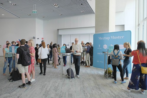
The concourse had a range of exhibitors and the ever-popular Meetup Muster, showcasing local meetups.
Official proceedings began with Welcome To Country, a reminder of the tribes and nations of this country, and musings on the new languages we create.
Fantastic to see a Welcome to Country opening #wds19 ❤️There is so much we have to learn from the oldest continuous surviving culture on the planet. Especially us who work with all this “new stuff” pic.twitter.com/7t1kb7L2BS
— Mischa Colley (@mischacolley) October 30, 2019
Trends
While certainly not a first for Web Directions, it was good to see parents with little ones in the room – it’s an important evolution of industry culture and something that should continue to be supported.
Life pro tip- take your baby to a conference! They basically network themselves #wooooooooo #wds19 @ International Convention Centre Sydney - ICC Sydney https://t.co/IyBq0bWnMT
— Amy Cleary (@amysqurrl) October 31, 2019
Sister2Sister
Rosemary Allsopp introducing Sister2Sister https://t.co/Xm7Xk1I7CD #wds19 #webdirections pic.twitter.com/5UMl63oTLI
— Jean-Jacques Halans (@halans) October 31, 2019
Rosemary Allsopp took a moment to talk to us about SISTER2sister:
The SISTER2sister mentoring program is an evidence-based and trauma-informed youth development program that provides structured mentoring, psychoeducational workshops, welfare support and crisis intervention services to vulnerable or disadvantaged teenage girls (Little Sisters) aged from 12 years and up.
If you are interested in becoming a mentor or otherwise supporting the program, check out SISTER2sister
Disclaimer & Image Credits
- These notes were hammered out very quickly and paraphrase what speakers were saying. If you need an exact quote, use a definitive source such as a recording or slide deck.
- Photo credits as per the social media embeds.
Old school jump menu
- Gretchen Anderson – Designing smart things: Balancing ethics and choice
- Inayaili de León – Humans vs Design at Scale
- Aaron Tan – Maturing Design Culture in an Organisation
- Jenny Chu – Getting your team to think like a product manager
- Katja Forbes – Designing for Trust
- Tim Holt – Adapting a component library for better adoption
- Gilmore Davidson – Intl we meet again
- Rhiana Heath – Things you can do with CSS that used to need JS
- Mark Pesce – New Money
- Nina Walia – Responsive (Clothing) Design
- Jonathon Colman – A content-first approach to product onboarding
- Alexandra Skougarevskaya – Design systems are a service
- Mandy Kerr – Fun with Sensors and Browser APIs for the web!
- Anson Parker – The Tree of Up
- Charlie Gerard - Strike a pose
- Aaron Z Lewis – Metaphors we believe by: the pantheon of 2019
Day One
Gretchen Anderson – Designing smart things: Balancing ethics and choice
Kicking off the first talk of the day at @webdirections is @gretared talking about balancing ethics and choice in design!
— Web Directions (@webdirections) October 30, 2019
On the topics of privacy and security, she asks us to consider not only "use cases" but more importantly the "abuse cases." #wds19 #webdirections pic.twitter.com/xRZkyDfBCC
We don’t really need to be reminded that we don’t really have Artificial Intelligence yet – we have lots of clever things, but they’re still just maths.
If it is written in Python, it’s probably machine learning. If it is written in PowerPoint, it’s probably AI. – Mat Velloso
“Smart Things” are different than things we built before. We don’t always know what will work, or even how things work when they do give us results we expect.
Three lenses:
1. assistants and agents – making useful things
2. detectives and defenders – ensuring the actions of things can be explained; and don’t do harm
3. roadmaps and planning – what are you going to build
Assistants and agents
Gretchen always asks “do we need this automation?” A useful example is the nailpolish dryer that turns off if you remove your hands, encouraging you to keep them in there and get them dry… or Gmail nudging you about emails you haven’t responded to. These little nudges are still providing assistance, you don’t have to create a whole monolithic assistant with a persona.
Some of this assistive stuff is just clearing away the cruft of a UI, cutting through with what you need.
Wix uses a lot of smart features to make it easier for people to create a website. It’s automation, but ultimately developers and designers made it… so it’s not the end of humans doing smart work.
Assistants are dynamic and responsive. Their uses are emergent, but they can still be a bit creepy. Not everyone will find it helpful if your maps suddenly offer a route home!
You can start just by automating tasks and learning what people value and need.

“Is this necessary” is always a useful question to ask. While observing a surgical robot people continually glossed over UI issues by saying “oh we’ll automate that”. She’d ask if that was a good idea – doctors actually wanted to control some things, not let a questionable AI do it.
Also be careful not to focus too hard on a specific solution. Recently people tried to train an AI to differentiate headshots of people of different asian races. Initially they expected it would use physical differences in facial features, but it actually used more cultural cues like hairstyles. AIs don’t work as we expect.
We need to be cautious and think about how things could go awry.
book: Radicalized – Cory Doctorow
Example of an expenses app that incidentally shared more details than it should. It’s easy to create systems that follow a happy path, but we have to consider the potential for abuse or accidental data sharing.
Also we need to make things usable enough that people actually use security features. Don’t make it so hard they turn them off.
Show people how their data is used; let people tune and throttle what your algorithms are doing; and importantly think how might we help people defend themselves from mistakes and abuse?
Roadmaps and planning
How do you manage the emergence of this technology, as a dev or product manager? What is this Smart Thing capable of today and what might it be doing tomorrow?
Remember smart things don’t work or learn like us. There’s a classic thought experiment of an AI told to make paper clips, but not told to stop – would it theoretically just use all the resources in the world to make paper clips? How and why would it know it should stop?
Use models and metrics to make decisions, much as we make risk decisions using an index of criticality/health.
Talk to people who really understand the data – can you trust it? People will know “oh you can’t trust that field, people use it to catch all kinds of other things”. Don’t just throw that data at your algorithm without workshopping the data.
Know why something doesn’t work
The designer for google maps AR tested 120 prototypes. Hope to one day see this fox!@gretared on designing smart things #webdirections #wds19 pic.twitter.com/rR9RdVyLhC
— Ivy Hornibrook (@ivyhornibrook) October 30, 2019
There was a beta for Google maps walking instructions – a relatively simple feature, but it had over 120 mockups. Including a much-loved animated fox as a guide, which was ultimately dropped because people expected to talk to the fox. It’s google, they wanted it to tell them about restaurants…
There was another feature of a blue line to follow – a classic way to mark running routes, for example. But people followed it so attentively on their phone that they ran into things. There was another idea of showing a particle field, but people thought it was – literally – trash. They didn’t understand why the feature had rubbish everywhere.
Ask questions, don’t make assertions. It’s really easy to fall into this trap, particularly when a PM turns up with strong opinions from a stakeholder. But you have to be inquisitive and ask questions.
How will the team know what’s working? What is the learning loop really like?
Don’t just build what’s loved, make things “smart” in the right way.
#wds19 here’s your homework pic.twitter.com/GiZwfSZDsi
— John Allsopp (@johnallsopp) October 30, 2019
Some resources…
- book: Weapons of Math Destruction – Cathy O’Neil
- book: Superintelligent – Nick Bostrom
- netflix: The Secret Rules of Modern Living
- talk: Sonia Koestering on Designing with Bad Data
- Moral Machines, Wallach & Allen
- blog: simplysecure.org
- Algorithms to Live By, Brian Christian & Tom Griffiths
- podcast: Security Sandbox
Gretchen’s own book: Mastering Collaboration (O’Reilly), on how teams can developer smart things better together.
Inayaili de León – Humans vs Design at Scale
Design will always need to scale. Fabulous talk @yaili ❤️🙌🏻#wds19 pic.twitter.com/rb5AMhv6NX
— Alex ✨ Webdirections Summit week (@skougs) October 31, 2019
Inayaili works at Microsoft doing DesignOps since long before it was a cool name… but it helps to have a shorthand name now!
She always understood how having some process could help deliver things, but it was really driven home when she took a year of maternity leave while working at Ubuntu. When she left they had a CSS framework in place, called Vanilla; but even with this and other things in place being short of a designer for a year was still going to be a challenge.
Having the design system in place was like having another designer on the team. It didn’t have opinions and couldn’t do new things, but the design system increased the team’s capacity to get things out the door.
There are a lot of things a robot designer can’t do (solve problems, make new components); but there are a lot of things it can do… and those things help you scale. The limitations are balanced by their value.
How can we get the benefits of systematising parts of our work, without forgetting that all of our process have an impact on the daily work of real people?
What do people want? There are lots of definitions but they have common themes – belonging, growth, significance. We should focus on these for our teams:
- Certainty and predictability – you don’t want your job to be boring, but you don’t want chaos either. It’s important for some things to be stable.
- Belonging – it’s good to know people care about you and are pleased to see you
- Growth – personal growth, not product growth
- Validation – we like to be recognised, we like it when people acknowledge our contributions, we don’t like people taking credit for our work
No matter how rational we think we are, we are emotional beings and our needs underly everything we do. Imagine working on a team with no sense of security, no consistency, you had no voice, you couldn’t question anything, you didn’t like anyone, nobody cared about you, and you were doing the same things without change…...
Three principles for design success:
- think remote first – we are all remote workers at times, so make systems that support remote work. Just as a11y isn’t just for people with permanent disabilities, it’s for everyone at some point.
- have an engineering mindset – understand how developers work and see what you can take from that. Developers write code assuming someone else will need to pick up their work and continue it. They comment code, define standards, write tests, try to keep the code clean and readable. Designers often get caught up thinking or saying “only I can finish this work” – engineers would get fired if they said that.
- empower people to challenge decisions – do engineers feel equipped to ask questions about the design process? do designers ask questions about dev?
Guidelines for human friendly design at scale:
- Document everything – this gives people certainty and autonomy. Think about what you have and haven’t documented, and what people ask about. Knowledge should never be held by just one person or small group. Decide where you will keep you knowledge.
- Templates – people like templates. Ingredients aren’t as useful without recipes. Start with simple things like a small form, simple content layouts, make lots of templates you can copy and paste and re-use. Get other people involved, ask engineers what they need, build from there.
- Support asynchronous participation – are meetings the only way you currently make decisions? Can you find other ways to let people participate even if they couldn’t be in the room? Consider people working remote or in other timezones. Also make sure enough time is being spent on decisions! You shouldn’t make design system decisions fast, you should make them well so they last. If you only use meetings you are forcing remote workers into longer hours, which is really bad for work/life balance. Let them participate in their normal working hours. Choose tools and processes that enable this.
- Promote transparency – does everyone know what’s happening this week? What they’re working on and why? Developers usually do this pretty well, designers tend to resist tracking their work. A simple Trello board can be incredibly valuable for a design team. Not just to track your work, but to make it visible – and to visualise how much work is being piled onto the team! Avoid the 'big reveal’ approach at the end of the process, share things as you go. Be open about how designers work, how ideas are tossed around, how decisions are made – make those processes visible.
- Educate, don’t dictate – you want people to understand why things are done the way they are, why things are scrutinised and tested more heavily before going into a design system than a quick mockup. Any interaction with design could be a learning moment. Many people without 'design’ in their job title do quite a lot of it. Don’t make assumptions that everyone reading your design docs is deeply trained in design. Empower other people to understand design and grow as professionals who know how to work with design teams.
- Make contributions visible – design system work is often interesting and people often want to help. Highlight those contributions when they happen! This may be literal things like stickers and merch that only contributors get, but you should at least give shout outs to people who contribute.
- Don’t be a blocker – if you are working on design processes and systems, you can easily be seen as the UI police. Saying no and asking people to wait is part of the job; but do it in a way that doesn’t make your team a blocker to others. Remember that if your system doesn’t do what people need, it will eventually die. Make room for experimentation and flexibility. Make it possible for imperfect things to be tried quickly, without undermining the existing pieces that are robust.
- Hire generous people – you want people who can show they can be generous in their work, they are not seeking glory just for themselves, that are proud when their workmates are successful and work to help others be successful. This may be more common in more senior people, but it can be there at any level.
You need to scale because design teams are usually outnumbered; and you need systems and process to handle that. It doesn’t make our jobs less creative, it enables the team to produce exponential to their size.
Think about the needs of humans that make it all possible, because it’s humans all the way down.
Aaron Tan – Maturing Design Culture in an Organisation
@aaronetan talking about design culture and maturity in organisation 👌 #wds19 pic.twitter.com/r6fgM5qNOQ
— Adam Bottega (@adzbottega) October 31, 2019
What does “design culture” really mean?
Design culture is about rediscovering the human side of business.
What about “design maturity”?
- Renato Feijo’s six stages of UX maturity (“Planning your UX strategy”), from unrecognised to the utopia of design being embedded at all levels of the organisation.
- Stephen Gates has a great visualisation of whether the design team is external, included, core or integral to the business.

Issues faced trying to get design established:
- fear of failure – you can see it in peoples actions, they may miss opportunities or make bad decisions out of fear
- iterate without vision – flying blind
- no focus, no goal – this is the organisation not having a vision, or having a vague one like “make more money”
- people resistant to change – not unique to design, but it is a big barrier
- failing without learning – you need to do post-mortems and retros, to work out how to improve and not repeat mistakes
- fear of leaping (no real change) – people end up giving nothing more than lip service to change, they are more tactical than strategic
“Ask for forgiveness, not permission” Aaron Tan on maturing design culture in risk averse organisations #wds19
— Matt Sutton (@stalemutton) October 31, 2019
Approach to maturity and improvement:
- understand your organisation’s core values – align to those values; and note that if an individual’s values aren’t aligned with the company values they are likely to be stressed and unhappy.
Your personal core values define who you are, and a company’s core values ultimately define the company’s character and brand. For individuals, character is destiny. For organizations, culture is destiny. – Tony Hsieh
- conduct user research – even if it’s small, “zero users give zero insights”. Make sure you are speaking the right language to stakeholders when you propose this – talk about business outcomes, not jargon.
- evangelise – create awareness with people in the organisation why design is valuable to their process. Be inclusive and bring people into the process.
- build a community – you can’t do this alone
- have space for thinking and reflection – velocity alone is not success. If you are moving without knowing where you are going you’re not really progressing. You need to take time to develop insights and not just rushed results.
- build resiliance and design muscle – if we don’t continue practicing design as a process, we’ll lose the skills.
- be both optimistic and realistic – have the big goals, but be realistic about your constraints.
Consider the psychology of risk – organisations that haven’t embraced design are often very risk-averse.

book: simon sinek, the infinite game
Change is not going to be easy. You will get a lot of blockers and barriers. Change is not authorised but you have to do it anyway. Ask for forgiveness later, not permission up front.
Give your designers a hug, they’re gonna need it!
Jenny Chu – Getting your team to think like a product manager
@j_ennychu at #wds19 pic.twitter.com/KPlC5YVOcq
— Adam Bottega (@adzbottega) October 31, 2019
Jenny joined a team that had about 20 people and 5 projects, but she was quickly becoming a bottleneck and focusing on short-term tactics and not long-term strategy.
The team did not get why they were building things. They didn’t have context that leaders had, and that was what they really wanted from Jenny. She wanted to syndicate what was in her head.
Bring people on the journey. Empower to make decisions on their own; get them engaged with the problem just as you are; then they can take up a lot of that short-term load – freeing you up for long term thinking.
Review feedback as a team –
- they have a weekly feedback meeting that’s treated as being as important as retro and planning. They split the feedback and respond to customers (they do use some consistent/canned answers). Created tickets in the backlog as required.
- Set things up so your whole team gets notified when feedback comes in. JIRA issue collector does this, there are slackbots.
- When this works, magic happens – engineers saying “we need to prioritise this bug, we get feedback every day”.
Have feature leads –
- this is usually an engineer; and the role complementes team lead, PM and designer. They are responsible for delivery of a specific feature. They drive the technical direction and follow through on execution.
- this is a role that can rotate between people on the team, everyone should have a chance to do this
- it’s a great growing opportunity for engineers; and gives PMs a way to work closely with an engineer

Prioritise as a team –
- Have a prioritisation framework
- set high level goals, eg. OKRs
- formally split team time between Keep The Lights On vs. OKRs.
- prioritise collaboratively – get the whole team to understand why you’re doing things in the first place
- try not to answer “which one is important” → ask engineers what they think, use it as a chance to coach them on prioritisation
- eventually you’ll see people say “no we’re not doing that, it’s not part of our goals”
Other tips –
- Demo your work – what have you learned about customers, what metrics have you looked at? Don’t just demo engineering stuff.
- Get peoples ideas – include people in vision setting workshops, kickoffs, etc
- Try to stay out of the backlog – PMs need to set higher level goals and not be bogged in details
The result of all this is the team is empowered to make decisions, they are all experts on the problem. The PM’s role is to create shared understanding and enable this empowerment. You get high velocity, high engagement/excitement, long term focus and better solutions.
Great product teams are made up of ordinary people who are empowered and inspired. – Marty Cagan
Katja Forbes – Designing for Trust
Truth bombs 💥 #wds19 pic.twitter.com/058HugmlKC
— Alex ✨ Webdirections Summit week (@skougs) October 31, 2019
Katja is talking about design ethics and trust… how designers use the incredible power and opportunity they have.
We are in a trust crisis.
When we are vulnerable we let people have power over us, because we trust they will do the right thing. But what we currently see in industry and politics is that our vulnerability is used and abused.
As designers, we are not having enough conversations “just because we can, doesn’t mean we should”. People may not be asking the question, people may not even know there is a question to be asked.
Examples of companies that have abused our trust:
- Facebook → took our data → gave it to Cambridge Analytica → swung an election. The terms and conditions allow it, but a bunch of designers have been involved in CA and other scandals.
- VW → dieselgate. This was a massive breach of trust from a company promoting itself as a green option.
- Boeing → two planes had crashed, but it took a presidential order to ground the planes. They had known about the problem for years.
We as designers have a responsibility to push back.
Then there’s Trump. “Fake news” is not a new thing. It’s been a thing throughout history. But what is new is robots creating new networks of fake news and pumping it out at an incredibly high rate. So fast that it will take an AI to detect this kind of misinformation campaign and counter it.
Example: The Spinner, which allows you to pay $49 to present information to people and manipulating them subliminally. Packages like “get your wife to initiate sex more often”, “get your parents to buy you a pet”, “get back together with your ex”. Gaslighting As A Service.
Anything we design will face questions of trustworthiness.
Yet more and more of what we design will be invisible. Recommendations for content, algorithmic content, these things are invisible – who’s making the decisions on how they work? Developers. Their job and training is to create great code, not necessarily the human design side, or the ethical side.
Invisibility is increasing.
Forbes:
- 2.5 quintillion bytes of data created every day
- 200b smart devices by 2020
Juniper:
- 85% of customer interactions will be managed by machines by 2020
Trust is decreasing. Edelman trust barometer:
- Trust declines year on year in 10/15 sectors
- In 20/28 countries there is a general distrust in institutions
- US experiences biggest drop from 52% to 43% drop
Invisibility is increasing. Trust is decreasing. @luckykat #wds19 #webdirections
— Ivy Hornibrook (@ivyhornibrook) October 31, 2019
2 500 000 000 000 000 000 bytes of data are created every day.
By 2020, 85% of customer interactions will be managed by machines. By 2025, that number will be 95% pic.twitter.com/8k7TXPi8qK
Who do you trust any more?
A quick experiment at Designit showed a non-technologist could create a credible deep fake video in half an hour. What does that do to trust?
All of our human interactions are based on trust. If we can’t trust each other, society can’t function.
We are the only species that trusts. Theory of Mind: parts of our brain let us do an amazing trick – we can project ourselves into someone else’s mind. Oxytocin, dopamine and empathy allow and encourage us to share peoples emotions.
Trust can be designed for... but how?
There are three basic ways to decide if you will act in trust:
- Risk – you don’t entirely trust it but you must choose, so you accept risk
- Awareness – you are aware of the risks, and you choose to proceed
- Trust – you can proceed with confidence. You know what will happen and you trust the parties involved.
Most services stop at risk or awareness – here are the T&Cs, here’s the risk – take it or leave it. People don’t use those services out of a sense of trust. You need a social contract to enable a trust leap.
Interfaces are disappearing and the decision making systems are hidden away in backends. How can you trust something you can’t see or even understand?
Fascinating how so many examples of designing AI to be more relatable, more trustworthy, (more human) involve eyes. @luckykat #webdirections #wds19 pic.twitter.com/5tySXyflG4
— Ivy Hornibrook (@ivyhornibrook) October 31, 2019
Driverless cars have a bad rap after some accidents. Trying to regain and build ways to trust an inanimate object like a car is difficult. A prototype has been created with big cartoon eyes that “look at” pedestrians, simulating eye contact to demonstrate and reassure that the car has spotted them.
Looking at the history of trust, we’ve moved from small communities where you could know everyone; to very large cities where you cannot possibly know everyone. That means we moved from individual trust to systemic trust. We don’t just place trust in individuals, we also trust institutions. We trust our banks, governments…aged care facilities? Do we truly trust these institutions?
We have a new trust paradigm. It’s an exciting time in history and for designers within that. Designers are responsible for designing how things work. Trust has been eroded, younger generations are more suspicous and less likely to trust, but new technologies are coming like blockchain which can codify transactions – codify the basis of some forms of trust. There are some great opportunities for using these new technologies, in some surprising sectors like provenance of food (avoiding counterfeit food is a significant problem).
This changes the shape of trust networks: from centralised, to platform-facilitated, to fully distributed.
Distributed trust is a new paradigm.
Project examples:
- (telecomms company) Growing and developing with fun – it was a legitimate use of gamification! Using gaming interactions to build up a profile that let people trust that someone else was an expert in a certain area.
- (aged care facility) project to engage the community to spend time with the elderly – it created a buddy system. It was valuable for people to meet someone new, and valuable for the elderly who often battle lonliness.
Trust misconceptions…
- You can only really design trustworthiness, not trust. Show that you are worthy and people can choose to trust you.
- You can’t control your brand, peoples perceptions or trust in your brand.
- Just because someone engages with you, doesn’t mean they trust you. They may not have options, they have other priorities, or they may just be assuming the risk.
- Trust does not equal transparency. Trust is still a leap into the unknown.
- Transparency doesn’t mean clarity – would the average person understand the deep details of how an algorithm really works?

The relationship between trust and transparency is a confidence threshold, where the balance tips and people feel confident.
Trust is not absolute. We talk about trust in an absolute sense – we do or don’t trust someone – but when you dig further you find out why they do or don’t trust. As design practitioners this should be familiar and encouraging. The why is more revealing and useful than the absolute.
You can break trust down into more nuanced areas:
- ability – competence, are they capable of doing the job
- benevolence – is this intity’s intention good? do they mean well?
- integrity – are they being honest? are they upholding promises and telling the truth?
There are things you can include in your interview script to explore these areas.
Building trust:
- takes time to build
- is very quick and easy to lose
- will constantly be questioned
- needs to be reinforced
Trust displacement:
- partner with a company that has a good trust basis – eg. Volvo, everyone sees them as safe. This works provided you are not deceiving people.
- authority – eg. B Corps, establishing expertise
Manipulation is not our purpose in designing for trust. Do not take this an use it for evil. Do not engage in trustwashing.
Take on the human perspective when shaping futures. If you are working on machine learning or AI projects, you are at the forefront of this issue.
What matters tomorrow is designed by us today. The runway is very short. You need to have your engine started now.
Tim Holt – Adapting a component library for better adoption
Tim’s team is responsible for building components for use in any ABC product.
They thought they’d done a good job and created their components according to the composition principle, not inheritance.
The gorilla/banana inheritance problem: you wanted a banana, you got a gorilla holding a banana inside an entire jungle.
Having built a classic Card component, they found as time went on that they’d tied too much to the overall Card and not the sub-components within it. That is they’d built the component according to what it is vs what it does.
Consider what a good abstraction does – eg. if it covers 9/10 cases then it’s good. You can make a new one for the 10th, it’s ok. But as the variants stacked up, their Card had been painted into a corner. It wasn’t flexible enough to cover new cases.
A big learning: design system != pattern libary.
They broke the card out into its pieces:
- container
- overall layout
- icon position
- heading style
Then they built these out with primitive components, each doing one thing well (single responsbility principle). The primitives don’t map directly to the design system, but they do map well to the technical requirements of developers consuming the library.
Variation can then be handled by composition, not by shoving endless new props into the Card component. Build what a component does, not what it is.
Even when people are doing something custom, they can use your primitives as the base. Partial adoption is still better than none at all.
Gilmore Davidson – Intl we meet again
Super entertaining (e10g) and informative (i9e) talk from @iamnotyourbroom on internationalisation.#wds19 pic.twitter.com/as9TZDVbjk
— Simeon Johnson (@lostumbrellas) October 31, 2019
Internationalisation is hard to say, everyone just says i18n. Localisation becomes l10n.
Fun fact, this method of shortening a word is called a numeronym.
Key things to remember are that languages are not countries, locales are not countries, countries are not languages… don’t use flags to show languages! But the fundamental is that you are having to think about how content needs to work for people in places other than the place you happen to live in.
World-Wide Web, not Wealthy Western Web. – Bruce Lawson, 2016
The problem here is supporting i18n really well is mostly done with lots of libraries; and that has a cost, including a weight and processing cost. In countries where internet access is very expensive the code used to support the local language can be very expensive to download.
An attempt to bring this together natively is the Intl formatting API. The general idea is to convert things on the fly instead of having to bring entire data sets for each locale.
Formatting

Intl.numberformat for the vast array of ways numbers (and particularly currencies) can be formatted
Some common libraries like Numeral and D3-format are very light; but they still have a cost. Then when you add in the separate data for each locale it begins to add up; and even if you manage that in clever ways it’s getting very complex. Then how do you know your data is correct when you can’t read it?
Intl.DateTimeFormat for dates and times
In this case many of the libraries are really big. MomentJS is notorious for blowing out bundle sizes. Date-FNS is lighter but still needs its own data.
There are some new ones like Luxon that build on top of the new APIs, which is the best of both worlds. But still you pay the cost.
Intl.RelativeTimeFormat for “friendly” dates like “yesterday” or “3 days ago”
This is a very new API, so it doesn’t have a lot of options yet.
Open source libs: timeago.js, HumanizeDuration, date-fns – with the current state of the API you are probably still better off using these. But you should know what’s coming in the API.
Everything else
Ignoring ListFormat and PluralRules for today.
Intl.Collator for sorting things – which is really hard across language, country and locale.
...
So that’s an overview of the APIs, can you actually use them? NumberFormat, DateTimeFormat and Collator have good support in modern browsers (and nodejs).
But the IE-lephant in the room is IE11, because IE11 won’t die until Windows 10 dies. Which means IE11 is not going anywhere in the forseeable future.
Surprisingly, IE11 does support NumberFormat, DateTimeFormat and Collator! The rest will need polyfills. The plus side here is that the data comes from the same source; and the API is the same. So it’s a good option to consider over libraries.
Do you need to use this stuff? As always… it depends. The product Gil currently works on is legally only able to operate in a single locale, so they’d be overkill. The open source libraries do a good job; and if your app can bear the weight they might work for you. But if your app needs to support lots of locations and needs to trim down the weight these new APIs might be ideal.
As always, it depends, and the choice is yours!
@iamnotyourbroom | Gil's slides and transcript
Rhiana Heath – Things you can do with CSS that used to need JS
Getting a lesson in replacing JS with CSS from @RhianaHeath#wds19 pic.twitter.com/g0aFSUeqzL
— Simeon Johnson (@lostumbrellas) October 31, 2019
Why use CSS for functionality? We’ve already got HTML and JavaScript… why would we replace that with CSS when it’s just meant to be for styling?
One big reason is 2% of people have JavaScript disabled. That’s a big number across the web. They do this due to speed and bandwidth; usability and a11y; security; or simply by accident.
All of your users are non-JS users while they’re downloading your JS. – Jake Archibald
CSS makes great no-JS fallbacks… don’t forget the humble NOSCRIPT element. Disabling JS is very easy, there are extensions for most browsers to make it very easy to test. Just remember when you’ve turned them on, or you can get a bit of a surprise when you go and open the next website!
Some tips:
- Have everything show by default, then hide/toggle with JS not CSS.
- Increase JS performance by removing JS you don’t need.
- Progressive enhancement – use CSS for as much functionality as possible. If CSS doesn’t load people usually refresh to get it working.
Specific techniques
:focus-within is great for things like dropdown navigation. Focus within tracks keyboard focus, so you can do dropdown navigation with little or no JS (the JS is required for accessibility, to reveal the state of your dropdown using ARIA). The selector scheme can be a little complex so you’ll probably copy and paste this one.
:target can create CSS-only modals, noting you will need to include aria-modal="true" for a11y. Pros are huge desktop support and no JS; main cons are that it modifies browser URL history, and isn’t supported so well on mobiles. Future – somewhere in the future this may be replaced by the DIALOG element, although that doesn’t seem to be gaining a lot of traction.
:checked has a lot of popular hacks associated with it, using the checked state of checkboxes to show and hide other content. You can build up things like expanders and accordions. Pros are wide browser support; cons are that it doesn’t support nested inputs, and mobile support. Future – DETAILS/SUMMARY. Currently support isn’t complete and it’s hard to style.
column-count and column-gap are great for masonry layout, where the order of content doesn’t really matter. Supported in all major browsers so long as you have all your prefixes in order; main con is the lack of control over content placement.
transition can replace a lot of expensive JS libraries used for animations. CSS is great for subtle UI animation. Avoid using transition on all as it tends to create really weird effects and performance problems. Browser support is generally great apart from background images in Safari which just don’t work. Cons are the possible performance issues and it only supports specific properties.
"CSS, like Batman, has no parents" - @RhianaHeath getting dark (knight).#wds19 pic.twitter.com/9IcmER7G6c
— Simeon Johnson (@lostumbrellas) October 31, 2019
So what can’t CSS do?
- Just like Batman, it has no parents. There is no :parent selector. This makes us all sad.
- Radio button hacks don’t work if you wrap the label around them.
- Accessibility can be impacted, eg. radio buttons aren’t meant to be used for carousels.
- Accessibility can also be an issue because CSS can’t transition dynamic properties like aria-hidden, be careful what you do and test in assistive tech
It’s good to take a step back and ask whether you really need a whole library, and look at what CSS can do.
@RhianaHeath | Rhiana’s slides | code demos
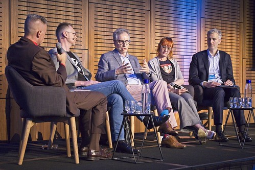
Mark Pesce – New Money

While panels are rare at Web Directions, when Mark and John talked about the topic of new money they decided to have Mark assemble a panel.
NOTE: this is an exceptionally loose capture, I usually wouldn’t attempt to capture a panel at all! There is a lot of content missing as many ideas were discussed too fast to capture accurately enough to post. For best results, watch the video when it comes out on Conffab.
...
Mark opens with an oppropriate tale from the crypt... the Libra manifesto that “we believe in a global currency…” ...but do we really believe all that?
In Australia we perhaps don’t. But we have increasingly eschewed physical money, and more people have phones than credit cards. There is a gap between what people should be able to do and what they can do.
Because Libra.
Zuck became a billionaire on social sharing. If Zuck gets sharing money right, he becomes a trillionaire.
We now have to wonder, how do we put this new money to work?
Mark hosts our panel:
- Nicholas Gruen (NG)
- Aimee Maree Forsstrom (AMF)
- Damian Jeffree (DJ)
- Samuel Brooks (SB)
...
DJ: existing currencies create their own barriers. They rely on central banks people can rely on and trust. For emerging nations with smaller economies this is often not true – it’s a bad design.
Mark: What do digital currencies bring to emerging economies?
AMF: to Aussies the idea of branchless banking might seem weird, but having bank branches is a luxury. We also think of bank accounts as normal, but famously M-Pesa took off in Kenya in 2007 and is now used in ten countries and a 30m user base. It has completely changed the movement of money; and it’s believed 2% of people were lifted out of poverty just by having access to m-pesa. So imagine facebook having a currency, with two billion users. This can be very freeing to many people.
Mark: (reminder of micro and macro economics) If we’re about to get cryptocurrencies what happens?
NG: we get a microeconomic miracle worker and a macroeconomic wrecking ball. Since the internet came about we have a reordering of public and private goods. We think public good comes from the government and private from companies… but Libra is from Facebook, not a government. Changing transaction costs changes culture. In trying to make as much money as possible, which is normal business, they’re destroying our culture and politics. Media itself was already doing this, political sound bites in america had already dropped to just 8 seconds long over a few short decades. The silicon valley buzzword was “scale”. Build something, plug it into the internet and boom! scale.
Mark: (the slow speed of Bitcoin making it unsuitable for on the spot transactions)
SB: web scale largely meant scaling data transfer which was good; but it’s not so good for currency. Bitcoin isn’t just slow it’s unstable. The way Libra and others are trying to fix this is to reorganise the tradeoffs, injecting more trust so they can make things faster. 3-4 second transaction finality, not 20 minutes. Libra is also backed by relatively stable assets, so the Libra acts as a repository receipt.
Mark: so it’s doable, small countries need it, it’s technically possible… so what are the questions of design? The design of the money and the tools people will be using.
DJ: money sits at the base and financial systems build on top of that. The risk appetite is zero, things have to be secure as it is possible to make it. Also needs to be stable. You need this base to build on with an acceptable risk level.
Mark: equivalent of stuffing money in a mattress, but knowing the money will be worth the same when you pull it out.
SB: cryptocurrencies can be autonomous in nature, which probably isn’t advisable the first time we do this.
Mark: ...money with bugs?
SB: yes! The decentralised governance of Bitcoin is still really an experiment, and it has largely failed – it has been forked a couple of times.
NG: you can’t trust a monetary system where people have discretion. You need rules.
The fabulous @aimee_maree ruling this panel at @webdirections talking new money & crypto currency, bringing the perspective of how its working in developing nations and future possibilities. #wds19 pic.twitter.com/N4k7YHeV7E
— Katja Forbes (@luckykat) October 31, 2019
AMF: there’s technical design and UI design. Without the UI adoption doesn’t work. m-pesa is quite clumsy, which is why it hasn’t taken off in countries with more stable banking systems. When we talk about blockchain basic decisions can make a massive difference, like whether you can do recursive operations. We don’t yet know how Libra will work, to that level. Those choices will make a massive difference to how things are designed on it. m-pesa is a digital currency, not a cryptocurrency; it’s not borderless but fees vary by region.
AMF: We need to think a lot about Katja’s talk about trust. Do these currencies have trust?
Mark: Zuck is really interested in all the data generated by those transactions; and this is what China’s government is interested in as well. It allows you to completely track peoples activities and it will be part of their social credit system.
Mark: we need transactions, we need ledgers.
NG: money started with tokens and ledgers…
Mark: ...and you’d bake them in clay and they were immutable!
Mark: who holds the data; who accesses it; what can you learn about people from that data; and what the impacts are?
DJ: you can tell everything about people from their purchase data, it’s incredibly important to control this data.
Mark: what controls do we need to put on this?
SB: you need to consider the privacy of the individuals; think about how data is being collected; what are the commercial sensitivities you are revealing; and what information asymmetries are being created. There are emerging privacy protection systems which may be applicable to cryptocurrencies.
Mark: so it’s theoretically possible to create a cryptocurrency that doesn’t give everything away?
SB: yes, it will always leak some information, but you can stop a lot of it.
NG: there was an argument against central administration as the central brain can’t know enough. There was another argument that we should not afford privacy to businesses, their books should be open. There are ideas that markets are good an governments are bad; but governments need to play a much more enabling role. There is a submerged city of public goods which don’t exist yet, because it costs too much to set it up. 23 And Me is the killer app here – it gives a partial analysis of your genome. The creator was from America so thought about it as a private good; but it would have been massively more valuable as a public good set up with a public/private partnership.
Mark: Facebook has announced a digital credential system will go with Libra. But that’s revokable. Presumably China’s system will be the same. So your money could suddenly be beyond reach because you don’t control your identity. Can we design systems that control identity without giving up control? Can we enable everyone to use these systems with financial safety?
SB: current cryptocurrencies make it technically possible to control your trading identity…
Mark: ...but the UI is horrible. Libra makes it much easier, much sleeker. Is this the faustian bargain?
SB: interfaces are getting better. We’re getting better at balancing control and convenience.
NG: it’s long been clear the internet needs a strong identity management system. This has fallen to companies like Facebook and Google instead of governments.
Mark: do these need to be front and centre for the developing world?
AMF: one of the key things about m-pesa is it works both online and offline. You can use it in rural areas without connection. That’s something we don’t think about in Australia. Remember when we used to talk about apps needing to work offline?
Mark: that’s suddenly front of mind in California with the wildfires and blackouts.
AMF: we need to think about things that are different in other nations. Buying a pride flag may be a crime. There may not be any civil law protecting free speech. These systems could be incredibly harmful in ways we don’t think about.
Mark: will there be one currency to rule them all, or will we see lots of them? Does it mean anything to someone in Bangladesh?
DJ: One winner seems unlikely. There will be real fights on this. Imagine a small nation being offered a deal to enter the trading system of a bigger nation, via the currency. This stuff needs to come through the front door; and the Chinese government will do that. They are likely to offer deals that have plenty in them to entice the smaller nation.
Mark: what do we need to keep front of mind as we work with new money? What questions do we have to ask from people selling them?
DJ: money is power! You need to see in any monetary proposal where that power is flowing to and who holds the levers of power.
AMF: as always first and foremost we have to think of humans, and our most vulnerable humans. We have to think not just how it will affect us but how it will affect others. Governments and systems can change, so how can these systems be used against people in future as well?
NG: money is public good – that’s fundamental, but you have to operationalise that. We’ve done that to date with a central bank appointed by government and independent to some degree. There was a democracy that was fighting oligarchy, not with elections but with juries. With monetary policies that sounds crazy, but prime ministers do it – they form small groups who know about monetary systems, to inform policy. Many of Google and Facebook’s biggest political problems could be addressed if they appointed a citizen’s council; and they had a veto over new ideas.
SB: as engineers and designers we face a world with more options to provide payment solutions to our users; where we can not just transfer money but program value. It’s important for us to do our homework understanding the negative side effects of the collection of that data.
Day Two
Nina Walia – Responsive (Clothing) Design
“Responsive (Clothing) Design” with Nina Walia #wds19 #webdirections pic.twitter.com/ZzuceGyYP5
— Jean-Jacques Halans (@halans) October 31, 2019
What does responsive clothing mean? Clothing that responds to stimulus and the environment it is in – which all clothes do, but since we’re adding technology we’re adding an adjective…
Video: 3D printed shawl that responds to where people are looking, using eye tracking.
Crash course on common technology, the hello world of responsive clothing… a garment with:
- coin cell battery holder
- coin cell battery
- conductive thread
- inputs and outputs – eg. an LED

These things are really cool but they are really fragile. You can’t put them through a sewing machine as the thread will break or easily get crossed. You certainly can’t wash the garment.
For this reason responsive clothing is similar to coutoure – painstakingly made, worn by one person, generally not practical for daily life… but very dramatic and theatrical.
Nina worked on a project early in the evolution of responsive clothing, the idea was to fully track body movement and turn it into music. To create a garment that encouraged you to explore your movement and surroundings, to examine the relationship you have with your clothes.
Why do we wear clothes, anyway? Obviously to avoid being arrested and to be protected from the elements… but if that was all we’d probably just have a couple of basic items of clothing in our closet. The real reason is expression, to represent ourselves, to demonstrate our choices and personality.
Real life is improvisation. Fluid. Open. Movement is like a language. So in many ways these projects really start with social practices and processes rather than devices.
In contrast, technology has to be used “correctly”. You learn the “right way” to touch an iPhone, even though gestures aren’t really very natural.
It’s more fun when there is a sense of fun and play, when we track natural movement and do things with that.
Wearable technology tends to stay in the coutour zone as you simply can’t do normal things like throw them through a washing machine and dryer, it would destroy the electronics. Also because the garments tend much more to experimentation and aren’t trying to be worn daily anyway.
So what of Ready To Wear?
There are many technological advancements in clothing – think of Goretex and compression sportswear. But most are practical, not many around expression.
Nina joined Google ATAP’s Project Jacquard, looking at this problem. Knowing that Google doesn’t make clothes, the idea was to enable others to do so. They also had to fit within established clothing manufacturing processes, it’s just too hard to go outside them.
They partnered with Levi’s… partly because they’re based in San Francisco so it was easy to meet up with them :) But Levi’s showed them how full on the denim manufacturing process is, with heat (it literally gets burned) and stretching. Levie’s thought it would be impossible for conductive thread to survive such a harsh process, but the engineering team took it as “challenge accepted!”. If they could crack denim they’d be able to use the technology in almost any other fabric.
They did it! ...she can’t reveal some of the details which are proprietary. But it worked! They created a smart thread that survived in denim.
What then? The technology worked, but how to make something useful with it?
Clothing designers have something we might think of as a persona, a “muse”, and a story to go with the garments they design. How does that evolve with smart fabric? The project ran into lots of people who were enthusiastic but didn’t really know what to actually do with the smart thread.
Levi’s used it in the Commuter range, which often gets used for innovation; and had a very strong community buying the products. Things like jeans made for bike commuting – with stretch, reflective spots and so on. Cyclists wanted to reduce the amount of times they pulled out their phone while riding; people walking through busy locations also wanted to be able to leave the phone in their pocket more.
Another classic situation is when people are waiting for a call, but they are meeting friends in the meantime so the phone goes on the table. Even when the phone is dormant, when it’s on the table research shows people are distracted by its presence.
At this point Levi’s pointed out you have to pick a part of the garment to make interactive. The area had to be rigid; and a piece that can be sewed on separately during manufacturing. Good options: cuff, collar, pocket, placket (where the buttons run). They also looked at places it’s possible and societally acceptable to touch.
So they went with the cuff. Which meant she had to design one of those “udder charts” defining gestures… They came up with “brush in”, “brush out”, “double tap” and “cover”. Almost immediately people wanted to customise what those gestures did. It’s tricky to teach people how to use the product, without making it too much up-front learning to be fun.
Next they needed to pair the hardware (clothing) with phones. This pushes the processing off the garment, to the phone, and through to the cloud as necessary. So they had to design an app.
Demo of the commuter jacket! Jacket lets you start music, skip tracks, look up locations, etc.
Nina Walia demoing Jacquard on stage https://t.co/Vkfvm1XmDZ #wds19 #webdirections pic.twitter.com/nlFoPiTPM9
— Jean-Jacques Halans (@halans) October 31, 2019
A neat social hack is to have the cuff buzz when your Lyft/Uber is approaching, to try to get rid of the awkward end-of-night ritual of people standing next to each other staring at the car approaching on a map on their phone.
Plus the jacket was actually a nice jacket. They got a review from GQ “finally a wearable that’s wearable!” which is a bit nonsensical but we get what they meant.
You can buy this jacket! Even in Australia!
Jonathon Colman – A content-first approach to product onboarding
Content: “it’s the stuff I came here for” Jonathon Colman
— Jean-Jacques Halans (@halans) November 1, 2019
A content-first approach to product onboarding with Jonathon Colman pic.twitter.com/uwpMSb5iwO
The four basic interactions of the universe:
- gravity
- electromagnetism
- weak nuclear force
- strong nuclear force
The four forces that act on people who are considering moving from one solution to another:
- push – away from what you have
- pull – to the new
- anxiety – about leaving
- inertia – change is hard
Let’s consider what content is – if Jon was to ask everyone we’d all have a different answer. So the most minimal definition of content: “it’s the stuff I came here for”.
Correct!!! 🤗🚀🚀🚀❤️ #wds19 pic.twitter.com/nzRkE5RT7n
— Elle Geraghty Content Strategy (@EllenGeraghty) November 1, 2019
Content first? Design from the content out, not the canvas in
– Mark Boulton
Think about the way the responsive web works – it really expects the content to respond to the space available to it. Which often breaks – great example of a headline being truncated and changing the meaning.
Content-first flips that – the layout needs to expand to fit the content.
Design without content is just decoration. – Zeldman
Most onboarding is created as decoration. Little pointers and hints scattered over what you already have.
Stop decorating! Start narrating.
Conceptual model for a narrative: Exposition → Inciting incident → Rising action → Crisis → Climax → Denouement → End. Star Wars follows this narrative arc perfectly.
Users go through a narrative when they use your product. You can design onboarding with these stories in mind.
resource: concept story worksheet
Story matters – we are connected to stories and we live through them.
Kathy Sierra – “Upgrade your user, not your product. Don’t build better cameras, build better photographers.”
We love people who do rad sh*t like @jcolman @webdirections #wds19 pic.twitter.com/FukY8LClF1
— Sample Coffee (@samplecoffeebar) November 1, 2019
You don’t sell your product, you sell the vision of the person you could become using the product. “People don’t buy products, they buy better versions of themselves.”
At Intercom they use Jobs To Be Done (JTBD), which is a useful model for building stories.
Think about how to translate the four forces into feelings:
- Understand the push
- Strengthen the pull
- Calm their anxieties
- Overcome the inertia
Speak to feelings, not mechanics.
Example of bad mechanics – light switches that need extensive documentation. Light switches!
⭐️Day 2 at @webdirections and I am sitting in my favourite talk so far by @jcolman on content/onboarding
— Imogen Baxter 💫 (@imogenhbaxter) November 1, 2019
"Stop trying to solve product problems with content"
my @sendle colleagues may remember that I'm obsessed with onboarding flows... so this is *heaven* pic.twitter.com/KhbrIcpZML
Product problems cannot be solved with content.
Focus on benefits not features.
example: introducing formatting tools in a chat client. The content is ok but it does mostly talk about the mechanics, what to click and what the buttons do. What people really want is for people to actually read and act on their messages!
Empty states are onboarding – you are missing a huge opportunity if you’re not using them. Talk about what the user will get by using the feature – the why, why should they use it. Then move on to how to do it and what will happen.
why/how/what comes from the book: Start With Why – Simon Sinek
- Understand the push
- Strengthen the pull
- Calm their anxieties – how will this make you and your stakholders successful
- Overcome the inertia – what’s the best, shortest path to success
Six key messages of onboarding, based on Jon reviewing hundreds of onboarding flows:
1. Welcome – acknowledge customers and make them feel valued
2. Identity – show how the customer should consider interacting with the product, establish your voice
3. Problems to solve – lead with the benefits of your solution and show how they address my needs
4. Explicit value proposal – set clear expectations for what your customers will get using your product
5. Show the mechanics – walk customers through how they can get the most out of your product
6. A call to action – don’t just explain the product, get me to start using it effectively
Onboarding is not a feature. Don’t build as decoration or an extra feature.
Onboarding is a product and ideally a team. Intercom has a dedicated onboarding team to build, measure and improve onboarding.
When you handle the four forces, magic can happen – and users see a world of possibilities.
@jcolman | Jon’s slides and resources | Four Forces | Tell The Story
Alexandra Skougarevskaya – Design systems are a service: how to keep your customers happy
Not too scared to wear a jumpsuit after the lesson we learnt from @luckykat yesterday, @skougs dives headfirst into danger. #wds19 pic.twitter.com/5gj3eEcmQu
— Josh Kinal (@sealfur) November 1, 2019
During Alex’s interview process she asked a lot about the way design was valued at Atlassian. The history of design at Atlassian was chequered, but when Alex joined they had set up the ADG – Atlassian Design Guidelines. The aha moment is that design systems elevate the value of design. She was sold and joined.
What Alex was fascinated by when she joined was the way the design system had been designed to evolve. A design system is not a Sketch file.
Design systems are a collection of rules, constraints, and principles, implemented in design and code. – Sylvee L
They held a workshop to define some brand principles:
- Bold
- Optimistic
- Practical, with a wink
They were able to agree – eventually – on colours and typography, illustration and writing style. This also led to the new logos and Charlie Sans font. They also managed to hammer out detente with marketing, agreeing on common foundations.
With leadership buy-in, they were able to drive the ultimate holy grail: adoption. The new style was actually rolled out across products.
But they weren’t really done. Products had taken the new design the same way people took medicine. There was a lot of hard-coding and overrides going on.
A design system is not a project, it’s a product for products.
They were a large team, about 22 just on ADG, but there were hundreds of engineerings in about 150 teams. They all wanted stuff.
A design system is nothing if your team can’t use it well. – Sarah Federman
They moved from a product for products, to a service for people.
A remote design critique at @Atlassian shown by @skougs. Followed by talking about the importance of onboarding and educating new hires on the design system. 🙌 #wds19 #webdirections pic.twitter.com/kkst99JdxN
— Web Directions (@webdirections) November 1, 2019
Design systems are about culture and mindset – and that’s hard when the culture is shipping. So they did a ton of user research on designers and developers inside Atlassian. They invested in the community and education in how to actually use the ADG. Given the scale of Atlassian, it was important to make it possible to onboard at scale. They also invested in design tools, instead of letting it trickle along in 20% time (now it’s three people working on it).
They were able to come up with a number on “design hours saved” – they measured designers on hours taken with and without the tooling, then multiplied that out.
This has been a journey over time. The pressures and needs have changed as the years went on and that’s natural. Your design system needs to evolve as the company grows and evolves.
Their current mindset is to make it easy for people to create distinctly Atlassian designs.
If you focus on having a design system as a goal, you will fail. Think about the problem you need to solve.
Mandy Kerr – Fun with Sensors and Browser APIs for the web!
Mandy Kerr having Fun with Sensors and Browser APIs for the web! #wds19 #webdirections pic.twitter.com/HXqUJDoTBO
— Jean-Jacques Halans (@halans) November 1, 2019
We start with an important introduction, to Mandy’s dog Jello! So when you see the word 'jello’ later, it’s a pooch not a pudding.
Preface to the technical: this a session called FUN with sensors and APIs, not practical production applications! There are practical applications but they’re not as fun to demo. Remember that everything starts with experimental implementations; and also keep an eye on the logos for browser support (not going to spend all the time talking about that).
(code samples in codepen, not attempting to transcribe them)
Web Speech API
Two interfaces:
- Speech recognition (input)
- Speech synthesis (output)
Focusing on speech recognition today.
The first demo is a simple capture of speech to rendered text – noting this does need an internet connection to phone home to a speech service. Interesting thing is you can see the words changing as it gathers more input and gained confidence in its context. You can also choose to wait and render in one go, but it’s not as illustrative.
Holy caticorn 🙀🦄 @Mandy_Kerr you knocked it out of the park with this talk! 👏🙌
— Simon Vrachliotis 🏄🏀💻😍 (@simonswiss) November 1, 2019
A great reminder that we should spend time having fun exploring new APIs and browser/device capabilities! ❤@webdirections #wds19 pic.twitter.com/FMKMRQIoHH
Notes:
- There are methods for starting and ending input, there are events for getting a result, and for when speech input has stopped.
- The result is an object; and the actual results are a little convoluted to get to as the API is designed to bring back multiple alternative results.
- You must trigger this from user input, which is a security consideration.
Demo: fire-breathing dragon, with bonus variable font because Mandy has to include one by law at this point. Interesting sidenote that the result comes with a confidence rating.
Demo: using a variable font to render text differently according to the volume and inflection of the input speech. It’s a bit of a failed experiment as there’s no timestamp in play to match things up to that level of detail. The sad thing is current speech to text tends to lose the richness of the input, it just turns things into strings. However you can detect certain words like 'love’ and 'Jello’ and then style those differently. In future hopefully we will get a much richer API.
Demo: a dog that listens to commands and responds to them. Demo ran into the classic problem that Australian accents are not supported well! But the virtual dog was able to respond to commands after a couple of tries… quite realistic when you think about it ;) There are some really practical reasons to want to accept basic commands – Netflix should accept verbal yes/no prompts, people often don’t have their hands free when an alarm or something goes off in the house.
The way the Web Speech API works at the moment:
Browser API → Speech Proxy → Speech To Text provider (hosted by the browser vendor)
Google does keep the recordings to improve the service; currently Firefox uses Google’s service but pays to have them not keep the recording. Or you can choose to use Mozilla’s Deep Speech service, which doesn’t work as well yet (in Mozilla’s own judgement). Mozilla is working to improve Deep Speech and also looking into options to download language packs, so you can use the API offline. It’s a feature they are keen to provide.
Audio and speech have lots of interesting possibilities for providing useful and accessible interfaces.
What do these images have in common? They're demos in my "Fun with Browser Sensors & API" talk at @webdirections today!
— Mandy Michael (@Mandy_Kerr) October 31, 2019
If you're here, join me in Engineering at 1:30pm & learn how to make some cool stuff, have some fun (and talk about some practical stuff as well).#wds19 pic.twitter.com/97pxclozvZ
Orientation sensors
The accelerometer detects a change in the orientation of the device. This does differ depending on the device’s specific hardware.
Demos: text and animation effects responding to the position of the phone…
- text slides to the bottom of the screen
- sliding colour flip for text – would have been great in some agency/brand work
- changing font weight and zoom as the phone tilts – would be great for a conference website
In more practical applications you’d use this to trigger subtle UI effects to reinforce interactions; or to add an interactive element to storytelling experiences. A lot of our current content is very static, and these APIs could bring some dynamic changes to it.
Light sensors
Ambient light sensor does what it sounds like – reads the amount of light the device is currently reading. There are two versions of the API, the first being deprecated, so be sure you get the right one if you google it.
There have been legitimate security concerns about these, because the specific implementation made it possible to steal data. The main fix is to add a frequency cap and round off the values being returned – this gave security but has not practically diminished the usefulness. Since the security concerns have been addressed, Chrome do plan to release this as a mainstream feature quite soon.
AmbientLightSensor creates an object; has methods for onreading and illuminance (current light level). That’s really all you need.
Demo: a page that shows a sun or moon depending on a light threshold. Quite fun for making different website designs.
Demo: changing font weight based on light conditions – this would make a real difference to readiability in those scenarios.
Demo: variable font with vines of flowers that bloom or close depending on the ambient light.
...
My favourite thing about #wds19? @Mandy_Kerr 's Caticorn. pic.twitter.com/UiEeTJIdL7
— isabel brison (@ijayessbe) November 1, 2019
Don’t be limited by the things we can already do. The web is still young and there is so much for us to create. Make interesting, useful, cool and fun things!
Combo demo… Smello the wizard who will only do magic in the dark; and the UFO + Caticorn game.
“That went really well, so I’m gonna stop there!” :D
There are lots of way to combine these interfaces and inputs, to create cool things. But in the meantime, hopefully you enjoyed abducting a caticorn with a UFO!
@mandy_kerr | Mandy’s slides and resources | Mandy’s codepens
Anson Parker – The Tree of Up
New inspiration for visual roadmaps, the Tree Of Up from @anson #wds19 pic.twitter.com/6M1FHpPKHk
— Cheryl Gledhill (@cherylgledhill) November 1, 2019
Starting with a digression into cars… BMW rationalised the way it named its models, using a mostly-but-not-always numbers system to indicate rough size and price. This works with hardware.
Software is different. It changes and pivots, it’s less predictable. To encompass any new item of scope, you can either expand your scope to envelop that from where you are; or you can pivot and move to that point with similarly sized scope.
Products have a trajectory and how fast you move from where you are along that trajectory is your velocity.
Up is a digital bank, built by engineers rather than bankers (there is a bank backing Up of course). Their mission is to connect people with their spending more. They look at everything through the software lens, which is why they have such a different approach to simple things like the design of their debit cards.
They added 'chat’ to their app rather than 'support’ because all customer dialogue goes through it. They can do surveys with customers very quickly. They have about 500 conversations every day and a lot of them are in the 'ideas’ category. Which is really cool that customers are excited enough to think about this stuff.
They were finding they were saying “it’s coming soon” a lot; and they also tag conversations so they could notify them when the feature shipped.
While a public roadmap isn’t going to be right for all companies, it works for Up. For those companies that do provide one it’s often a lot like a Trello board – now/next/done kind of stuff. But they miss the dimension of how things are connected. Things have dependencies. Some things have to go first.
So Anson thought a diagram would do a good job of articulating that. He had some inspiration from a game he had on his phone, with a technology tree. It was a cool way to visualise interconnection of features. Quite a few games have them.
Started with a brief coding experiment before realising he had to see if it worked at all; so he mocked it up in Illustrator. People liked the mockup and it went from there, and it became known as The Tree Of Up.
The diagram shows groupings and links between related features; and indicates their status. It makes it easy for lay people to understand things like the need to support multiple accounts before you can support shared savings.
Technically this is kept very simple, it’s an SVG exported from Illustrator, some JS mapped to JSON and put on the website. While it would be cool to automate it, the time hasn’t really been worth spending yet.
The most common question is why share this? Doesn’t this give your competitors a blueprint? Not really – it’s the ability to execute that’s important. Most of the ideas will have been considered, plenty of other banks would want to do them, but haven’t done so yet. There are lots of things that are tricky to build in banking.

The next step in the roadmap was the Spring Up Tree – a renewal of the tree, adding new feature ideas. It was a bit of a test to see whether the tree would scale; and so far it does.
One learning is that it’s not really useful to put dates on there, they change too much and it annoys people when you don’t meet them. Better to just show the shape.
Two rules of banking: keep people’s money safe; and give people access to their money. But curiously lots of people ask to have their savings hidden away from them! So you have to be careful building something like that.
The tree does a great job internally as well, to show people the bigger picture. The visual approach really helps people understand where they are and where they are going.
Charlie Gerard - Strike a pose: Gesture recognition in JavaScript with Machine Learning & Arduino.
Showing us some instructional code @devdevcharlie talks about how you want your algorithm to find patterns in the data. #wds19 #webdirections pic.twitter.com/0G9TMZ5sSW
— Web Directions (@webdirections) November 1, 2019
The goal is to play Street Fighter using nothing but body movements. Why? Why is not the point!
Materials:
- arduino with wifi
- IMU hardware sensor linked up to the arduino, providing accelerometer and gyro
- button to differentiate gameplay from other movement (there are other ways to do this but this was simple)
- JavaScript: tensorflow.js, johnny five js library, nodejs server
Step 1: collect the data. What you get back is raw data, six numbers on every line.
Step 2: process the data with tensorflow and train it with lots of samples. We label the events with numbers, to suit tensorflow – 0, 1, 2 are the punch, uppercut and hadoken. The data is mapped into 'features’ in tensorflow terms. Then you map them into Tensors. You divide up your data into test and training data.
Step 3: create a machine learning model. This step is still more art than science, you try different models and see what works for you. The literal output is a data file (JSON).
Step 4: predict. This is where you start feeding in new data and see if it gets the answers right. For the game, this means we take in new data and predict which move was made.
For the demo Charlie has switched hardware to use a Google Daydream remote, as it produces the same data. But that just changes the data source, not the rest of the code.
Live demo! It did work despite tempting the demo gods!
"Uppercut!" @devdevcharlie shows a working demo of gesture recognition using Street Fighter. #wds19 #webdirections pic.twitter.com/AhsgED7rcY
— Web Directions (@webdirections) November 1, 2019
Once you know how to record and detect gestures, you can record anything.
Next demo: a Harry Potter spell casting app. (lots of wireless interference in the room so it didn’t work). The point is that the code is the same, you just feed it different gestures.
What else can you do with this? Well the inputs are the same as your phone! So whatever you can do with these sensors you will be able to do with phones when those APIs become mainstream. Or you might have any one of a range of other hardware with gyro and accelerometer.
The key steps to understand:
- record data – literally getting the data from a source
- process the data – preparing it so it can be used
- splitting – cut the data down to what your algorithm needs
- training – to improve accuracy of predictions
- predicting – able to use live data for new predictions
Also it doesn’t matter that this isn’t a practical example, the point is to learn how to use hardware and machine learning. If we don’t learn fun new things we’ll never be able to do cool new stuff!
Aaron Z Lewis – Metaphors we believe by: the pantheon of 2019
Aaron Z Lewis closing these two days: “Metaphors we believe by: the pantheon of 2019”#wds19 #webdirections pic.twitter.com/7PtilQCYPf
— Jean-Jacques Halans (@halans) November 1, 2019
Aaron has been studying media history, digital anthropology and social psychology. “You can handle the post-truth!”
Technology is blurring all kinds of lines, from the physical and virtual, right through to life and death.
We are now dealing with lots of versions of “the truth” and what is real. New media tech is making us god-like in our ability to (re)shape people’s realities.
This reminded Aaron of his childhood in a very conservative christian home, where many difficult questions were answered with believing in god. With his now-secular view, he can see parallels with how we relate to new god metaphors.
What is metaphor?
The essence of metaphor is understanding and experiencing one kind of thing in terms of another. – George Lakoff
We rely on metaphor extremely heavily in GUI design, very early MacOS shows this with its skeuomorphism. We are so used to them we forget they are metaphors – files, folders, trash/garbage cans, the web being “pages”, the ideas of cut/copy/paste which came from physical manuscripts.
Let’s zoom back out and begin our tour of seven different god metaphors.
The human colossus
An idea from Wait But Why, thinking about the entirety of humanity as a single being. The more we can and do communicate on a global scale, the more we become the human colossus; each human acting as a cell. The colossus can do things no individual could accomplish. It has however brought us to the brink of ecological disaster.
Seven gods of the digital pantheon in 2019:
— Ivy Hornibrook (@ivyhornibrook) November 1, 2019
1. Human colossus - the insatiable desire to continuously grow value, creating ecological desire
This is 24 hours of twitter data. @aaronzlewis #webdirections #wds19 pic.twitter.com/oL2mOPRcpV
Moloch
The god of coordination failure. In mythology a god that demanded unreasonable sacrifices. Moloch gives us a way to imagine our strange inability to stop things we collectively wish to stop. Nuclear weapons, climate change. Intractable coordination problems perpetuating harmful problems, at the cost of humanity.
The Uruk Machine
The god of heartless market forces. A god named for the Uruk period of Mesopotamian mass urbanisation. The Uruk Machine has authoritarian impulses and cannot care about anything which does not strengthen the economy, no matter the social unrest it causes. The pattern plays out when small groups are trampled by a larger, more powerful group. This happened when european colonists arrived and collided with native Americans. Clashes over ownership of property happened when one side did not even have a strong concept of such ownership. One force overwhelmed the other. The Uruk Machine bulldozes what was there before, at the cost of our emotional wellbeing.
The Stack
The God of Systems Thinking… the most academic god, named by MIT’s Benjamin Bratton.
This is a way to imagine how geopolitics are shaped in the present day.
User – anything from a human to a self-driving car
Interface – how people interact with the stack
Address – anything from a home to an IP address
City – smart cities of the future
Cloud – servers
Earth – the raw materials to make devices
The stack is a theory of governance, thinking how we might control the stack as technology and humanity evolve side by side. A technologist’s dream. Not actively hostile to humans, simply indifferent.
The Stack: a high fidelity model of the world that we might be able to manipulate it one day in the future @aaronzlewis closing out #wds19 ‘Metaphors we believe by: the pantheon of 2019’ talk. So cool 🤩 pic.twitter.com/zvaeF3xEu1
— Alex ✨ (@skougs) November 1, 2019
Yggdrasil
The god of spooky entanglement, from Norse mythology. A huge tree that connects the multiverse together. In a world where billions of people are networked even small local actions can have unforseen effects – the butterfly effect via data packets. Nothing is “someone else’s problem”, everything is connected and can come back on us.
It’s surprising we think of the internet as a cloud, rather than a tree like Yggdrasil’s branches and roots.
The Singularity
The god of artificially-intelligent utopia. The closest god to generating a real-life religion. People who believe they can vanquish Moloch by creating AI sufficiently advanced to grant immortality to humans. There are many similarities to the idea of The Rapture in christianity, a moment in the future when they will be saved, to transcend from the human.
Egregore
The god of collective intelligence. This arises whenever a group of humans gather around a common goal. A distributed intelligence, crossing a lot of minds and machines. We talk about corporate entities acting as a unit, even though they are made up of people and materiel. Whether gods, demons or dictators, Egregors are very powerful. Egregor makes room for plurality, for every group of people there is a collective intelligence that rises up. Thanks to the internet, more Egregors appear all the time – a cambrian explosion of Egregors.
...
“Humans are pretty bad a dealing with complex systems...” #wds19 pic.twitter.com/j7HObJTUZK
— Mark Pesce (@mpesce) November 1, 2019
What can these “gods” teach us and how do they relate to the deities of old?
In the Middle Ages, people could not help but experience themselves as determined by God. – Hubert Dreyfus, All Things Shining
Humans are pretty bad about reasoning on complex systems. We tend to reductionism, to seek simplistic explanations that are easier to accept. We’ve created a world beyond any complexity people could have imagined in medieval times.
People have always known our ideas of god as ruling a kingdom were metaphors for bigger, harder ideas. They are not literal things, they are metaphors for big ideas. The pantheon we see now won’t make sense in future.
These new gods can leave people depressed. There is a tight feedback loop between the gods we believe in and the societies we create.
Absolutely fascinating final keynote talk by @aaronzlewis at #wds19 Really loved this as it's a topic I'm super interested in! Got a lot more ideas and research to do now! Thanks Aaron! pic.twitter.com/4J7AMDrSrs
— Adam Bottega (@adzbottega) November 1, 2019
But these gods should give us hope. They re-acquaint us with the paradoxical idea that complex systems are both bigger than us and inside us as well.
This pantheon is not an exhaustive list, there are many more.
Look for the hidden metaphors that guide your own thinking.
@aaronzlewis | Aaron’s blog post 'Metaphors we believe by’